In a sentence: True Winter and Bright Winter are both cool, deep and high-contrast, the difference is that True Winter is the purest icy cool and sits a touch deeper, while Bright Winter is cool-leaning-neutral and the brightest season of all. Skip to the distinguishing palette or find out which you are.
True Winter vs Bright Winter: How to Tell the Difference
By ToneLalaUpdated July 13, 2026
Contents
These two come up on my draping table more than almost any other pair. Someone arrives certain they're a Winter, dark hair, bright eyes, skin that goes clean and clear against cool color, and the only question left is which Winter. True and Bright sit side by side on the spectrum, they share the same crisp neutrals, and to an untrained eye they can look identical in a palette card.
They part ways on two dials, though, and once you've seen the split in person it's hard to unsee. True Winter is about coolness taken to its purest point. Bright Winter is about brightness taken to its highest point. Same family, different obsession, and the colors that flatter each one quietly draw the line.
True Winter vs Bright Winter: the core difference
Every season sits on three dials, undertone, value and chroma. True and Bright Winter agree on more than they disagree, which is exactly why they get muddled.
- Undertone: both are cool. But True Winter is the most purely cool season on the wheel, sitting right at the icy, blue-based end of the dial. Bright Winter is cool-leaning-neutral: still cool, with a faint neutral edge. That tiny lean is what lets it go electric instead of glacial.
- Value: True Winter is deep, and its darkness is part of its drama. Bright Winter is medium-deep, a shade lighter, reading more lit-from-within than weighted.
- Chroma: this is where they truly separate. True Winter is bright and clear, but its clarity serves the coolness. Bright Winter is the highest-chroma season there is: clarity is the whole point, and it carries the most saturated, charged colors on the wheel.
So both are cool, deep-ish and high-contrast. The shorthand I use with clients: if the deciding factor is how cool, you're looking at True Winter; if it's how bright, you're looking at Bright Winter. True Winter is an icy spotlight. Bright Winter is the same coolness with the saturation dial pushed all the way up.
The colors that tell them apart
Most winter colors flatter both seasons, that's the trap. These are the ones that pull in opposite directions, so they're the ones worth testing.
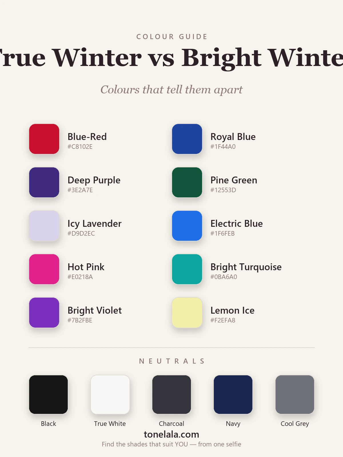
| Color | Hex | Flatters |
|---|---|---|
| Blue-Red | #C8102E |
Leans True Winter, a pure blue-based red, cool to the core |
| Royal Blue | #1F44A0 |
Leans True Winter, deep, classic, icy-cool |
| Deep Purple | #3E2A7E |
Leans True Winter, dark, cool and weighted |
| Pine Green | #12553D |
Leans True Winter, deep cool green, more jewel than electric |
| Icy Lavender | #D9D2EC |
Leans True Winter, a barely-there cool pastel that stays clean |
| Electric Blue | #1F6FEB |
Leans Bright Winter, charged, vivid, lit from within |
| Hot Pink | #E0218A |
Leans Bright Winter, maximum saturation, cool-neutral |
| Bright Turquoise | #0BA6A0 |
Leans Bright Winter, glowing blue-green, very high chroma |
| Bright Violet | #7B2FBE |
Leans Bright Winter, purple turned up to electric |
| Lemon Ice | #F2EFA8 |
Leans Bright Winter, a cool-bright yellow True Winter can't quite hold |
Shared neutrals: Black #161616, True White #F8F8F5, Charcoal #34353B, Navy #1B2750 and Cool Gray #6F727A, both seasons wear all five, and black-with-true-white is a signature for each.
Still not sure, True Winter or Bright Winter?
Find your color season →How to tell which you are
You can get a long way at home with daylight, a mirror and a few honest comparisons.
- The blue-red versus electric-pink drape. Hold a pure blue-based red near your face, then a charged hot pink. True Winter looks cleanest in the cool, blue-toned red and finds the electric pink slightly shrill. Bright Winter lights up under the electric pink and finds the quieter red a touch flat.
- Icy pastels versus full brights. Both can wear icy pastels, but watch which energizes you. If a soft icy lavender or pale icy blue keeps your face crisp, that's a True Winter signal. If pastels feel like they need turning up and the most saturated brights are where you come alive, that's Bright.
- The near-muted test. Drape a cool color that's just slightly toned down. True Winter can usually hold it, the coolness keeps it clean. Bright Winter goes flat almost instantly, because anything short of full saturation drains it.
- What washes you out. Warm tones gray out both seasons. But notice the direction of failure on cool colors: if even crisp brights feel a hair too much and the iciest, deepest cools are most flattering, lean True; if quieter cools look dull and only the electric versions click, lean Bright.
The thread through all of it: True Winter is chasing the purest cool, Bright Winter the highest brightness. Whichever quality your face rewards is your season.
If you're True Winter / If you're Bright Winter
If you're a True Winter, your home is pure icy coolness. Blue-based reds, royal blue, deep purple and pine sit beautifully on you, and your icy pastels stay crisp rather than needing to shout. You can wear the deepest cool jewel tones without being overpowered, and a near-muted cool still reads clean. Build from there in the full True Winter guide.
If you're a Bright Winter, your home is maximum clarity. Electric blue, hot pink, bright turquoise and bright violet are where your face snaps into focus, and you need colors kept saturated, the moment they soften, they go flat on you. Black and true white give you the high contrast your coloring is built for. The full Bright Winter guide lays out the rest.
The reliable way to settle it
Home draping gets you close, but daylight shifts, phone screens lie, and your own hair color can tug the read one way or the other, a warm balayage on a True Winter can easily fake a brighter, more neutral cast. That's why borderline Winters so often bounce between the two.
A photo-based analysis takes the guesswork out. It reads your actual undertone, value and contrast from a clear image of your face and places you on the right side of the line, no flattering light, no wishful thinking. If you want to understand the whole map of seasons around these two, the color analysis guides walk through each one. Or settle it directly and find out which Winter you are.
Frequently asked questions
What's the difference between True Winter and Bright Winter?
Both are cool, deep and high-contrast, so they share black, true white and the crisp brights. The split is undertone and chroma. True Winter is the purest, iciest cool and sits a little deeper, it owns blue-based reds, royal blue and icy pastels. Bright Winter is cool-leaning-neutral and the highest-chroma season of all, so it can go fully electric: hot pink, electric blue, bright turquoise. Iciest cool → True Winter; most electric → Bright Winter.
Am I True Winter or Bright Winter?
Drape a clear blue-based red against a charged electric pink. If the icy, blue-toned color looks cleaner and the electric one tips slightly garish, you're reading True Winter. If the electric pink lights your face up and the quieter blue-red feels a touch flat, you're Bright Winter. True Winter wants pure coolness; Bright Winter wants maximum brightness.
Which is warmer, True Winter or Bright Winter?
Bright Winter is the marginally warmer of the two, not warm, but cool-leaning-neutral, with a faint neutral edge that lets it carry the most vivid, electric colors. True Winter is more purely cool, sitting at the icy, blue-based extreme of the undertone dial.
Which is deeper, True Winter or Bright Winter?
True Winter is the deeper of the two. Its value runs dark and its coolness is absolute, so the deepest blue-based jewel tones sit naturally on it. Bright Winter is medium-deep and reads lighter and more charged, its defining trait is chroma, not depth.
Can you be both True Winter and Bright Winter?
No, you have one season, but you can sit on the border between them. The two are neighbours on the winter spectrum, so a borderline person may flatter colors from both. Even then one direction is your home: pure icy coolness leans True Winter, maximum electric brightness leans Bright Winter. A proper analysis pins which side you fall.
How can I tell if I'm True Winter or Bright Winter at home?
Test three things in daylight: a blue-red versus an electric pink, icy pastels versus charged brights, and how a slightly muted cool treats your skin. True Winter stays crisp in the iciest, bluest colors and a near-muted cool still looks clean. Bright Winter needs the brightest, most saturated version of everything and goes flat the moment a color softens.
Related guides

Deep Winter vs True Autumn: How to Tell the Difference
A color analyst on Deep Winter vs True Autumn, how they differ on undertone, value and chroma, the colors that separate them, and how to tell which you are.

Bright Winter vs Bright Spring: How to Tell the Difference
A color analyst on Bright Winter vs Bright Spring, how undertone, value and chroma differ, the colors that separate them, and how to tell which one you are.

Deep Winter vs Bright Winter: How to Tell the Difference
A color analyst on Deep Winter vs Bright Winter, how they differ on undertone, value and chroma, the colors that separate them

Deep Winter vs True Winter: How to Tell the Difference
Deep Winter vs True Winter, explained by a color analyst: how they differ on undertone, value and chroma, the colors that separate them

True Summer vs True Winter: How to Tell the Difference
True Summer vs True Winter, explained by a color analyst: how they differ on value and chroma, the colors that separate them, and how to tell which you are.

Bright Spring vs True Spring: How to Tell the Difference
A color analyst on Bright Spring vs True Spring, how they differ on undertone, value and chroma, the colors that separate them
Prefer in person? Find color analysis near you
Browse local color analysts by city, or get the same season, palette and best-colors breakdown online from one selfie.
See your colors on a photo of you
Upload one selfie and ToneLala reveals your season, your full palette, and your best hair, makeup, jewelry and outfits, styled on you.