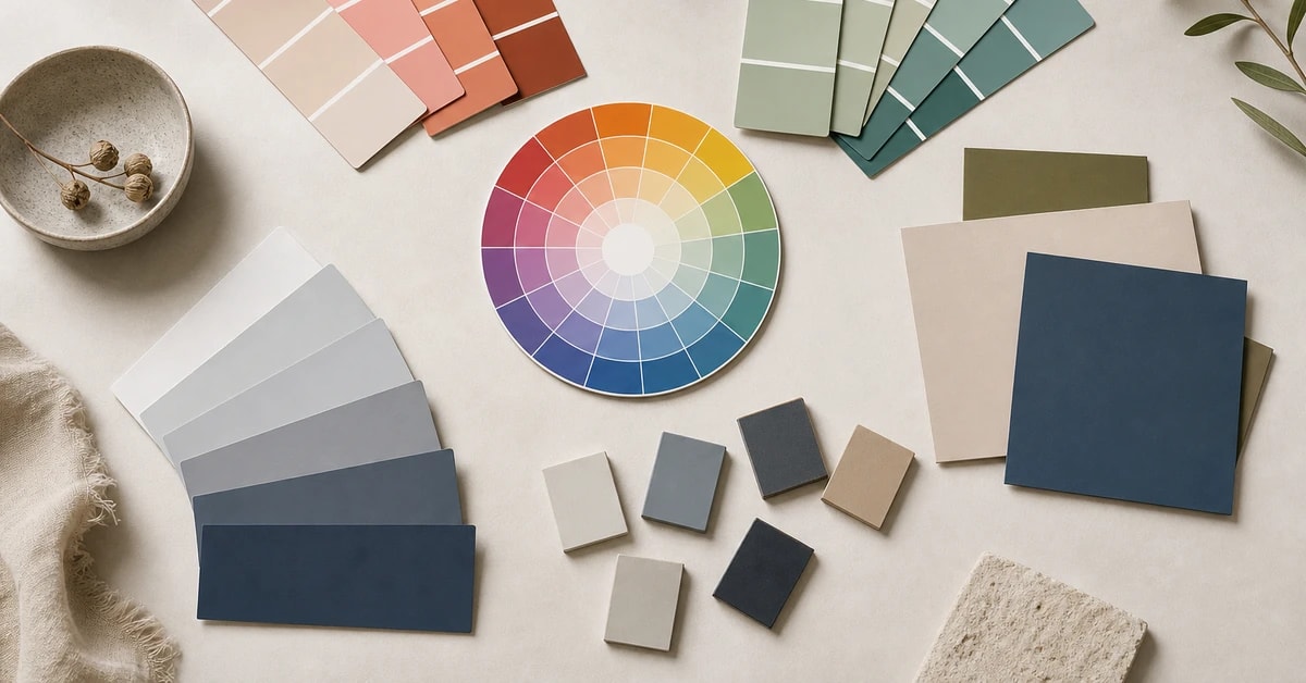
In a sentence: Complementary colors sit opposite each other on the wheel (blue/orange, red/green, yellow/purple) for maximum contrast; analogous colors are calm next-door neighbours; triadic colors are three evenly spaced hues for balanced energy, and the trick to all three is letting one shade lead. Skip to the color-wheel palette or find your season.
Complementary Colors: A Practical Guide
By ToneLalaUpdated July 8, 2026
Contents
A client once turned up to a session convinced she "couldn't do color," wearing a navy jumper and a single pair of rust-colored earrings. She'd put them on by accident. They were the best thing she owned, that little hit of warm orange against all that cool navy made her whole face lift, and she had no idea why it worked. That's complementary color, doing its quiet job before anyone's named it.
The color wheel sounds like school, I know. But it's the one piece of theory that genuinely earns its keep in a wardrobe, because it stops the guessing. Once you can see that orange lives opposite blue, that green sits between teal and yellow, that three colors can balance each other across a circle, you stop wondering whether two things "go" and simply know. Below are the three schemes I lean on most, complementary, analogous and triadic, and, more to the point, how to wear each without looking like a paint chart.
What complementary colors actually are
Complementary colors are the pairs sitting directly across from one another on the color wheel. The three you'll meet again and again are blue and orange, red and green, and yellow and purple. Because each pair shares no common hue, one is warm, the other cool, they create the strongest contrast two colors can. Stand them side by side and each looks more saturated, more itself. That's not an opinion; it's how the eye reads opposing wavelengths.
In practice the pairings get more wearable once you shift off the primary versions. Pure blue and pure orange is a lot. Nudge them to cobalt and amber, or teal and coral, or navy and rust, and you keep the magic contrast while losing the traffic-cone effect. The principle holds the whole way round the wheel: plum with chartreuse, raspberry with sage, aubergine with mustard. Warm against cool, every time.
Analogous colors: the calm option
Analogous colors are the opposite experience. Instead of opposites, you take three shades that sit next to each other on the wheel, teal, blue and green, say, or coral, terracotta and amber. They share an underlying hue, so there's no clash to manage; the look is tonal, soothing and quietly expensive. This is the scheme behind most "elevated" capsule wardrobes, where everything seems to murmur in the same key.
The risk with analogous dressing is that it goes flat, three shades this close can blur into a single soft smudge. The fix is value: vary how light and dark the pieces are. A pale sage top, a mid sage-green trouser and a deep forest coat are all analogous, but the difference in depth keeps the outfit alive. If you want to understand that lever properly, my guide to value and contrast in color analysis is the place to go.
Triadic colors: balanced but lively
Triadic schemes use three hues spaced evenly around the wheel, picture a triangle laid over it. The classic example is the three primaries (red, yellow, blue), but in clothes that translates to something like cobalt, raspberry and mustard, or teal, coral and a soft violet. You get more variety than a complementary pair and more energy than an analogous trio, with a built-in sense of balance because the colors are equidistant.
Triadic is the most playful of the three, which means it rewards restraint. Let one of the three dominate, treat the second as a supporting act, and reduce the third to a single accent, a bag, a shoe, a stripe. Three colors fighting for equal billing is where triadic tips from "considered" into "clown." One leads, two follow.
The wearable color-wheel palette
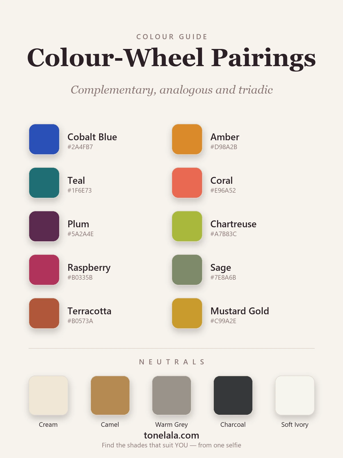
Here are the ten shades I keep returning to, drawn from all three schemes so you can see how the wheel translates into real garments. Read them in pairs and trios rather than as a list.
| Color | Hex | Scheme & how to use it |
|---|---|---|
| Cobalt Blue | #2A4FB7 |
The cool half of a complementary pair. Wear it big, a coat, a dress, with amber as the accent. |
| Amber | #D98A2B |
Cobalt's warm opposite. A scarf, a heel or a clutch in amber is all you need to complete the pairing. |
| Teal | #1F6E73 |
Complements coral, but also anchors an analogous teal-blue-green trio. The most flexible shade here. |
| Coral | #E96A52 |
Teal's warm opposite and a softer route into "orange." Brilliant as the pop in a cool outfit. |
| Plum | #5A2A4E |
Pairs complementarily with chartreuse, or sits analogously beside raspberry and aubergine. |
| Chartreuse | #A7B83C |
Plum's electric opposite. A small dose against deep purple looks modern; a lot of it is a statement. |
| Raspberry | #B0335B |
Complements sage and works as one leg of a cobalt-raspberry-mustard triad. Rich and grown-up. |
| Sage | #7E8A6B |
Raspberry's muted green complement, the calm, dusty foil that makes warm pinks glow. |
| Terracotta | #B0573A |
The wearable face of orange. Complements soft denim blue; sits beautifully in a warm analogous trio. |
| Mustard Gold | #C99A2E |
Completes a triadic set with cobalt and raspberry, or partners aubergine as a yellow-purple complement. |
Neutrals that calm any scheme: Cream #EFE7D6 and Soft Ivory #F6F4EE to lighten and separate clashing hues, Camel #B68A52 to warm a palette towards autumn, Warm Gray #9A938A as a quiet modern base, and Charcoal #36383A as a grounding dark that's kinder than black.
Bold opposites or calm neighbours, which actually suits you?
Find your color season →How to wear each scheme without overthinking it
Three rules cover most of it. First, let one color lead. Whether it's a complementary pair or a triad, decide which shade owns the outfit and let the others accent it, roughly seventy per cent, twenty per cent, ten. Second, mute or separate when contrast feels loud. Two saturated opposites are easier to wear once one is dialled down, or once you slip a neutral between them. Third, use value in analogous looks so a tonal outfit has light, mid and deep notes rather than one flat wash.
And match the intensity of the scheme to yourself. This is the bit color wheels never mention: a high-contrast person, dark hair, fair skin, bright eyes, can carry a bold cobalt-and-amber pairing that would overwhelm someone softer and more blended, who'll look far better in a hushed analogous set. The wheel tells you which colors relate; it can't tell you which versions flatter your face. For that, browse the color analysis guides, and if you're weighing warm against cool shades specifically, colors for warm undertones is a useful companion read.
Putting it together
The color wheel isn't a rulebook so much as a map, it shows you which combinations will create contrast (complementary), which will feel calm (analogous), and which will feel balanced and lively (triadic). Pick the mood you're after, choose your scheme, then let one color lead and keep a neutral nearby for when things get shouty. Do that and you stop owning a wardrobe of separate items that "don't go," and start owning outfits. The last step is knowing which version of each color, how warm, how deep, how bright, was made for you, and that's exactly what a personal analysis is for.
Frequently asked questions
What are complementary colors?
Complementary colors are the pairs that sit directly opposite each other on the color wheel, blue and orange, red and green, yellow and purple. Because they share no underlying hue, each one makes the other look more vivid when they're placed side by side. That's why a cobalt coat with an amber scarf, or a teal dress with coral shoes, looks so alive: it's contrast at its purest.
What is the difference between complementary, analogous and triadic colors?
Complementary colors are opposites on the wheel (two hues, maximum contrast). Analogous colors are next-door neighbours, three shades that sit beside each other, like teal, blue and green, for a calm, tonal look. Triadic colors are three hues spaced evenly around the wheel, like cobalt, raspberry and mustard, giving you a balanced but lively set. Complementary is the boldest, analogous the softest, triadic the most playful.
How do you wear complementary colors without looking garish?
Use one as the star and the other as the accent rather than splitting an outfit fifty-fifty. A navy outfit with rust-orange earrings reads chic; navy trousers with an equally loud orange top can read like a sports kit. Muting one or both shades helps too, teal with terracotta is far easier to wear than electric blue with neon orange, and a neutral like cream or camel between them softens the clash.
What are some examples of complementary color pairs?
The three classic pairs are blue and orange, red and green, and yellow and purple. In wearable terms that becomes cobalt with amber, teal with coral, raspberry with sage, plum with chartreuse, and terracotta with a soft denim blue. Each pairs a warm shade with a cool one, which is exactly what gives complementary combinations their punch.
Which color scheme suits me best?
It depends on your contrast level and undertone, not just personal taste. High-contrast coloring (think dark hair, light skin, bright eyes) carries bold complementary pairings beautifully, while softer, more blended coloring tends to look better in analogous, tonal combinations. A personal color analysis tells you your contrast and undertone, so you know which scheme, and which version of each color, actually flatters you.
Related guides

Best Eyeshadow for Your Eye Color
The best eyeshadow for your eye color, the shades that make blue, green, brown, hazel and gray eyes pop, with the contrast trick and real hex codes.
Best Color Combinations for Outfits
The best color combinations for outfits, plus how to build them straight from your own palette so every pairing actually suits you.

Soft Autumn Color Palette: The Complete Guide (with Hex Codes)
A color analyst's complete Soft Autumn guide, your exact palette with hex codes, best neutrals and metals, colors to avoid

Soft Summer Color Palette: The Complete Guide (with Hex Codes)
The complete Soft Summer color palette, 30+ colors with hex codes, neutrals and metals, an at-a-glance profile, Soft Summer vs Soft Autumn and Light Summer, makeup, hair and a capsule wardrobe.

Olive Skin Tone: The Complete Guide
What olive skin tone actually is, how to tell if you have the green-gray cast, your likely undertone, the seasons it maps to and the colors that flatter it.

Auburn Hair Color: Who It Suits & the Best Colors to Wear With It
A color analyst's guide to auburn hair, who it suits, the flattering shade range, and the 10 best outfit colors plus 5 neutrals to wear with it
Prefer in person? Find color analysis near you
Browse local color analysts by city, or get the same season, palette and best-colors breakdown online from one selfie.
See your colors on a photo of you
Upload one selfie and ToneLala reveals your season, your full palette, and your best hair, makeup, jewelry and outfits, styled on you.