In a sentence: Deep Autumn and Deep Winter are both deep, dark and dramatic, the difference is undertone: Deep Autumn is warm (rust, mahogany, dark gold), Deep Winter is cool (true red, sapphire, black-and-white). Skip to the distinguishing palette or find out which you are.
Deep Autumn vs Deep Winter: How to Tell the Difference
By ToneLalaUpdated July 12, 2026

Contents
These two land on my draping chair more often than any other pair, and almost always wearing black. Dark hair, dark eyes, real depth in the face, so somewhere along the way someone reached for jewel tones and a black blazer, and it half-worked. That's the trouble. Deep Autumn and Deep Winter look so alike at first glance, same intensity, same appetite for strong color, that depth gets mistaken for the answer when it's only half of it.
The half nobody can see in their own mirror is undertone. One of these seasons is warm and one is cool, and once you know which, the whole palette falls into place. Below is how they actually differ, the colors that pull them apart, and the tests I use when someone genuinely can't tell.
Deep Autumn vs Deep Winter: the core difference
Every season sits on three dials, undertone, value and chroma, and these two agree on almost everything except the one that matters most.
- Undertone, this is the whole game. Deep Autumn is warm: golden at its core, with enough neutral depth to carry very dark color without tipping cool. Deep Winter is cool: blue-based, with just a whisper of neutral-depth to keep it from going icy-bright. Warm versus cool is the line that separates them.
- Value, nearly identical. Both are deep. These are two of the darkest palettes in the whole system, which is exactly why depth alone never settles the question. If you're using "but I'm so dark" as evidence for Winter, it points equally at Autumn.
- Chroma, close, with a tell. Both are saturated rather than muted, but the quality differs. Deep Autumn's color is rich and full-bodied, like stained wood or dark amber, saturation with warmth baked in. Deep Winter's is clear and glassy, like a cut jewel, the same intensity, but cold and crisp.
So the picture is two high-contrast, deep-toned people who need strong color to match their own drama. The fork is temperature. Think of Deep Autumn as the hour just after sunset, warm light gone dark and concentrated. Deep Winter is a jewel box under a cool lamp, the same richness, lit from the cold side. Get the temperature right and the rest of the palette follows on its own.
The colors that tell them apart
Most of their palettes overlap in depth, so the colors worth studying are the ones that swing hardest one way. Lean these against your skin and the warm-or-cool answer tends to show up fast.
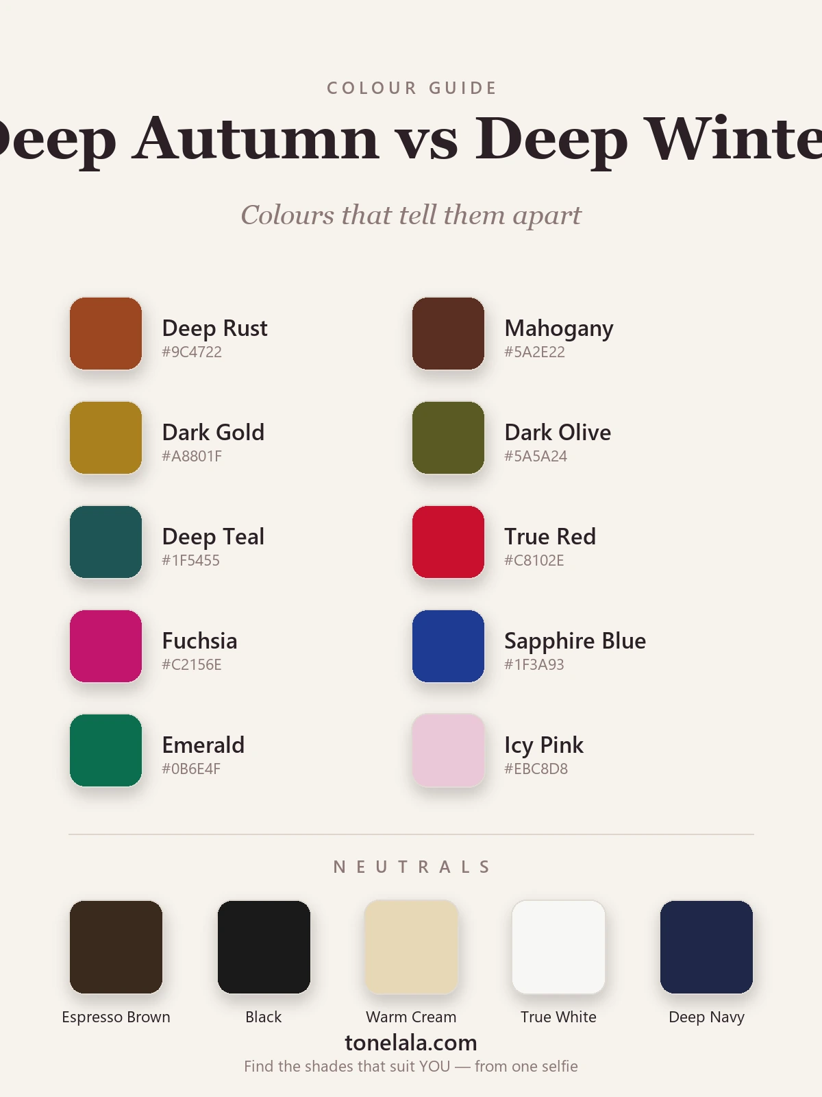
| Color | Hex | Flatters |
|---|---|---|
| Deep Rust | #9C4722 |
Deep Autumn, warm, earthy, glows on golden depth |
| Mahogany | #5A2E22 |
Deep Autumn, warm red-brown; Winter reads it muddy |
| Dark Gold | #A8801F |
Deep Autumn, golden through and through |
| Dark Olive | #5A5A24 |
Deep Autumn, warm, greened earth tone |
| Deep Teal | #1F5455 |
Deep Autumn, green-leaning, warm depth |
| True Red | #C8102E |
Deep Winter, clear blue-red, sharpens the face |
| Fuchsia | #C2156E |
Deep Winter, cool and electric, no warmth in it |
| Sapphire Blue | #1F3A93 |
Deep Winter, cold, saturated, unmistakably cool |
| Emerald | #0B6E4F |
Deep Winter, cool, glassy green |
| Icy Pink | #EBC8D8 |
Deep Winter, pale and cool; Autumn has no pastels |
Shared neutrals: Espresso Brown #3A2A1E (Autumn's best "dark"), Black #1A1A1A (Winter's, and one of the few seasons it truly flatters), Warm Cream #E7D7B6 (Autumn), True White #F7F7F4 (Winter) and Deep Navy #1E2749, which both can wear if the depth is right.
Still not sure, Deep Autumn or Deep Winter?
Find your color season →How to tell which you are
The mirror lies about undertone, so don't trust a vibe, test it. Daylight, no makeup, hair pushed back.
- The gold-and-silver check. Hold a gold chain to your jaw, then a silver one. On a Deep Autumn, gold melts into the skin and silver looks thin and cold. On a Deep Winter it flips, silver sharpens you, gold pulls sallow. This is the single fastest read.
- Espresso brown versus true black. Lay a deep espresso brown next to your face, then a true black. Brown warms a Deep Autumn and makes the skin look lit; black throws a hard shadow under the chin on them. On a Deep Winter, black does the opposite, it crisps the whole face up, while brown goes flat and dull.
- Rust versus red. Drape a warm rust, then a clear true red. One of them evens your skin out and one leaves it patchy or gray. Rust winning means warm; red winning means cool.
- Watch what washes you out. Pay less attention to colors you like and more to which ones drain you. If icy pastels and bright fuchsia leave you looking tired, you're warm. If mustard, camel and muddy olive turn your skin sallow, you're cool. What pulls you down is more honest than what you're drawn to.
If two or three of these point the same way, trust them over a single hunch. If they contradict each other, that's worth noting too, borderline results often mean you're a softer or truer neighbour rather than a true Deep.
If you're Deep Autumn / If you're Deep Winter
If you're Deep Autumn, your wardrobe wants warmth turned up and darkened down: deep rust, mahogany, dark gold, deep teal and forest green, with espresso brown and warm cream doing the neutral work instead of black. Antique gold, copper and bronze are your metals. Your "dark" is espresso, not black, it holds the drama without the cold shadow. The full breakdown, with every hex code, is in the Deep Autumn guide.
If you're Deep Winter, you get the one thing most seasons can't carry: true black and true white actually flatter you. Build around clear, cool jewel tones, true red, fuchsia, royal purple, sapphire, emerald, and let icy pastels play the role pale colors usually can't. Silver and white gold over yellow gold. Contrast is your friend; muted and dusty is the trap. The complete palette lives in the Deep Winter guide.
The reliable way to settle it
Here's the honest part: undertone at this depth is genuinely hard to judge in your own bathroom mirror. Lighting shifts it, a recent tan shifts it, dyed hair shifts it, and the very darkness that defines both seasons makes warm-versus-cool harder to read, not easier. A Deep Autumn shot under cool light with ashy hair can pass for Deep Winter in a single frame, and the reverse happens just as often.
A photo-based analysis sidesteps all of that. It reads your undertone, value and contrast from a clear image of your own face, measuring the warmth and depth directly rather than guessing from how you feel about black. If you've been ping-ponging between these two, that's the thing that ends it. You can browse the rest of the color analysis guides to compare neighbours, or simply find out which you are and stop wondering.
Frequently asked questions
What's the difference between Deep Autumn and Deep Winter?
They share depth and drama but split on undertone. Deep Autumn is warm, rust, mahogany, dark gold and deep teal light it up. Deep Winter is cool, true red, fuchsia, sapphire and crisp black-and-white look striking instead. Warm and earthy points to Deep Autumn; cool and icy points to Deep Winter.
Am I Deep Autumn or Deep Winter?
Drape a warm earthy color like rust or mahogany against your face, then a cool clear one like true red or fuchsia. The season that makes your skin look even and lit, rather than sallow or ashy, is yours. Deep Autumn glows in warm depth; Deep Winter sharpens in cool clarity.
Which is warmer, Deep Autumn or Deep Winter?
Deep Autumn is the warm one, golden at its core, so earthy jewel tones suit it. Deep Winter is cool, with only a whisper of neutral depth, which is why blue-based jewel tones and icy brights flatter it instead.
Which is cooler or deeper, Deep Autumn or Deep Winter?
Deep Winter is the cooler season. On value the two are very close, both sit among the darkest palettes, so depth alone won't separate them. Undertone and clarity do the work: Deep Winter runs cool and clear, Deep Autumn warm and rich.
Can you be both Deep Autumn and Deep Winter?
No, you have one season, though you can sit near the border. Both are deep and high-contrast, so people land between them, but your skin's undertone tips you one way. If warm rust and cool fuchsia look equally good, that usually means neither is quite right and you're a softer or truer neighbour worth checking.
How can I tell whether I'm Deep Autumn or Deep Winter?
Three quick tests: hold gold then silver to your face (gold harmonizes on Deep Autumn, silver on Deep Winter); compare espresso brown against true black near your jaw (brown warms a Deep Autumn, black sharpens a Deep Winter); and check whether warm rust or cool red leaves your skin clearer. A photo-based analysis reads all three for you.
Related guides

Deep Winter vs True Autumn: How to Tell the Difference
A color analyst on Deep Winter vs True Autumn, how they differ on undertone, value and chroma, the colors that separate them, and how to tell which you are.

Deep Winter vs Bright Winter: How to Tell the Difference
A color analyst on Deep Winter vs Bright Winter, how they differ on undertone, value and chroma, the colors that separate them

True Autumn vs Deep Autumn: How to Tell the Difference
True Autumn vs Deep Autumn explained: undertone, value and chroma, the colors that separate them, and how to tell which season you really are.

Soft Autumn vs Deep Autumn: How to Tell the Difference
A color analyst breaks down Soft Autumn vs Deep Autumn, how they differ on value and chroma, the tell-tale signs, the colors that separate them

Deep Winter vs True Winter: How to Tell the Difference
Deep Winter vs True Winter, explained by a color analyst: how they differ on undertone, value and chroma, the colors that separate them

Deep Autumn Color Palette: The Complete Guide (with Hex Codes)
The complete Deep Autumn (Dark Autumn) color palette, 30+ colors with hex codes, neutrals and metals, an at-a-glance profile, Deep Autumn vs Deep Winter, makeup, hair and a capsule wardrobe.
Prefer in person? Find color analysis near you
Browse local color analysts by city, or get the same season, palette and best-colors breakdown online from one selfie.
See your colors on a photo of you
Upload one selfie and ToneLala reveals your season, your full palette, and your best hair, makeup, jewelry and outfits, styled on you.