In a sentence: True Autumn and Deep Autumn are both warm, but True Autumn is golden and medium-depth while Deep Autumn runs darker, richer and higher in contrast. Skip to the distinguishing palette or find out which you are.
True Autumn vs Deep Autumn: How to Tell the Difference
By ToneLalaUpdated July 10, 2026
Contents
I drape these two seasons against each other more often than almost any other pair. A woman walks in convinced she's an Autumn, the gold jewelry, the way camel and rust suit her, and she's right about that. What she can't see in the mirror is whether she belongs to the pure warm Autumn or the deep, near-Winter edge of it. The skin tells the same warm story either way. It's the depth and the contrast that quietly disagree.
That's the whole problem in a nutshell. Both seasons love rust, olive and bronze, so the overlap feels reassuring right up until you reach for a true dark. One of these women can wear a chocolate so deep it's almost black and look striking. The other one disappears behind it. Sorting out which is which comes down to three things, and undertone is only the first.
True Autumn vs Deep Autumn: the core difference
Think of every season as a position on three dials: undertone (warm to cool), value (light to dark), and chroma (muted to clear). True Autumn and Deep Autumn agree on the first dial and split on the other two.
Undertone. True Autumn is the purest warm of the three Autumns, solidly golden, with no cool pull whatsoever. Deep Autumn is also warm at its heart, but because it sits next to Winter on the color wheel, its warmth is a shade more restrained. In practice both wear gold beautifully; the difference is that Deep Autumn can also handle a deep, cool-leaning shade without flinching, whereas a true cool tone turns True Autumn slightly gray.
Value. This is the dial that does most of the work. Value means how light or dark a color is. True Autumn lives in the medium range, think of the colors of a forest in early October, warm and golden but rarely jet-black. Deep Autumn is dragged downward toward darkness; its defining trait is depth. Espresso, bottle green, aubergine and the darkest mahogany are home turf for a Deep Autumn and too weighty for a True Autumn, who looks better in a softer, sunnier register.
Chroma. Chroma is how pure or muddy a color reads. True Autumn is muted-to-rich, earthy, never icy, never neon. Deep Autumn is muted too, but it carries a touch more intensity and can take a color right up to its darkest, most saturated point. Where True Autumn says warm and mellow, Deep Autumn says warm and concentrated.
The shorthand I give clients: True Autumn is golden and gently muted; Deep Autumn is warm but deep, with the volume turned up on contrast.
The colors that tell them apart
These aren't the colors the two seasons share, they're the ones that pull them apart. Watch how a shade behaves on you and you'll see which way you lean.
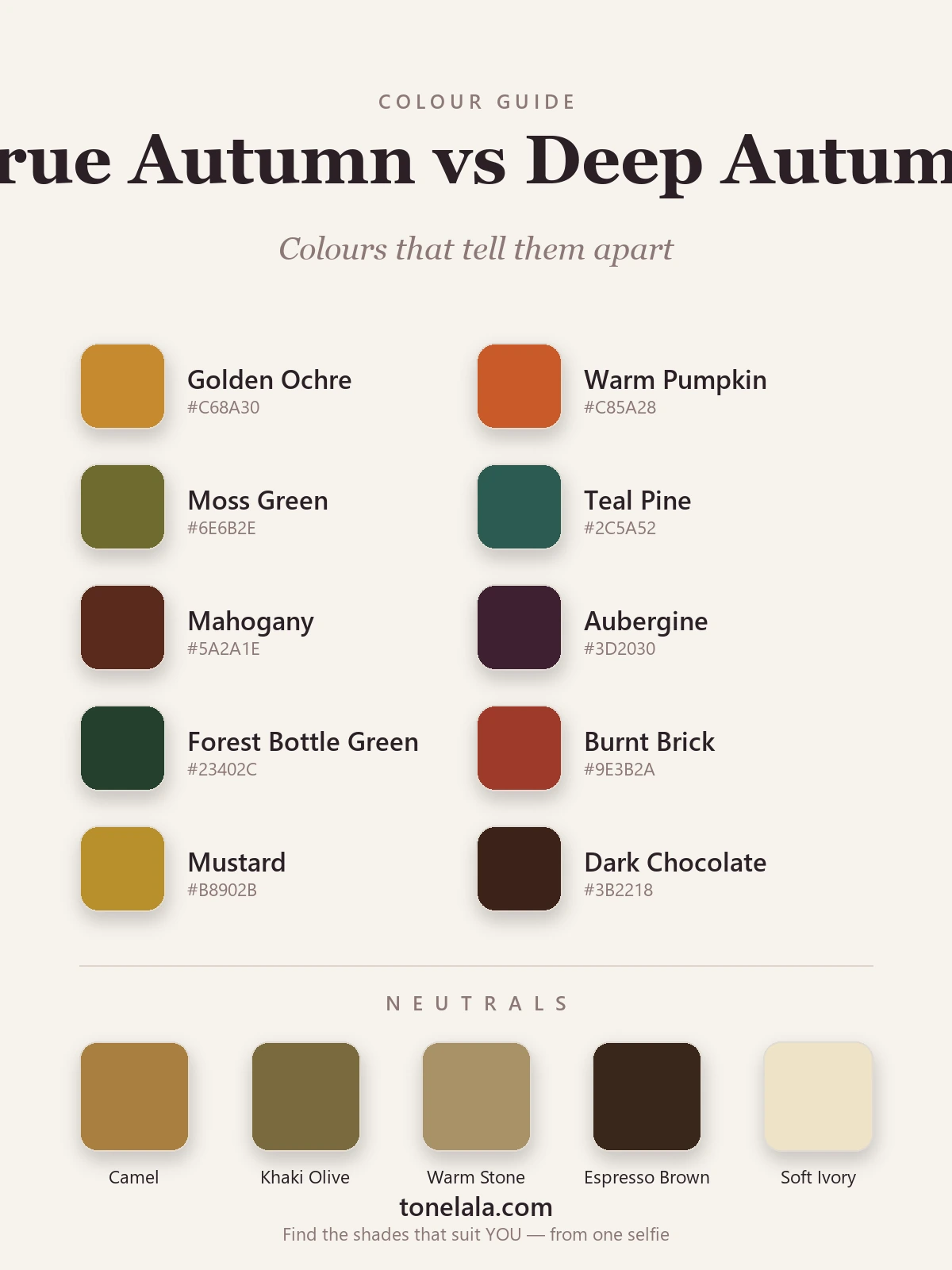
| Color | Hex | Flatters |
|---|---|---|
| Golden Ochre | #C68A30 |
True Autumn, pure sunlit warmth, no darkness |
| Warm Pumpkin | #C85A28 |
True Autumn, medium-value, glowing orange |
| Moss Green | #6E6B2E |
True Autumn, yellow-green, soft and earthy |
| Mustard | #B8902B |
True Autumn, golden, mid-depth, mellow |
| Burnt Brick | #9E3B2A |
True Autumn, warm red-orange in a softer register |
| Teal Pine | #2C5A52 |
Deep Autumn, deep blue-green with Winter's edge |
| Mahogany | #5A2A1E |
Deep Autumn, dark, rich red-brown |
| Aubergine | #3D2030 |
Deep Autumn, near-black warm purple |
| Forest Bottle Green | #23402C |
Deep Autumn, dense, dramatic green |
| Dark Chocolate | #3B2218 |
Deep Autumn, the deepest warm brown |
Shared neutrals: Camel #A9803F, Khaki Olive #7A6A3C, Warm Stone #A99268, Espresso Brown #3A271B, Soft Ivory #EFE2C6.
The top five sit in the medium, golden range, they sing on True Autumn and start to look a bit washed or flat on Deep Autumn. The bottom five are the deep, concentrated shades, they read as powerful and intentional on Deep Autumn and tend to overwhelm True Autumn. The neutrals belong to both, which is precisely why the camel coat and olive knit never settle the argument.
Still not sure, True Autumn or Deep Autumn?
Find your color season →How to tell which you are
Do this in daylight, near a window, with no makeup and your hair pushed off your face. You're watching your skin, not the fabric.
Drape medium against deep. Hold a clear warm rust or pumpkin up under your chin, then swap it for a near-black chocolate or aubergine. For a True Autumn the medium golden shade brings the face to life and the very dark one casts a shadow that drags the features down. For a Deep Autumn the dark shade looks deliberate and elegant, while the medium tone can leave the face looking slightly unsupported.
Test contrast against blending. Deep Autumns usually have more natural contrast between hair, skin and eyes, dark hair against fair-ish skin, or deep eyes that hold attention. True Autumns tend to be more blended, their coloring melting together in a warm, low-contrast way. High contrast almost always points Deep.
Check what washes you out. Pure, icy or pastel colors wash out both, but watch the dark end. If black sits surprisingly well on you (rare for an Autumn), you're very likely Deep. If even a charcoal feels harsh and you're happiest in golden mid-tones, you're True.
Watch the metals, then go deeper. Both seasons are gold-first, so jewelry alone won't separate them, that's why I list gold and silver in the palette. Use it as a confirmation that you're warm, then let value and contrast make the final call.
If you're True Autumn / If you're Deep Autumn
If you're True Autumn, lean into the golden middle of the spectrum: warm pumpkin, mustard, moss, camel, terracotta and bronze. Keep your darks soft, a warm brown rather than a black, a deep teal rather than a navy. Your magic is glow, not drama, so let colors stay sunlit. The full breakdown lives in the True Autumn guide.
If you're Deep Autumn, you get the whole rich, low-lit end of warm color: mahogany, bottle green, aubergine, espresso and the deepest rust. Contrast is your friend, pair a dark neutral with one saturated accent and you'll look polished rather than heavy. Just keep everything warm-rooted so you don't tip into cool Winter. There's much more in the Deep Autumn guide.
The reliable way to settle it
Here's the honest truth after years of doing this: undertone, value and contrast are genuinely hard to judge on yourself. Bathroom lighting lies, phone screens shift color, and we all have a story in our head about what suits us. The thing that actually settles a True Autumn versus Deep Autumn question is a careful read of your real coloring, how warm your skin is, how dark a color you can carry, and how much contrast lives in your face.
That's exactly what a photo-based analysis is built to measure. It looks at your undertone, your natural value and your contrast level together, then places you in one season rather than leaving you guessing between two. If you've read both palettes and still can't choose, that's your sign to stop squinting at swatches. Browse the rest of the color analysis guides to see how the system fits together, then find out which you are, it takes a couple of photos and a short quiz.
Frequently asked questions
What is the difference between True Autumn and Deep Autumn?
Both are warm, but True Autumn is the purest warm season, golden, medium in depth and richly muted. Deep Autumn borrows from Winter: it stays warm at the core yet runs noticeably darker and higher in contrast, so it can carry near-black browns and aubergine that would swamp a True Autumn.
Am I True Autumn or Deep Autumn?
Drape a clear warm rust against a deep mahogany or chocolate. If the rich golden warmth lights you up and the very dark shade feels heavy, you lean True Autumn. If the deep, dark colors look intentional and the medium golden tones read a touch flat, you lean Deep Autumn.
Which is warmer, True Autumn or Deep Autumn?
True Autumn is warmer. It sits at the center of the warm axis with no cool influence at all. Deep Autumn is still warm, but its depth pulls it a step toward Winter, so its warmth is slightly tempered.
Can you be both True Autumn and Deep Autumn?
No, you have one season. But many people sit on the border between them, which is exactly why they get confused. The two palettes overlap in the rich, muted middle; they part ways at the extremes of depth and clarity.
How can I tell which season I am at home?
Use daylight, no makeup, hair pushed back. Compare your skin against gold versus silver jewelry, then against a medium rust versus a near-black brown. The combination of undertone, how dark a color you can wear, and how much contrast suits you points to one season over the other.
Related guides
Deep Winter vs True Autumn: How to Tell the Difference
A color analyst on Deep Winter vs True Autumn, how they differ on undertone, value and chroma, the colors that separate them, and how to tell which you are.
Soft Autumn vs True Summer: How to Tell the Difference
A color analyst on Soft Autumn vs True Summer, the two dials that separate them, the colors that tell them apart, and how to decide which you are.
True Spring vs True Autumn: How to Tell the Difference
True Spring vs True Autumn, explained by a color analyst, how they differ on value and chroma, the colors that separate them, and how to tell which you are.
Deep Autumn vs Deep Winter: How to Tell the Difference
Deep Autumn vs Deep Winter, settled by a color analyst: how they split on undertone, value and chroma, the colors that separate them
Soft Autumn vs True Autumn: How to Tell the Difference
Soft Autumn vs True Autumn, explained by a color analyst, how they differ on undertone, value and chroma, the colors that separate them
Soft Autumn vs Deep Autumn: How to Tell the Difference
A color analyst breaks down Soft Autumn vs Deep Autumn, how they differ on value and chroma, the tell-tale signs, the colors that separate them
Prefer in person? Find color analysis near you
Browse local color analysts by city, or get the same season, palette and best-colors breakdown online from one selfie.
See your colors on a photo of you
Upload one selfie and ToneLala reveals your season, your full palette, and your best hair, makeup, jewelry and outfits, styled on you.