In a sentence: "Warm spring" is the everyday name for the warm, light-to-medium, bright season the twelve-season system calls True Spring: golden, vivid coloring flattered by golden, vivid color, built on warm coral, golden yellow, leaf green and peach with ivory and golden camel neutrals. Skip to the full palette with hex codes or find your own season.
Warm Spring Color Palette (a.k.a. True Spring)
By ToneLalaUpdated July 6, 2026
Contents
A warm spring's skin looks like there's a low golden light switched on just behind it. I had a client come in last year certain she was "an autumn", everyone in her family was, so she'd assumed she'd inherited it, and she'd been wearing rust, olive and chocolate brown for a decade. The earth tones weren't ugly on her, exactly, but they sat heavily, like a coat one size too big. When I draped a clear golden yellow, then a warm coral, her whole face came up to meet the color. The muddiness lifted, her eyes brightened, and she laughed and said she looked "switched on." She wasn't a muted autumn at all. She was a warm spring, wearing her relatives' palette.
That mix-up is exactly why this guide exists. "Warm spring" is a name people reach for instinctively, they know they're warm, they know they suit fresh rather than heavy color, but it isn't always clear how it maps onto the seasons you see online. So here's the plain version: what a warm spring actually is, why it lines up with True Spring, your palette in real hex codes, the colors to keep away from, and how to tell yourself apart from the warm seasons that border you. I've kept it to what's useful at the mirror and the shop rail.
What "warm spring" actually means
Strip the label back and a warm spring is defined by three qualities, the same three dials every season sits on:
- Undertone, warm. Not warm-ish, not neutral. The undertone is decisively golden, with no blue in it. This is the quality the name puts front and center, and it's the one that matters most.
- Value, light-to-medium. Sunlit and fairly light, with a little more body than the palest spring coloring, but never deep or heavy.
- Chroma, bright/clear. Vivid, saturated and fresh, never grayed, dusty or muddy.
Add those up and you get warm, golden, clear coloring that's flattered by warm, golden, clear color. Picture late-April sun on new leaves, warm, vivid and unmistakably clean. The trap is hearing "spring" and reaching for chalky pastels, or hearing "warm" and reaching for heavy earth tones; a warm spring suits neither. The colors need to glow, not just lean warm.
Why "warm spring" maps to True Spring
Here's the bit that confuses people, and it's worth saying clearly. There are two systems in circulation. The older warm/cool approach sorts everyone into a warm or cool version of each season, so it talks about a "warm spring," a "cool summer," and so on. The newer twelve-season system takes the same coloring and renames it after its single most defining quality. For this season, that quality is warmth. So the warm spring becomes True Spring: "true" meaning the warmth is the headline, undiluted by lightness or brightness tipping it elsewhere.
Same person, two labels. If you've tested as a warm spring on a quiz, or a stylist has called you one, you can read every True Spring resource as yours, the palette, the makeup notes, the lot. For the full breakdown of that season, including how it differs from its neighbours, my detailed True Spring color palette guide is the companion to this one. The two names point at one wardrobe.
The palette
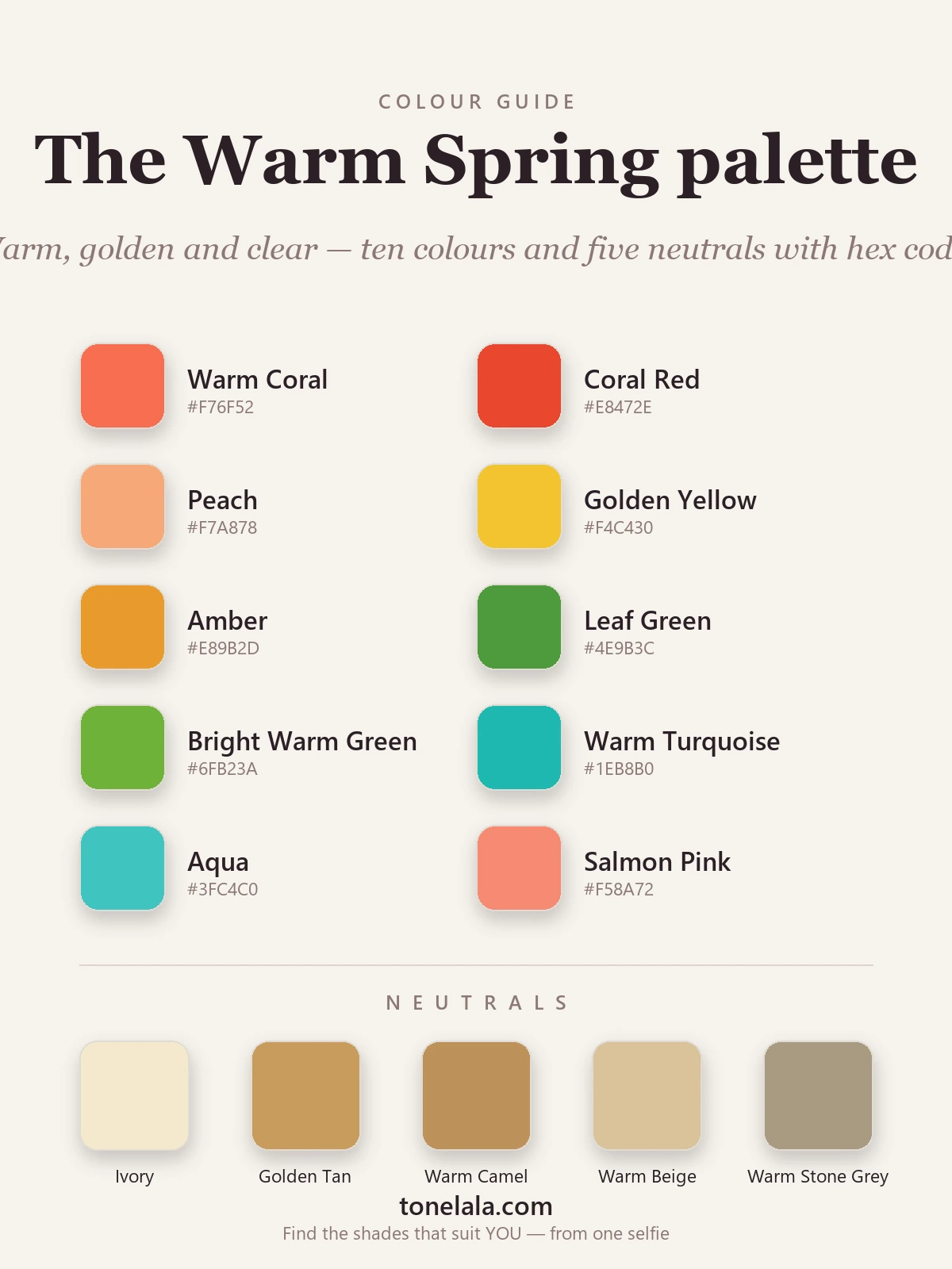
Warm, vivid and fresh. Every color looks like clear spring sun with a little gold mixed in.
Your best colors
| Color | Hex |
|---|---|
| Warm Coral | #F76F52 |
| Coral Red | #E8472E |
| Peach | #F7A878 |
| Golden Yellow | #F4C430 |
| Amber | #E89B2D |
| Leaf Green | #4E9B3C |
| Bright Warm Green | #6FB23A |
| Warm Turquoise | #1EB8B0 |
| Aqua | #3FC4C0 |
| Salmon Pink | #F58A72 |
Your neutrals: warm and golden, never stark: Ivory #F4E9CE (your "white"), Golden Tan #C99B5E, Warm Camel #BE915A, Warm Beige #D9C39A, and Warm Stone Gray #A99B83 for a softer cool option. There's no black on the list on purpose, a warm, golden neutral always does more for you near the face.
Your metals: yellow gold is made for a warm spring, and a warm bright gold or light copper sings too. Silver and platinum read cold and a touch hard against your golden warmth, so keep them for buckles and watch cases rather than anything close to the face.
Pretty sure you're warm, but not sure which warm season?
Find your color season →Colors to avoid (and why)
- Black & heavy darks: charcoal, deep navy, espresso. Too dark and too cool for your light-to-medium warmth; they swallow the face and cast shadows where there shouldn't be any.
- Cool & icy tones: icy blue, fuchsia, cool gray, blue-based pink. They fight your golden undertone and turn fresh skin sallow.
- Muted & dusty tones: sage, dusty rose, grayed mauve, taupe. Your colors work because they're clear; mute them and your skin goes flat.
The mirror test never lies: if a color makes your face look tired, gray or heavier than the garment itself, it's too dark, too cool or too muted for you.
How to know you're actually a warm spring
Warm-and-bright coloring borders a couple of seasons that share part of its character, so it's worth a quick check before you commit.
- Warm spring vs warm autumn: both are purely warm, but depth and clarity separate them. A warm spring is lighter and clearer; a warm autumn is deeper and more muted. Hold a fresh golden yellow against your face, then a dusty terracotta, whichever lights you up tells you which side you're on. Vivid lifts a spring; muted earth lifts an autumn.
- Warm spring vs a lighter, softer spring: both warm and clear, but value and saturation differ. If full, vivid warm colors start to overwhelm you and gentler, paler warm versions feel more like you, you may be the lighter Light Spring rather than a true warm spring.
- Warm spring vs a brighter, sharper spring: both warm and bright, but a Bright Spring is even more intense and higher in contrast, with a cooler edge. If the very brightest colors start to feel sharp, you sit on the warmer, slightly gentler warm spring side.
Undertone, value and contrast are genuinely hard to judge in your own bathroom mirror, where the lighting and your hair color both lie to you. If you want to settle it properly, browse the full set of color analysis guides for the neighbouring seasons, or have a photo-based analysis read all three dials for you rather than guessing.
How to wear your warm spring colors
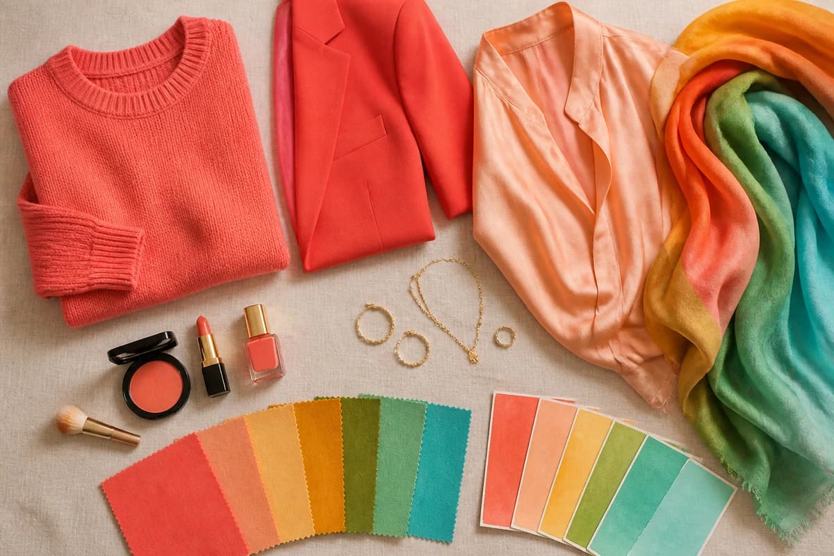
The quickest win is to put one of your clear colors where it counts, closest to the face, in a top, a scarf or a knit, because that's where the palette does its real work. A warm coral jumper or a golden-yellow scarf will do more for your skin than the same color in a pair of trousers ever could.
For a "dark," skip black and let warm camel or leaf green play that role; the outfit stays in your warmth and nothing goes heavy. And lean into the brightness rather than apologizing for it, on a warm spring, vivid and golden never reads as loud. It reads as awake, which is the whole point.
Putting it to work
Build a small capsule from two warm neutrals you'll reach for constantly, say ivory and golden tan, plus two or three of your clearer colors, like warm coral, golden yellow and leaf green. Everything mixes effortlessly because it all shares the same warm, vivid, fresh DNA, so a handful of pieces quietly becomes a whole wardrobe and getting dressed gets easier rather than harder. Whether you call it a warm spring or a True Spring, the instruction is identical: keep it golden, keep it clear, and let the color glow.
Frequently asked questions
What is a warm spring in color analysis?
A warm spring is the warm, clear, light-to-medium season, golden, vivid coloring flattered by golden, vivid color. In the twelve-season system it's the season usually labeled True Spring, so 'warm spring' and 'True Spring' describe the same person. The palette runs to warm coral, golden yellow, leaf green, warm turquoise and peach, with warm neutrals like ivory, golden tan and warm camel.
Is warm spring the same as True Spring?
Yes, they're two names for one season. Older warm/cool systems called it a warm spring; the twelve-season system renames it True Spring because warmth is the dominant quality that defines it. If a guide says True Spring, read it as your warm spring guide.
What colors should a warm spring wear?
Warm, clear and golden colors: warm coral, coral red, peach, golden yellow, amber, leaf green, warm turquoise and salmon pink. For neutrals, lean on ivory, golden tan and warm camel rather than black. The rule of thumb is that every color should look sunlit and golden rather than icy or dusty.
What colors should a warm spring avoid?
Black and heavy darks, cool and icy tones like icy blue, fuchsia and cool gray, and anything muted or dusty such as sage or mauve. They fight a warm spring's golden, bright coloring and either drain the face or look heavy against it.
How do I know if I'm a warm spring and not a warm autumn?
Both are purely warm, so it comes down to clarity and depth. A warm spring is lighter and clearer, fresh, vivid color lights the face. A warm autumn is deeper and more muted, rich, earthy, dusty tones suit it. If bright golden color lifts you and dusty earth tones drag you down, you're the spring.
Related guides

True Spring Color Palette: The Complete Guide (with Hex Codes)
A color analyst's complete True Spring guide, your palette with hex codes, best neutrals and metals, colors to avoid
True Spring Celebrities
A color analyst's look at the warm, bright, golden palette often linked to True Spring celebrities, plus how to tell if you share the season.
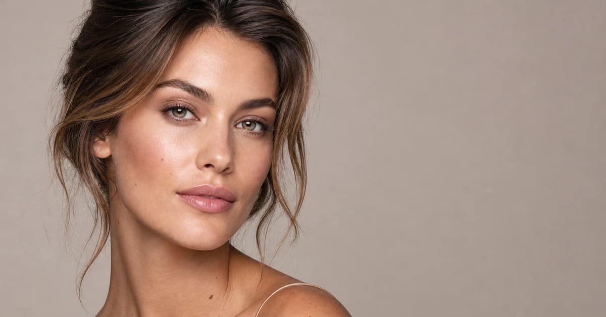
True Spring vs True Autumn: How to Tell the Difference
True Spring vs True Autumn, explained by a color analyst, how they differ on value and chroma, the colors that separate them, and how to tell which you are.
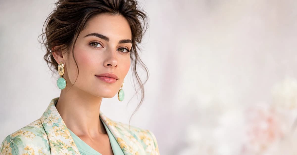
True Spring Outfits: Capsule Wardrobe & Outfit Ideas
A stylist's True Spring outfit guide, capsule building blocks, casual, work and evening outfit formulas, and your 10 best wardrobe colors plus 5 neutrals.
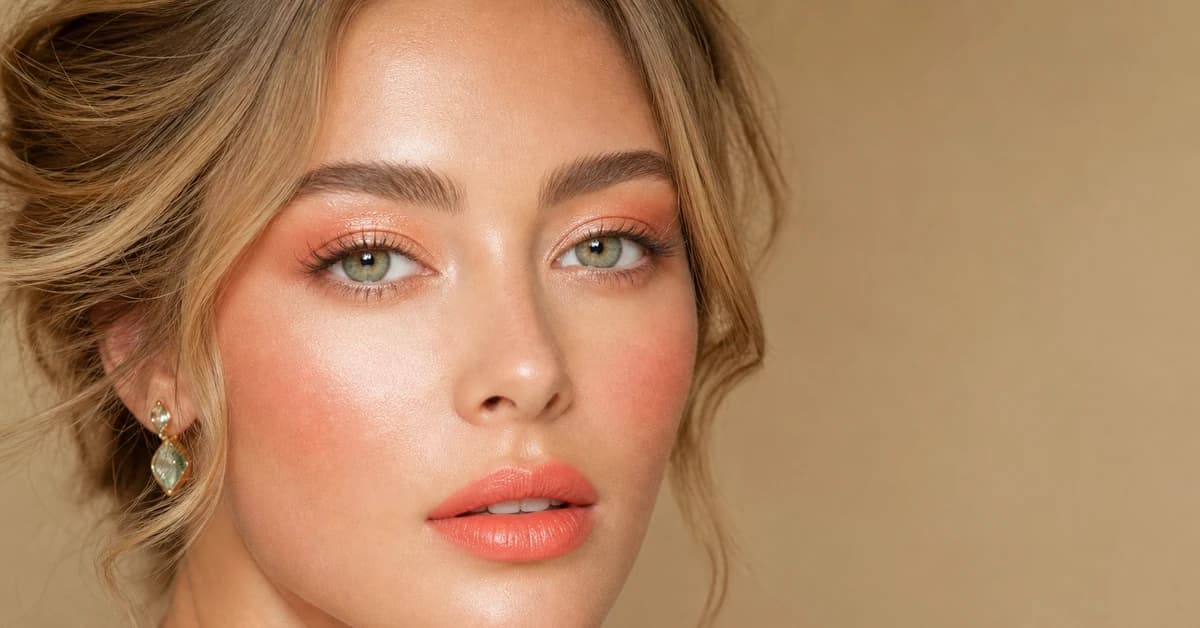
True Spring Makeup: Best Shades for Lips, Eyes & Cheeks
A color analyst's True Spring makeup guide, 10 best lip, blush and eye shades with hex codes, your base tones, and the colors to avoid.

True Spring vs Light Spring: How to Tell the Difference
True Spring vs Light Spring, explained by a color analyst: how undertone, value and chroma differ, the colors that separate them
Prefer in person? Find color analysis near you
Browse local color analysts by city, or get the same season, palette and best-colors breakdown online from one selfie.
See your colors on a photo of you
Upload one selfie and ToneLala reveals your season, your full palette, and your best hair, makeup, jewelry and outfits, styled on you.