In a sentence: your skin undertone is the permanent color underneath your skin, cool (blue or pink), warm (golden or peach) or neutral (a balance), and it decides which colors make you glow, no matter how light or deep your complexion is. Skip to the undertone palette or find your season.
What Is My Skin Undertone
By ToneLalaUpdated July 11, 2026

Contents
The first thing I do with a new client is hold a sheet of gold fabric under one side of their jaw and a sheet of silver under the other, then watch their face rather than the fabric. On one side the skin settles and looks even; on the other it picks up a faint gray or yellow cast. That small shift is your undertone showing itself, the quiet base color that lives beneath your skin and never washes out. It is the single most useful thing to know about yourself before you buy another jumper.
Most people confuse undertone with skin tone, and the mix-up sends them shopping for the wrong colors for years. Skin tone is just the surface, how fair or deep you read, which changes with a summer of sun. Undertone is the layer underneath, and it stays put. Once you can name yours, getting dressed stops being guesswork: you know whether a red should lean blue or orange, whether your white should be crisp or creamy, and why some colors you own have always looked a little off in photographs.
What a skin undertone actually is
Undertone is the color sitting beneath the visible surface of your skin, created by the balance of pigments below it. It comes in three families. Cool undertones read blue, pink or rosy. Warm undertones read golden, peach or yellow. Neutral undertones sit in the middle, carrying a fairly even mix of both. Crucially, your undertone does not change when you tan, flush after a run, or pale over winter, those things shift your skin tone, the surface depth, while the base underneath stays exactly where it was.
Here is why it matters more than almost anything else when you pick colors. A garment sits right next to your face, and anyone looking at you is constantly comparing your skin to the fabric. When a color shares your undertone, the two harmonize and your complexion looks like the freshest thing in the frame. When the temperatures clash, a warm, golden color against cool skin, or an icy blue against warm skin, the fabric throws its cast onto your face, and you look sallow, gray or tired. That is the whole mechanism. No color is bad; it is simply the right or wrong temperature for you.
Skin tone vs skin undertone
These two get used interchangeably, and they shouldn't be. Skin tone is the depth of your complexion at the surface, fair, light, medium, tan or deep, and it moves with sun exposure. Skin undertone is the permanent base color underneath. Two people can both have a medium skin tone and yet need opposite palettes, because one is warm underneath and the other cool. So when you are choosing clothes, makeup or hair color, undertone is the dimension that does the heavy lifting; tone mostly tells you how light or dark to take a shade, not which direction to push it.
How to find your skin undertone at home
No single test is foolproof, so I always read several cues together and let the weight of evidence decide. Do these in natural daylight, with no makeup on and away from colored walls.
- The wrist-vein check. Look at the veins on the inside of your wrist. Blue or purple veins suggest a cool undertone; green or olive-tinged veins suggest warm. If you genuinely can't tell, they look blue-green, that points neutral.
- The gold vs silver test. Hold a piece of gold jewelry near your face, then a piece of silver. If gold makes your skin look lit and even, you lean warm. If silver makes it look clean and clear, you lean cool. If both look fine, you are likely neutral.
- The white vs cream test. Drape a pure-white top under your chin, then a cream or ivory one. Cool skin looks crisp and fresh against pure white; warm skin looks healthier against cream, while white can make it look slightly gray.
- How you react to sun. People who burn easily and stay pink often skew cool; people who tan readily and rarely burn often skew warm. It's a soft clue, not a rule, but it adds to the picture.
- The overall verdict. Tally your answers. Mostly blue-vein, silver, pure-white, burn-prone? You're cool. Mostly green-vein, gold, cream, tan easily? You're warm. A genuine split down the middle is the signature of a neutral undertone.
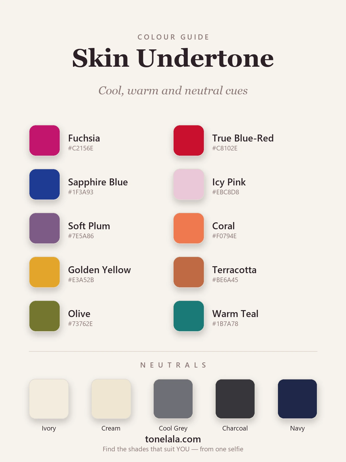
The palette above shows the idea at a glance: cool cues on one side, fuchsia, a blue-based red, sapphire, icy pink and soft plum, and warm cues on the other, coral, golden yellow, terracotta, olive and a warm teal. Look at which half you instinctively imagine near your face looking right. The neutrals run from cream and ivory (kinder to warm skin) through to cool gray, charcoal and navy (kinder to cool skin), with each undertone leaning toward its own end.
The colors that suit each undertone
Once you know your family, the color logic falls into place, and the simplest way to use it is to take any shade you love and reach for its cool or warm version.
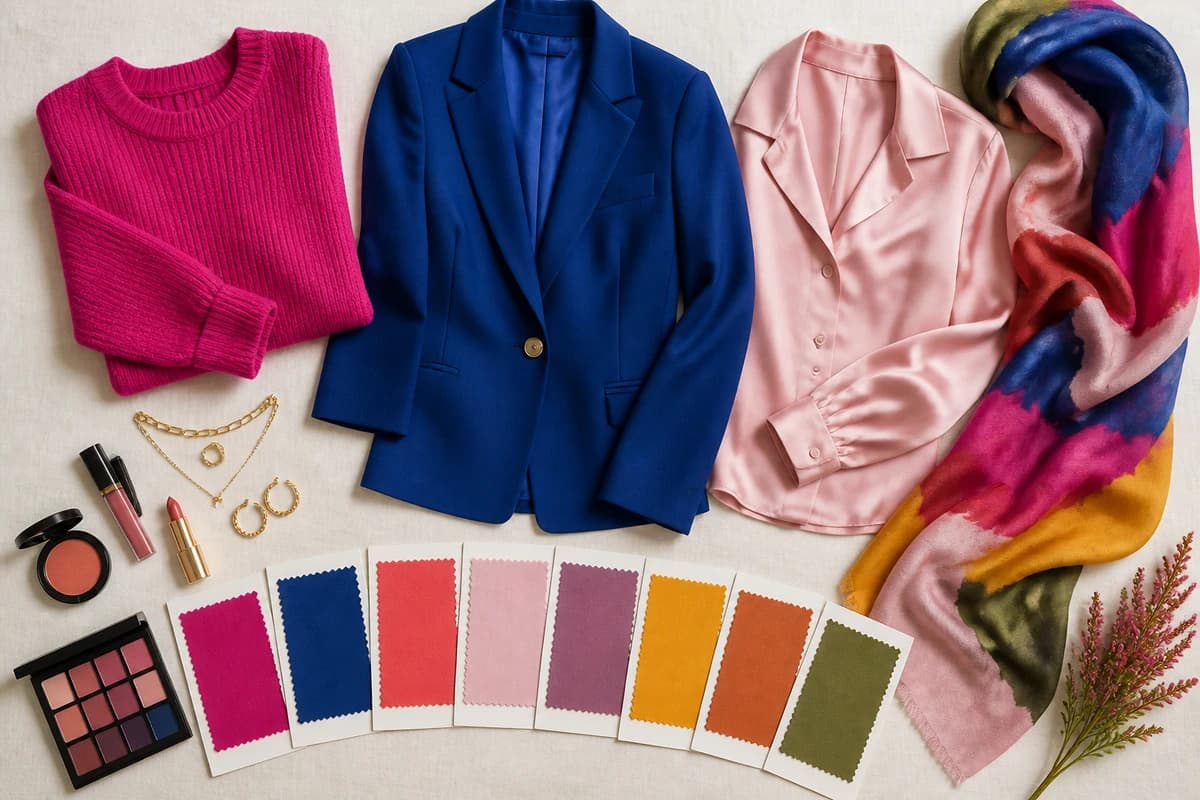
Cool undertones are flattered by blue-based colors: a true blue-red rather than orange-red, fuchsia and cool berry, emerald, sapphire and cobalt, royal purple, and soft icy pastels. Your best neutrals are cool, pure white, gray, charcoal and navy, rather than golden beige. If you've confirmed you're cool, the dedicated guide to the best colors for cool undertones goes deeper.
Warm undertones glow in golden, earthy, sun-warmed shades: coral and tomato red rather than blue-red, golden yellow and mustard, peach, terracotta, olive and forest green, plus the warm end of teal. Your neutrals lean cream, camel and chocolate-brown. The full breakdown lives in the guide to the best colors for warm undertones.
Neutral undertones have the most room to play, because both cool and warm shades can work. The trick is to favor balanced, slightly muted versions of colors and to notice your lean, most neutral people tip a touch cool or a touch warm, and following that lean is what sharpens the result. Jewel tones, soft berries, teals and a versatile taupe tend to be safe, easy wins.
Not sure which side of the line you fall on?
Find your color season →What to do if your undertone looks neutral
Plenty of people run the tests and get a split decision, and that is a real, valid result rather than a failure of the method. A neutral undertone simply means your warm and cool pigments are close to balanced. If that's you, don't force yourself into one camp, instead, look for your gentle lean. Does gold flatter you slightly more than silver, or the other way around? Does a true emerald (cool) or a warm forest green sit better near your face? That small preference is your direction of travel, and dressing a few degrees toward it is usually all it takes to look noticeably more polished. Neutral undertones are also the ones that benefit most from a proper draping, because the differences are subtle enough to be hard to judge in a bathroom mirror.
Undertone and your color season
Knowing your undertone is the foundation, but it isn't the finished house. In seasonal color analysis, every palette is built from three dimensions: undertone (warm or cool), depth (light or deep) and chroma (soft/muted or bright/clear). Your undertone sorts you into the cool half of the system, the Winter and Summer families, or the warm half, the Spring and Autumn families. Depth and chroma then decide which season within that half, and therefore your exact shades.
Two cool people can suit very different palettes: a cool, deep, high-contrast person leans Winter and wants clear, saturated color, while a cool, soft, low-contrast person leans Summer and wants muted, dusty versions of the same hues. The same split happens on the warm side between Spring and Autumn. So undertone narrows the field to a half, and a full reading does the rest. If you want to start placing yourself, the color analysis guides walk through every season in detail.
Putting it together
Finding your undertone is the unlock that turns getting dressed from a guessing game into a quick temperature check. Run the wrist, jewelry and white-versus-cream tests in daylight, weigh the answers together, and let them point you cool, warm or neutral, then build a small wardrobe around the neutrals and a few feature colors from your side of the palette. Keep the opposite temperature for accessories you wear away from your face, if at all. The only step left after that is precision: confirming your exact season and pulling out the specific reds, blues, pinks and neutrals that flatter you. That's what a personal analysis is for, it reads your undertone, depth and contrast together and hands you the palette, so you never have to second-guess a color again.
Frequently asked questions
What is my skin undertone?
Your skin undertone is the subtle color sitting underneath the surface of your skin, and it stays the same even when your visible complexion tans, flushes or fades. It falls into one of three families, cool (a blue, pink or rosy base), warm (a golden, peach or yellow base) or neutral (a balance of the two). It is different from your skin tone, which is just how light or deep your skin looks. Undertone is the thing that decides which colors make you glow and which leave you looking washed out.
How do I find my skin undertone at home?
Use a few cues together rather than relying on one. Check whether the veins at your inner wrist look more blue or purple (cool) or more green (warm); hold gold and silver jewelry to your face and see which makes your skin look clearer; and notice whether you tend to burn (often cool) or tan easily (often warm). Pure white versus cream against your face is another good check, cool skin looks crisp in white, warm skin looks better in cream. If the signals pull in both directions, you are most likely neutral.
What is the difference between skin tone and skin undertone?
Skin tone is the surface depth of your complexion, fair, light, medium, tan or deep, and it shifts with sun exposure. Skin undertone is the permanent base color beneath it, which reads cool, warm or neutral. Two people can share the same medium skin tone but have completely different undertones, which is why the same color can flatter one of them and drain the other. For choosing clothes and makeup, undertone matters far more than tone.
Can my skin undertone be neutral?
Yes, and it is common. A neutral undertone means your skin carries a fairly even balance of warm and cool, so the usual tests come back mixed, your veins look blue-green, both gold and silver suit you, and neither pure white nor cream looks wrong. Neutral undertones have the most flexibility with color, though most people still lean slightly cool-neutral or warm-neutral, and pinpointing that lean is what gives you your most flattering shades.
Does my skin undertone tell me my color season?
It is the first and most important clue, but not the whole answer. Undertone sorts you into the cool half or the warm half of seasonal color analysis. Your depth (how light or deep your coloring is) and chroma (how soft or bright it is) then decide your exact season, and therefore the precise reds, blues and neutrals that flatter you. A full personal color analysis reads all three together; you can start one at tonelala.com/onboarding.
Related guides

Warm vs Cool Skin Tone: How to Tell
Learn how to tell if you have a warm, cool or neutral skin tone with simple at-home tests, plus the colors that flatter each undertone.

Warm vs Cool Undertones
A color analyst's guide to warm vs cool undertones: simple at-home tests, the neutral middle ground, and example colors with hex codes for each.

Skin Tone Chart: Find Your Shade & Undertone
A color analyst's skin tone chart to find your shade (fair to deep) and undertone (warm, cool or neutral) with simple at-home tests, and your color season.
Olive Skin Undertones: Warm, Cool and Neutral Olive Explained
Olive skin is a green-gray cast that can sit over a warm, neutral or cool undertone. Five daylight tests to tell which olive you are, with the colors, makeup, hair and seasons for each.

Gold vs Silver: Which Suits You
A color analyst on whether gold or silver jewelry suits you, three quick undertone tests, why one metal lifts your face, and what to wear if you're neutral.

Types of Skin Tones Explained
A color analyst explains the types of skin tones, depth (fair to deep) and undertone (warm, cool, neutral), how they differ, and how to find yours.
Prefer in person? Find color analysis near you
Browse local color analysts by city, or get the same season, palette and best-colors breakdown online from one selfie.
See your colors on a photo of you
Upload one selfie and ToneLala reveals your season, your full palette, and your best hair, makeup, jewelry and outfits, styled on you.