In a sentence: The color wheel arranges every hue in a circle, three primaries, three secondaries and six tertiaries, split into a warm half and a cool half, and once you can read it, matching colors stops being guesswork. Skip to the wheel or find your season.
The Color Wheel Explained
By ToneLalaUpdated July 7, 2026
Contents
Hand someone a box of paints and they'll reach for the same three colors first: a red, a yellow and a blue. There's a reason for that instinct. Those three are the ones you can't mix from anything else, and every other color in the box, every orange, every sage green, every dusty violet, is a recipe built from them. Arrange them in a circle in the order a rainbow falls, and you've got the color wheel: a small, tidy map that explains why some colors sit together like old friends and others practically vibrate when you put them side by side.
I lean on the wheel constantly when I'm dressing a client, but not in the fussy, paint-by-numbers way it sometimes gets taught. It's a tool for seeing relationships, which colors are neighbours, which are opposites, which half of the circle a color belongs to. Get comfortable with that and a wardrobe stops feeling like a pile of unrelated items and starts behaving like a system. So let me walk you through how the wheel is actually built, where the warm and cool halves fall, and the handful of moves that turn it into outfits.
How the wheel is built: primary, secondary, tertiary
Start with the three primary colors: red, yellow and blue. They're the foundation because no amount of mixing other paints will produce them, they're the source, and everything else descends from them. On the wheel they sit at equal distances apart, three points of a triangle.
Mix any two neighbouring primaries and you get a secondary color. Red and yellow make orange. Yellow and blue make green. Blue and red make violet. Each secondary sits exactly halfway between its two parents, so the circle now has six colors evenly spaced, the primaries and the secondaries alternating around the rim.
Fill the remaining six gaps and you get the tertiary colors, each one a blend of a primary with the secondary beside it. That's where the double-barrelled names come from: red-orange, yellow-orange, yellow-green, blue-green, blue-violet and red-violet. (The primary always gets named first, which is a small thing but worth knowing.) Add those in and you've got the standard twelve-hue wheel, a smooth gradient that travels all the way around with no hard jumps, red easing into orange easing into yellow and on through to violet and back to red.
That's the whole structure. Three you start with, three you mix, six in between. Once it's in your head you can place any color on the wheel and immediately know what it's related to.
The warm half and the cool half
Here's the division that does the most work in styling. Draw a line across the wheel and you split it into two temperatures.
The warm half spans red, orange and yellow, the colors of firelight, autumn leaves and afternoon sun. They tend to feel cozy, energetic, advancing; they seem to come toward you. The cool half spans green, blue and violet, water, shade, twilight. They feel calmer and tend to recede, settling back rather than leaping forward.
The part that trips people up is that temperature lives inside individual colors too, not just across the halves. There's a warm red that leans toward orange (think tomato or scarlet) and a cool red that leans toward blue (think raspberry or cherry). A warm green has yellow in it, like olive; a cool green has blue in it, like emerald. Even a color that sits squarely on the cool side has a warmer and a cooler version. That lean is subtle on the wheel but enormous on a face, it's the single thing personal color analysis is most concerned with, because wearing the right temperature of a color is what makes skin look clear and rested rather than sallow or gray. If you want the deeper version of that idea, the seasonal color analysis guide walks through how undertone gets read.
The twelve-hue wheel, in color
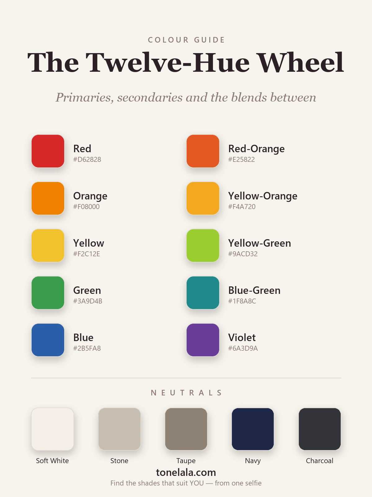
The palette below is the wheel laid out flat so you can see the relationships rather than just read about them. It runs in order, red, through the oranges, into yellow, round through the greens and blues, and on to violet, exactly as the colors sit around the circle. The neutral strip sits separately, because neutrals aren't really on the wheel at all.
| Hue | Hex | Type and temperature |
|---|---|---|
Red #D62828 |
Primary | A near-true red, balanced between warm and cool, the parent of pink, maroon and coral alike. |
Red-Orange #E25822 |
Tertiary | Red sliding toward orange; firmly warm and full of energy. |
Orange #F08000 |
Secondary | Red plus yellow; the most unambiguously warm color on the wheel. |
Yellow-Orange #F4A720 |
Tertiary | A golden, glowing hue, warm and soft at once. |
Yellow #F2C12E |
Primary | The lightest hue on the wheel; warm and the brightest in value. |
Yellow-Green #9ACD32 |
Tertiary | The hinge between warm and cool, yellow keeps it lively, green calms it. |
Green #3A9D4B |
Secondary | Yellow plus blue; sits on the cool side but carries a warm memory. |
Blue-Green #1F8A8C |
Tertiary | Teal, properly cool, watery and crisp. |
Blue #2B5FA8 |
Primary | The anchor of the cool half; recedes and calms. |
Violet #6A3D9A |
Secondary | Blue plus red; the bridge that carries the cool half back round to warm. |
The neutrals: Soft White #F4EFE6, Stone #C7BEB0, Taupe #8C8273, Navy #1E2749 and Charcoal #33333A. These don't appear on the color wheel because they're not pure hues, they're the quiet, low-chroma colors that partner with everything. They're the backbone you build an outfit on, with the wheel colors layered over the top.
Wondering which *temperature* of these hues actually flatters you?
Find your color season →Using the wheel to build outfits
This is where the wheel earns its keep. Once you can see which colors are neighbours and which are opposites, a few reliable combinations open up, and you can lean on them whether you're pairing a top with trousers or planning a whole capsule.
Analogous: colors sitting next to each other on the wheel, like blue, blue-green and green. Because they share a parent, they blend softly and never fight. An analogous outfit reads calm, considered and tonal; it's the easiest way to look pulled-together with almost no risk. This is the logic behind a lot of the best tonal dressing, and it pairs naturally with the way I think about depth in value and contrast in color analysis.
Complementary: colors directly opposite each other, like blue and orange, or red and green. Opposites carry maximum contrast, so the pairing crackles with energy. The trick is proportion: let one color lead and the other show up as an accent, a scarf, a shoe, a flash of lining, rather than splitting an outfit fifty-fifty, which can tip into costume.
Triadic: three colors evenly spaced around the wheel, like red, yellow and blue, or the three secondaries. A triad feels balanced and playful at once. Again, weight it: one dominant color, two supporting, usually softened into tints and tones so it reads grown-up rather than primary-school.
And then there's the move most real wardrobes actually run on, a neutral base with one wheel color as the hero. Navy, charcoal, taupe, stone and soft white go with everything precisely because they're not on the wheel competing for attention. Build the bones of an outfit in neutrals and you can drop in any single hue from the wheel as the focal point, swapping it day to day without rethinking the whole thing.
A quick note on hue, tint, shade and tone
One honest caveat before you go matching everything by the wheel. The twelve hues here are pure, full strength, straight off the circle, and almost nothing in your wardrobe is. Add white to a hue and you get a tint (red becomes pink). Add black and you get a shade (red becomes maroon). Add gray and you get a tone (a dusty, muted version). Most clothes are tints, shades or tones rather than pure hues, which is exactly why two people can both "suit red" and need completely different reds, one a bright cool raspberry, the other a soft warm brick.
The wheel tells you how colors relate; it can't tell you which tint, shade or tone of a color belongs near your face. That comes down to your own undertone, depth and contrast, and reading those three together is the whole job of a personal analysis, which hands you a palette of the exact versions of these hues that make your skin look its best. The wheel is the map; your palette is the route marked on it. If you'd like to keep exploring the map first, the color analysis guides cover undertone, season and palette in far more detail.
Frequently asked questions
What is a color wheel?
A color wheel is a circular chart that arranges colors in their natural order, red, orange, yellow, green, blue and violet, so you can see how they relate to one another. It's built from three primary colors (red, yellow and blue), the three secondaries you get by mixing them (orange, green and violet), and six tertiaries that sit between. The wheel matters because position tells you everything: colors next to each other blend quietly, colors opposite each other clash with energy, and the whole thing splits cleanly into a warm half and a cool half.
What are primary, secondary and tertiary colors?
Primary colors are red, yellow and blue, the three you can't make by mixing other colors, and the parents of everything else on the wheel. Secondary colors are orange (red plus yellow), green (yellow plus blue) and violet (blue plus red), each sitting halfway between the two primaries that make it. Tertiary colors are the six blends between a primary and its neighbouring secondary, red-orange, yellow-orange, yellow-green, blue-green, blue-violet and red-violet. Together that's the twelve hues of a standard color wheel.
Which colors are warm and which are cool?
Draw a line through the wheel from yellow-green down to red-violet and you split it in two. The warm half runs through red, orange and yellow, colors that feel like sunlight and fire. The cool half runs through green, blue and violet, colors that feel like water, shade and sky. The catch is that almost any color can lean either way: there are warm reds and cool reds, warm greens and cool greens. That lean is exactly what personal color analysis reads on your skin to decide which version of a color flatters you.
How do I use a color wheel to match clothes?
Pick a color you want to wear and let the wheel suggest its partners. Colors sitting next to each other (analogous, like blue and blue-green) give a calm, tonal outfit. Colors directly opposite (complementary, like blue and orange) give a bold, high-energy pairing, use one as the main color and the other as an accent. Three colors evenly spaced around the wheel (a triad) feel balanced and lively. Neutrals sit outside this system and go with anything, which is why they're the backbone of most wardrobes.
What is the difference between hue, tint, shade and tone?
Hue is the pure color itself, the twelve positions on the wheel, like red or blue-green, before anything is added. A tint is a hue with white mixed in, which makes it lighter and softer (red becomes pink). A shade is a hue with black added, which makes it deeper (red becomes maroon). A tone is a hue with gray added, which makes it muted and dustier. The wheel shows pure hues, but real clothes are nearly always tints, shades or tones, and which of those suits you is what a personal palette pins down.
Related guides
Warm Colors vs Cool Colors
A color analyst explains warm colors vs cool colors, the temperature spectrum, real hex examples, how to tell them apart and use them in your wardrobe.

Warm vs Cool Undertones
A color analyst's guide to warm vs cool undertones: simple at-home tests, the neutral middle ground, and example colors with hex codes for each.

Warm vs Cool Skin Tone: How to Tell
Learn how to tell if you have a warm, cool or neutral skin tone with simple at-home tests, plus the colors that flatter each undertone.

Warm-Toned Skin: How to Tell & Best Colors
How to tell if you have warm-toned skin, the vein, jewelry and white-paper tests, plus the colors, metals and neutrals that flatter warm skin

Skin Tone Chart: Find Your Shade & Undertone
A color analyst's skin tone chart to find your shade (fair to deep) and undertone (warm, cool or neutral) with simple at-home tests, and your color season.

Fair Skin Tone: Undertones & Best Colors
A color analyst's guide to fair skin tone, how to spot it, read your cool, warm or neutral undertone, the seasons it suits
Prefer in person? Find color analysis near you
Browse local color analysts by city, or get the same season, palette and best-colors breakdown online from one selfie.
See your colors on a photo of you
Upload one selfie and ToneLala reveals your season, your full palette, and your best hair, makeup, jewelry and outfits, styled on you.