In a sentence: Warm colors have yellow, gold or red underneath them and cool colors have blue, and most real shades sit somewhere along that temperature spectrum rather than at the extremes. Skip to the temperature spectrum or find your season.
Warm Colors vs Cool Colors
By ToneLalaUpdated July 10, 2026
Contents
Hold a lemon next to a lime and you've already understood color temperature. The lemon's yellow has a golden, sunny glow to it; the lime's green has a cool, blue-tinged sharpness. Same brightness, same juicy saturation, but one feels warm and one feels cool, and you knew which was which before you could explain why. That instinct is doing real work, and it's the same instinct that decides whether a jumper makes your face look lit or slightly tired.
Most people treat warm and cool as two tidy boxes: oranges over here, blues over there. In practice it's a spectrum, and the interesting colors live in the middle where the boundary gets blurry. A green can be warm (olive, with yellow in it) or cool (emerald, with blue in it). A red can be warm (tomato) or cool (raspberry). Once you stop sorting colors into two bins and start hearing the temperature underneath each one, you can pick the right version of any color you love, and that single skill is what makes a wardrobe finally hang together.
What makes a color warm or cool
Temperature is about what's mixed into a color, not the color itself. Warm colors carry yellow, gold, orange or red undertones, they remind us of sunlight, fire, autumn leaves, terracotta tiles. Cool colors carry blue undertones, they remind us of water, ice, deep shade, a clear winter sky. That's the origin of the words, and it's a surprisingly accurate guide.
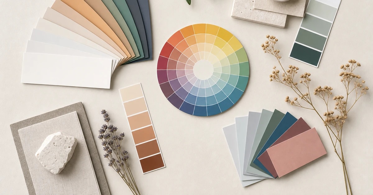
The cleanest way to picture it is the color wheel cut in half. Draw a line from yellow-green down to red-violet, and one side holds the warm family, reds, oranges, yellows and the yellow-leaning greens. The other side holds the cool family, the blue-leaning greens, blues, and the blue-leaning purples and pinks. Pure red and pure purple sit right on the fence, which is why they're the trickiest to call.
But here's what the half-wheel diagram hides: almost every color can be made warm or cool. There's no single "green", there's a warm, mossy, yellow-green and a cool, jewel-toned blue-green, and they behave like different colors against your skin. Same with pink (peachy-coral versus blue-raspberry), with gray (a warm greige versus a cool slate), even with white (cream versus blue-white). So the useful question is never "is this a warm color or a cool color," it's "which version of this color am I looking at."
The color temperature spectrum
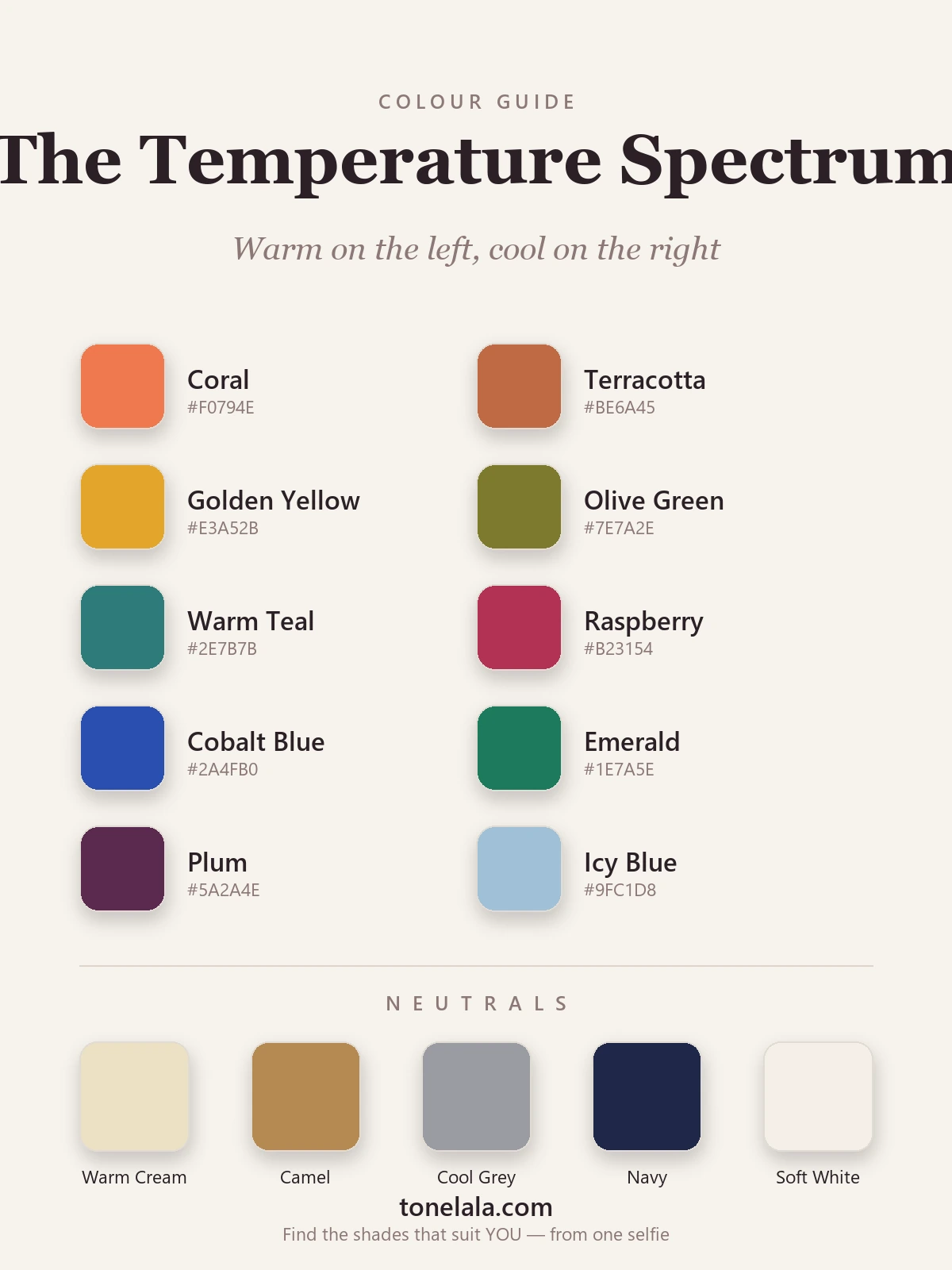
The palette below runs warm on the left to cool on the right so you can see the slide from one temperature to the other. The warm end glows golden and earthy; the cool end turns crisp and blue. Look at the two greens especially, warm olive and cool emerald, and the two reds, coral and raspberry. They're the same point on the color wheel pulled in opposite temperature directions, and that's the whole concept in one strip.
| Color | Hex | Temperature |
|---|---|---|
Coral #F0794E |
Warm | Peachy-orange red, warmth you can almost feel. |
Terracotta #BE6A45 |
Warm | Roasted, earthy orange-brown; reads expensive and sun-baked. |
Golden Yellow #E3A52B |
Warm | Pure sunlight, yellow with gold poured into it. |
Olive Green #7E7A2E |
Warm | Green with yellow underneath; proof green isn't cool by default. |
Warm Teal #2E7B7B |
Warm-neutral | The warm way to wear blue-green, green and gold tilt it toward warm. |
Raspberry #B23154 |
Cool | A blue-based red; sharp and fresh, never orange. |
Cobalt Blue #2A4FB0 |
Cool | Deep, clear blue, about as cool as color gets. |
Emerald #1E7A5E |
Cool | Green with blue in it; jewel-toned and crisp beside warm olive. |
Plum #5A2A4E |
Cool | A blue-leaning purple, cool, deep and a touch dramatic. |
Icy Blue #9FC1D8 |
Cool | Pale, frosted blue; the chilliest, lightest note here. |
The neutrals tell the same story. Warm Cream #EDE0C4 and Camel #B68A52 are warm neutrals, soft, golden, the background for an earthy palette. Cool Gray #9A9CA3 and Navy #1E2749 are cool, clean and blue-based. Soft White #F4EFE6 sits in the middle as a near-neutral off-white. Notice there's a warm and a cool option for almost every neutral job, which is exactly how you keep a whole outfit in one temperature.
Want to know which temperature actually flatters you?
Find your color season →How to tell warm from cool in real life
The single most reliable trick is comparison. A color on its own is hard to judge, your eye has nothing to measure it against. Put two versions side by side and temperature jumps out instantly. Lay a coral lipstick next to a fuchsia one and the coral suddenly looks unmistakably warm, the fuchsia unmistakably cool, even if each looked ambiguous alone. Do this with two whites, two grays, two reds, and you'll train your eye fast.
When you can't compare, ask what's hiding underneath the color. Mentally push a red toward orange or toward blue, whichever feels more natural to it tells you its lean. A brick red wants to go orange (warm); a cherry red wants to go blue (cool). The same move works for any color: nudge a green and see whether it heads toward yellow (warm) or blue (cool). A few specific tells help too, beige with a yellow cast is warm while beige with a gray cast is cool, and a yellow-gold metal reads warm against skin while a silver-white one reads cool.
One honest caveat: lighting lies. Warm indoor bulbs make everything look a little golden, cool daylight a little blue. If you're trying to judge a color's true temperature, do it in soft, even daylight near a window, and trust the side-by-side comparison over a single color seen in isolation.
Warm vs cool colors in your wardrobe
This is where the theory earns its keep. The colors sitting closest to your face, tops, scarves, knitwear, collars, should mostly match your temperature, because that's where a color either echoes your undertone or argues with it. If your skin is warm and golden, the warm end of the spectrum lights you up; if it's cool and pink, the cool end does. (Not sure which you are? That's the best colors for warm undertones question, and it's worth settling properly.)
That doesn't mean banishing half the color wheel. The smartest way to mix temperatures is to keep your flattering temperature near your face and let the opposite one live away from it, a cool-toned bag or shoe with a warm outfit, a warm-toned belt with a cool one. Worn at arm's length, the "wrong" temperature reads as a deliberate accent rather than something competing with your skin. The only real misstep is putting the opposite temperature right under your chin, where the contrast with your undertone is hardest to forgive.
A genuinely useful habit: when you fall for a color, find its temperature before you buy. Love green? Decide whether you're reaching for warm olive or cool emerald, they'll behave completely differently on you. Love pink? Coral or raspberry, not just "pink." Building a small capsule in one consistent temperature, with two flattering neutrals as the base, is what makes everything in your wardrobe quietly go together. If you want the bigger picture of how temperature fits depth and contrast, the color analysis guides and the seasonal color analysis guide walk through the whole system.
Putting it together
Warm versus cool comes down to one question you can now answer on sight: is there yellow and gold under this color, or blue? Once you can hear that temperature underneath every shade, you stop buying colors that "should" suit you and start choosing the version that actually does, warm olive over cool emerald, coral over raspberry, cream over blue-white, whichever way your skin leans. Get the temperature right near your face, mix freely everywhere else, and getting dressed turns calm and certain. The fastest way to know which end of the spectrum is yours, and the exact shades within it, is a personal analysis, which reads your undertone directly and hands you your side of the line.
Frequently asked questions
What is the difference between warm colors and cool colors?
Warm colors have yellow, gold or red folded into them, think coral, terracotta, golden yellow, olive and warm teal. Cool colors have blue underneath, raspberry, cobalt, emerald, plum and icy blue. The simplest way to picture it is the color wheel split in half: the reds-through-yellows side is warm, the greens-through-purples side is cool. Most real colors aren't purely one or the other, though, they sit somewhere along a temperature spectrum, leaning one way.
How can I tell if a color is warm or cool?
Ask what's hiding underneath the color. A red with orange in it (tomato, brick) is warm; a red with blue in it (raspberry, cherry) is cool. The same test works across the wheel: a yellow-green is warm, a blue-green is cool. A reliable trick is to compare two versions side by side, put a coral next to a fuchsia and the difference in temperature becomes obvious, even when each looks ambiguous on its own.
Are warm colors better than cool colors?
Neither is better, they just suit different people. Warm colors flatter skin with golden, peach or yellow undertones, while cool colors flatter skin with pink, red or blue undertones. The 'best' temperature for you is the one that matches your own undertone, which is exactly what a personal color analysis pins down. A color that lights up one person can gray out another purely because of temperature.
Can you wear both warm and cool colors together?
Yes, and most wardrobes mix them without anyone noticing. The trick is to keep most pieces in the temperature that flatters you, then treat the opposite temperature as an accent worn away from the face, a cool-toned bag with a warm outfit, for instance. Problems only show up when the wrong temperature sits right next to your skin, where it competes with your undertone instead of echoing it.
Is navy a warm or cool color?
Navy is usually cool, it's a deep blue, and blue is the coolest part of the wheel. But navy comes in temperatures too: a navy with a touch of red or brown in it reads warmer and softer, while an inky blue-black navy reads sharply cool. That's why some people in navy look fresh and others look slightly drained, the version matters. Matching the navy's temperature to your own undertone is what makes it one of the most universal neutrals there is.
Related guides

Warm vs Cool Undertones
A color analyst's guide to warm vs cool undertones: simple at-home tests, the neutral middle ground, and example colors with hex codes for each.

Warm vs Cool Skin Tone: How to Tell
Learn how to tell if you have a warm, cool or neutral skin tone with simple at-home tests, plus the colors that flatter each undertone.

Warm-Toned Skin: How to Tell & Best Colors
How to tell if you have warm-toned skin, the vein, jewelry and white-paper tests, plus the colors, metals and neutrals that flatter warm skin

How to Find Your Undertone
A color analyst's guide to finding your undertone with the vein, jewelry, white-paper and sun tests, read warm, cool and neutral the way the pros do.

Skin Tone Chart: Find Your Shade & Undertone
A color analyst's skin tone chart to find your shade (fair to deep) and undertone (warm, cool or neutral) with simple at-home tests, and your color season.

Fair Skin Tone: Undertones & Best Colors
A color analyst's guide to fair skin tone, how to spot it, read your cool, warm or neutral undertone, the seasons it suits
Prefer in person? Find color analysis near you
Browse local color analysts by city, or get the same season, palette and best-colors breakdown online from one selfie.
See your colors on a photo of you
Upload one selfie and ToneLala reveals your season, your full palette, and your best hair, makeup, jewelry and outfits, styled on you.