In a sentence: a skin tone chart maps two things at once — your depth (fair → deep) and your undertone (warm, cool or neutral) — and where they meet points to your colour season and your most flattering shades. Skip to the skin tone chart palette or find your season.
A client sat down last month certain she already knew her shade. She'd matched her foundation a dozen times, so "medium" felt settled. But when I held a sheet of pure white under her chin, her skin went faintly grey, and against cream it warmed straight up. Her depth was right — she really was medium. What she'd never named was the other half of the picture: the golden cast underneath, the part that decides whether a colour lifts her face or quietly drains it. Foundation had told her how deep her skin was. It had never told her which way it leaned.
That gap is what a proper skin tone chart closes. Most charts you'll find online only show the depth axis — a strip of faces or foundation cards running pale to dark — and stop there. Useful for matching concealer, useless for picking a jumper. The version that actually changes how you get dressed reads two axes together: depth, and undertone. Find yourself on both and you've done most of the work of placing your colour season.
What a skin tone chart actually shows
Think of the chart as a grid. One axis is depth — how light or deep your skin is — running fair, light, medium, tan, deep. This is the visible surface, and it's what shifts when you catch the sun. The other axis is undertone — the steady colour sitting beneath the surface, which reads cool (blue, pink, rosy), warm (golden, peach, yellow) or neutral (a balance of the two). Undertone doesn't move with a tan; it's fixed.
Here's the part most charts miss. Depth and undertone are independent. You can be fair and warm, or fair and cool. You can be deep and warm, or deep and cool. That's why two friends who buy the same numbered foundation can look brilliant in completely different colours — same depth, opposite undertone. So a skin tone chart that only shows depth is half a map. The square you're standing in is the one where your depth and your undertone cross.
The depth axis: fair to deep
Depth is the easy half to read, because you can mostly see it. The quickest gauge is how your skin behaves in sun. Here's the spectrum I use, with a rough sun cue for each:
| Depth | What it looks like | In the sun |
|---|---|---|
| Fair | Porcelain to light; often shows freckles or visible veins | Burns easily, rarely tans |
| Light | A shade up from fair; "neutral light" in most ranges | Burns, then tans a little |
| Medium | Mid-range; the most common depth worldwide | Tans readily, burns sometimes |
| Tan | Warm mid-deep; holds colour well | Tans deeply, burns rarely |
| Deep | Rich, dark complexions across many undertones | Rarely burns; deepens in sun |
Two honest caveats. First, the lines between these are soft — if you hover between "light" and "medium", you're simply light-medium, and nothing breaks. Second, depth on its own doesn't dictate your colours; it mostly tells you how light or how saturated to take a shade. A fair person and a deep person can both be cool Winters wearing the same true red — one just wears a touch lighter version of everything. If you want the depth-specific shortlists, I've written them out for fair skin, light skin, medium skin, tan skin, olive skin and deep skin.
The undertone axis: warm, cool or neutral
Undertone is the half that does the heavy lifting, and the half you can't simply eyeball. No single test is foolproof, so I read several cues together and let the weight of evidence decide. Do these in daylight, bare-faced, away from coloured walls.
- Wrist veins. Blue or purple veins lean cool; green or olive-tinged veins lean warm. Genuinely can't tell — they look blue-green? That points neutral.
- Gold vs silver. Hold gold near your face, then silver. If gold makes your skin look lit and even, you're warm. If silver makes it look clean and clear, you're cool. Both fine — neutral.
- White vs cream. Drape pure white under your chin, then cream. Cool skin looks crisp in white; warm skin looks healthier in cream, and pure white can grey it slightly.
- Sun reaction. Burn-prone and stay pink? Often cool. Tan readily, rarely burn? Often warm. A soft clue, not a verdict.
Tally them. Mostly blue-vein, silver, white, burn-prone is cool; mostly green-vein, gold, cream, easy-tanning is warm; a real split down the middle is the signature of neutral. For the full method — including the white-paper test and how the pros read each cue — see how to find your undertone.
How to use the skin tone chart
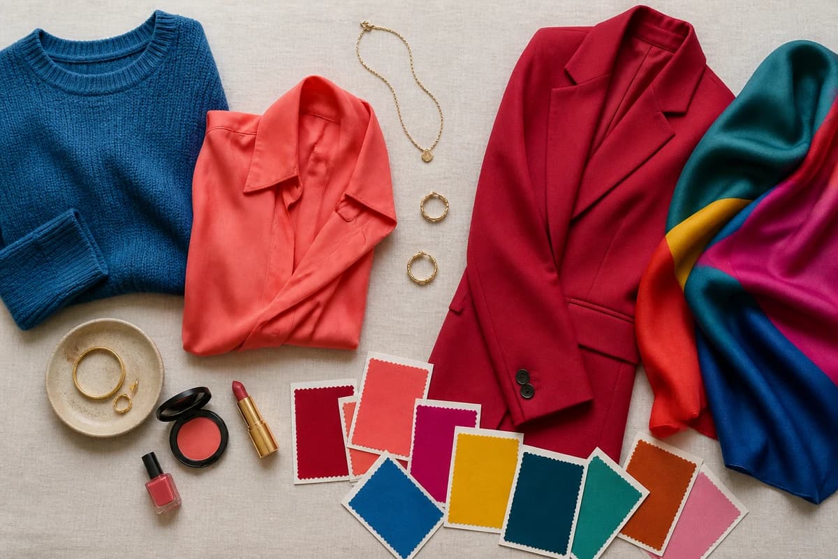
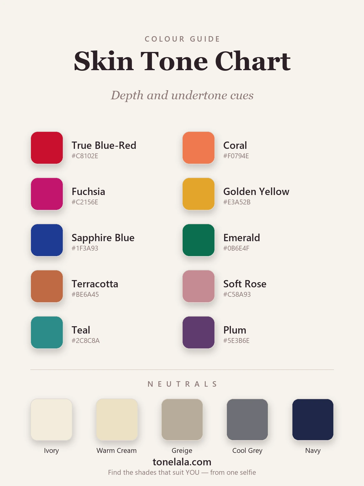
Now put the two axes together. The palette above is built to span the whole chart on purpose: cool cues — a true blue-red, fuchsia, sapphire, emerald and plum — sit alongside warm cues — coral, golden yellow, terracotta and soft rose — with a balanced teal in the middle that almost any skin can wear. The neutrals run the same way, from warm cream through greige to cool grey and navy, so each undertone has an anchor at its end.
To find your square, answer both axes and read across. Say you land on medium depth, warm undertone: your colours are the warm, golden, earthy versions — coral, golden yellow, terracotta — taken at full mid-saturation, anchored by warm cream and camel. Land on medium depth, cool undertone instead and you swing the other way: blue-red, fuchsia, emerald and sapphire, anchored by cool grey and navy, at the same saturation your depth supports. Same depth, opposite halves of the palette. That single crossing is what a depth-only chart can never tell you, and it's where the undertone deep-dives earn their keep — the best colours for warm undertones, best colours for cool undertones and best colours for neutral undertones each lay out the full shade list for that side.
Want to know exactly which square on the chart is yours?
Find your colour season →From your square to your colour season
Your spot on the chart isn't the destination — it's the doorway into seasonal colour analysis, which is just this chart with a third dimension added. Every season is built from undertone (warm or cool), depth (light or deep) and chroma (soft and muted, or bright and clear).
Your undertone makes the first cut. Cool sends you to the Winter and Summer families; warm sends you to Spring and Autumn. Then depth and chroma split each pair:
- Cool + deep + bright → Winter. High contrast, clear saturated colour.
- Cool + light + soft → Summer. Lower contrast, muted dusty hues.
- Warm + bright + clear → Spring. Light-to-mid depth, fresh and lively.
- Warm + deep + muted → Autumn. Rich, earthy, low-contrast warmth.
So two cool people on the chart can need very different palettes: a deep, high-contrast cool reads Winter and wants colour at full strength, while a soft, low-contrast cool reads Summer and wants the muted version of the same hues. The same fork happens on the warm side between Spring and Autumn. Depth nudges you within your pair; chroma decides how loud or soft your shades run. If you want to walk through all twelve, the colour analysis guides cover each season in detail.
Where charts fall short
I'll be straight about the limits, because they matter. A chart is a brilliant starting frame, but it can't read the subtle middle ground — and that's where most people actually live. Neutral undertones, in particular, are hard to place from a bathroom mirror: the tests come back mixed, and the difference between a neutral-warm and a neutral-cool can be a single degree that completely changes which red flatters you. Chroma is harder still to self-assess; almost nobody can judge from a chart whether they want colour bright or muted, yet getting that wrong is the most common reason a "right" colour still looks off.
That's the gap a personal reading closes. It looks at your undertone, depth and contrast together, against your skin, and resolves the borderline calls a static chart leaves open — the exact reason draping has been the professional standard for decades.
Putting it together
Find your square in two moves and you've done the important work. Read your depth off the surface — fair, light, medium, tan or deep — using how you react to sun as the tiebreaker. Then read your undertone by weighing the vein, jewellery and white-versus-cream tests together until they point cool, warm or neutral. Where the two answers cross is your spot on the chart, your half of the colour palette, and the doorway to your season. Build a small wardrobe around the neutrals at your end and two or three feature colours from your side, and getting dressed turns from guesswork into a quick check. The only step left is precision — confirming your exact season and the specific reds, blues and neutrals that flatter you — and that's what a personal analysis is for.