In a sentence: warm undertones have gold, peach or yellow under the skin and glow in earthy, golden colors; cool undertones have a blue, pink or rosy base and come alive in blue-based ones; neutral sits in between, the fastest tell is whether gold or silver flatters you more. See the side-by-side palette or find your season.
Warm vs Cool Undertones
By ToneLalaUpdated July 10, 2026

Contents
The first thing I do with a new client is hold a length of gold fabric to one side of her jaw and silver to the other, then say nothing and watch her face. Almost always, one side quietly wins, the skin next to it looks clearer, more even, more itself, while the other side casts a faint gray or a yellow muddiness. That single moment tells me more than any quiz could, because it isolates the one thing that decides which colors flatter you: your undertone.
Undertone trips people up because it's invisible until you put color next to it. It isn't how light or deep your skin is, and it isn't your tan. It's the temperature running underneath, gold and peach on the warm side, blue and rose on the cool. Get that one reading right and a frustrating wardrobe suddenly makes sense: you understand why the camel coat does nothing for you but your friend looks incredible in it, why one red ages you and another lights you up. So let's work through how to tell warm from cool (and the neutral middle most guides skip), with real colors for each.
What undertone actually is
Undertone is the color sitting beneath your skin's surface, and it's fixed, it doesn't shift with sun exposure, a flush, or a bad night's sleep. Surface tone (how pink or olive or golden you look day to day) can change; undertone doesn't. There are three categories. Warm undertones carry gold, peach or yellow. Cool undertones carry blue, pink or rosy red. Neutral undertones are balanced, a near-even mix, often leaning very slightly one way.
Here's why it matters more than almost anything else. A color always sits right next to your face, and your eye constantly compares the two. When the color shares your undertone, the fabric and your skin harmonize and your complexion looks like the freshest thing in the frame. When it clashes, a cool, blue-based color against warm skin, or a golden color against cool skin, the fabric pushes its opposite temperature onto your face, and you read as sallow, gray or simply tired. That's the whole mechanism. No color is "bad"; it's just the wrong temperature for you.
How to tell if you're warm or cool
No single test is foolproof, but three together are very reliable. Do them in natural daylight, near a window, with no makeup and your hair pushed back.
- Gold vs silver. The most useful test by far. Hold gold jewelry (or gold fabric) to your face, then silver. Warm undertones look lit and even beside gold and slightly washed out beside silver; cool undertones look clean beside silver and faintly muddy beside gold. If both genuinely look fine, note that, it points to neutral.
- The vein check. Look at the inside of your wrist in daylight. Veins that read green suggest warm; blue or purple suggest cool; a mix of blue-green leans neutral. It's a clue, not a verdict, thin or deep skin can skew it, so don't decide on this alone.
- Sun reaction. Warm undertones tend to tan and rarely stay pink. Cool undertones tend to burn, go pink, then fade. It's not universal, but it's a genuine signal.
- White vs cream. Hold a piece of optic white near your face, then warm cream. If pure white looks crisp and cream looks dull, you're likely cool. If cream looks soft and flattering while bright white feels harsh, you're likely warm.
The trick is to look for agreement. One test pointing cool means little; three of them pointing the same way is your answer. And watch your skin, not the fabric, the right temperature makes you look rested; the wrong one drops a shadow under your chin or pulls yellow into your face.
Warm vs cool, hue by hue
This is the idea that makes everything click: almost every color exists in both a warm and a cool version, and the version is what flatters or fails you, not the color family itself.
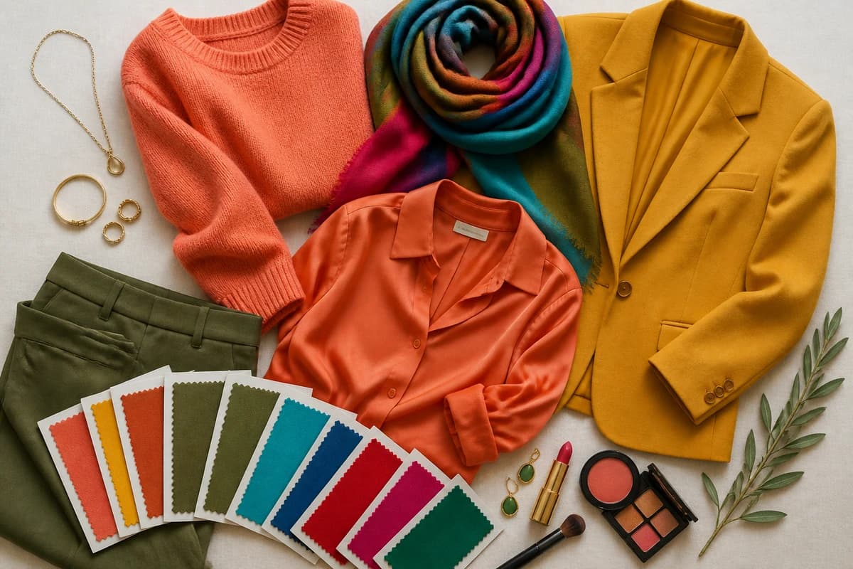
::img:palette:: {#the-palette}
On the warm side I've put coral #F0794E, golden yellow #E3A52B, terracotta #BE6A45, warm olive #7E7A2E and turquoise #3FAFA6. Notice the thread: every one has gold or yellow folded into it. Even the "blue", turquoise, is the green-gold version of blue, which is exactly how a warm person wears that part of the spectrum.
On the cool side: true blue-red #C8102E, fuchsia #C2156E, emerald #0B6E4F, sapphire blue #1F3A93 and royal purple #4B2E83. Same families, a red, a pink, a green, two blues, but each one is built on a blue base instead of a golden one. Put the two reds next to each other and you'll see it instantly: coral leans toward orange, true blue-red leans toward cherry.
So the rule cuts both ways. If you're warm, take any color you love and reach for its golden version: tomato not blue-red, honey not lemon, teal not cobalt. If you're cool, do the opposite: raspberry not coral, lemon not mustard, sapphire not turquoise. Same hue, dialled to your temperature, that one shift is what makes a wardrobe finally feel like it fits.
On neutrals: the same logic runs through your basics. Warm undertones are kinder served by warm cream #EDE0C4 and camel #B68A52 than by stark white. Cool undertones look crisp in cool gray #6E7076, charcoal #36363B and navy #1E2749. A neutral undertone can borrow from both, leaning on softer mid-temperature versions of each.
Not sure which side you land on?
Find your color season →What if you're neutral?
Neutral is real, and it's more common than the internet suggests. If gold and silver both look acceptable, your veins read blue-green, and warm and cool tops both seem "fine," you're probably balanced. The blessing is range, far more colors work on you than on a strongly warm or strongly cool person. The catch is that "fine" does a lot of heavy lifting: when everything works a little, it's hard to find the shades that work brilliantly.
Most neutral undertones still tip a few degrees one way, and the genuinely flattering shades tend to be slightly muted, mid-temperature versions of a color rather than its most extreme warm or cool form, a teal rather than a cobalt or a turquoise, a soft coral rather than a fiery orange or an icy pink. If you've never been able to decide whether you're warm or cool, neutral is often the honest answer, and it's exactly the case where a careful read pays off most.
Undertone is the start, not the finish
Here's the part most guides leave out. Undertone tells you the direction of your palette, never the exact shade. In seasonal color analysis, your palette is built from three dials: undertone (warm or cool), depth (light or deep) and chroma (soft or bright). Temperature sorts you into a half of the system, warm sends you toward the Springs and Autumns, cool toward the Winters and Summers: but depth and chroma decide your precise colors.
That's why two warm people can need quite different palettes: a light, clear warm glows in fresh, sunny shades (Spring), while a deep, muted warm carries roasted rust and golden olive (Autumn). Likewise a cool person might be a vivid, high-contrast Winter or a soft, dusty Summer. Our color analysis guides walk through each season in detail once you know your temperature. And if you genuinely can't tell whether you're warm, cool or neutral in your own mirror, which is hard, because your brain adapts to your own face, that's exactly what a personal analysis settles.
Putting it together
Start with the gold-versus-silver drape and the vein check, look for two or three signs that agree, and you'll usually know your temperature within minutes. From there the principle is simple: warm undertones reach for golden, earthy versions of every color; cool undertones reach for blue-based ones; neutral picks the balanced middle. That alone will fix most of the "why doesn't this suit me?" mysteries in your wardrobe. The last step, turning warm into your exact coral and your exact olive, or cool into your precise red and sapphire, is what a proper season reading is for. It reads your undertone, depth and contrast together and hands you the palette, so you stop guessing at color for good. You can start one here.
Frequently asked questions
How do I tell if I have warm or cool undertones?
The most reliable quick test is the gold-versus-silver one: hold a piece of gold jewelry to your face, then silver. If gold makes your skin look lit and even, you lean warm; if silver looks cleaner and gold looks slightly muddy, you lean cool. Back it up with two more checks, warm undertones often see green-looking veins at the wrist and tan rather than burn, while cool undertones see blue or purple veins and burn more easily. No single test is proof, but when all three agree you've found your temperature.
What is the difference between warm and cool undertones?
Undertone is the color sitting underneath your skin's surface, separate from how light or deep you are. A warm undertone has gold, peach or yellow in it; a cool undertone has blue, pink or rosy tones. It doesn't change with a tan or the seasons. The practical difference is which colors flatter you: warm undertones glow in golden, earthy shades, while cool undertones come alive in blue-based ones.
Can you have both warm and cool undertones?
Sort of, that's what 'neutral' undertone means. If gold and silver both look fine, your veins read blue-green, and you can wear warm and cool colors without either looking obviously wrong, you sit in the balanced middle. Neutral isn't a cop-out answer; it's a real category, and it usually means you lean very slightly one way, which a proper analysis can pin down.
Is the vein test for undertones accurate?
It's a useful clue, not a verdict. Green-looking veins suggest warm, blue or purple suggest cool, but wrist skin is thin and the result is easily skewed by lighting, skin depth and how visible your veins are. Treat it as one vote among several. The gold-versus-silver drape and how your skin reacts to sun are usually more telling, and the most accurate read comes from looking at color against your whole face in daylight.
Does undertone matter more than skin color for choosing clothes?
Yes, undertone is the single biggest factor in whether a color flatters you, more than how light or deep your skin is. Two people with very different skin depths but the same warm undertone will both glow in coral and look tired in icy fuchsia. Depth and contrast then fine-tune the exact shade, which is why undertone tells you the direction and your color season tells you the precise version.
Related guides

Warm vs Cool Skin Tone: How to Tell
Learn how to tell if you have a warm, cool or neutral skin tone with simple at-home tests, plus the colors that flatter each undertone.

Warm-Toned Skin: How to Tell & Best Colors
How to tell if you have warm-toned skin, the vein, jewelry and white-paper tests, plus the colors, metals and neutrals that flatter warm skin

How to Find Your Undertone
A color analyst's guide to finding your undertone with the vein, jewelry, white-paper and sun tests, read warm, cool and neutral the way the pros do.
Olive Skin Undertones: Warm, Cool and Neutral Olive Explained
Olive skin is a green-gray cast that can sit over a warm, neutral or cool undertone. Five daylight tests to tell which olive you are, with the colors, makeup, hair and seasons for each.

Types of Skin Tones Explained
A color analyst explains the types of skin tones, depth (fair to deep) and undertone (warm, cool, neutral), how they differ, and how to find yours.

What Is My Skin Undertone
A color analyst explains what your skin undertone is, how to find it with simple at-home tests, and the colors that flatter cool, warm and neutral undertones.
Prefer in person? Find color analysis near you
Browse local color analysts by city, or get the same season, palette and best-colors breakdown online from one selfie.
See your colors on a photo of you
Upload one selfie and ToneLala reveals your season, your full palette, and your best hair, makeup, jewelry and outfits, styled on you.