In a sentence: The best colors to go with purple are mustard yellow and gold (its warm complement), teal and emerald for a jewel-toned pairing, coral and blush for softness, and gray, white, camel or navy as neutrals. Skip to the full pairing palette or find your most flattering colors.
Colors That Go With Purple: 12 Stylish Combinations (with Hex Codes)
By ToneLalaUpdated July 5, 2026
Contents
Purple is one of the most misunderstood colors in a wardrobe. People treat it as difficult, a color that "doesn't go with anything", when the truth is almost the opposite: it goes with far more than its reputation suggests, if you respect what it actually is. The mistake I see most often is pairing a rich purple with another loud color and hoping for the best. Purple is already doing a lot. It doesn't need a shouting partner; it needs a smart one.
My rule of thumb is simple. Decide whether you want purple to feel regal, fresh, or soft, then pick the pairing that pushes it in that direction. Mustard makes it look expensive and deliberate. Teal and emerald make it look like a jewel box. Blush and gray make it look effortless. Same purple, three completely different outfits, and not one of them is hard to pull off.
What kind of color purple is
Purple lives between blue and red on the color wheel, which makes it a fundamentally cool, blue-based color with a warm red heart. That dual nature is the whole story. The bluer the purple (think violet, royal, aubergine), the cooler and more dramatic it reads; the redder it gets (plum, grape, mulberry), the warmer and softer. Either way it carries depth and a touch of luxury, purple has been the color of royalty for centuries precisely because it's saturated and rich rather than light and casual.
What follows from that is the key to pairing it. Because purple is cool and deep, its most flattering partners tend to be either warm colors that contrast it (mustard, coral, camel) or cool jewel tones that match its intensity (teal, emerald, burgundy). The yellow family is purple's direct complement on the wheel, which is why a mustard-and-purple combination looks so intentional, the contrast is baked into the colors. Understanding that one fact does most of the heavy lifting.
The best colors to go with purple
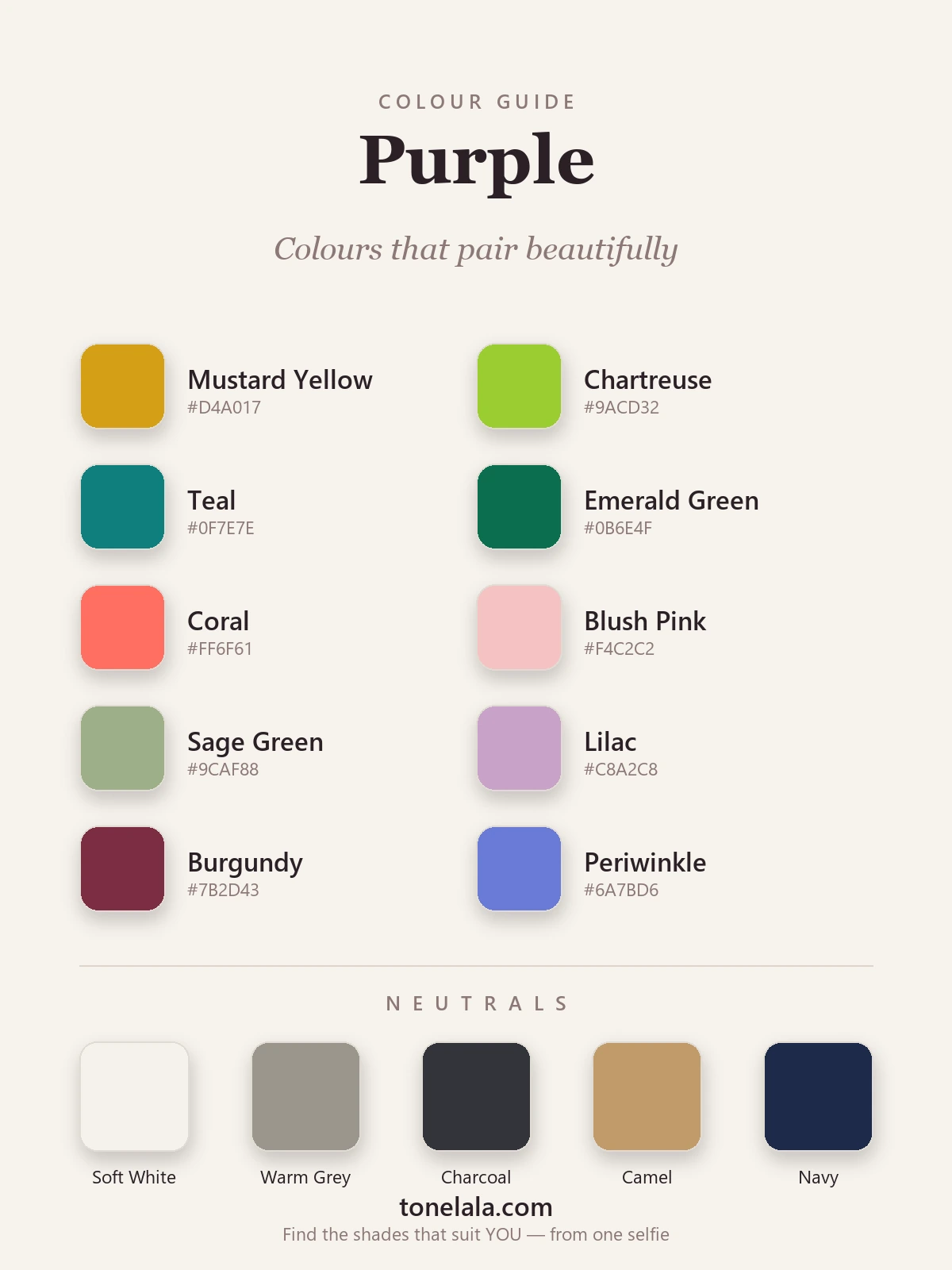
Ten shades I reach for again and again, a mix of warm complements, cool jewel tones, and soft tonal partners.
| Color | Hex |
|---|---|
Mustard Yellow #D4A017 |
Purple's true complement. Warm against cool, the most expensive-looking pairing of the lot. |
Chartreuse #9ACD32 |
A sharper yellow-green for a modern, high-energy contrast that stops short of neon. |
Teal #0F7E7E |
An analogous blue-green that matches purple's depth, rich, polished, slightly unexpected. |
Emerald Green #0B6E4F |
Jewel on jewel. Emerald and purple read as deliberately luxe, especially for evening. |
Coral #FF6F61 |
Warm and fresh, it lifts a cool purple without the harshness of true orange. |
Blush Pink #F4C2C2 |
Analogous and soft, the romantic, low-effort pairing that flatters almost everyone. |
Sage Green #9CAF88 |
A muted, dusty complement; sophisticated and calm next to a deeper purple. |
Lilac #C8A2C8 |
Tonal dressing, a lighter tint of purple itself for a quietly chic monochrome. |
Burgundy #7B2D43 |
Analogous and deep; two rich colors that share DNA and feel intentional together. |
Periwinkle #6A7BD6 |
The blue side of purple, a soft, airy partner that keeps the whole look cool and gentle. |
Neutrals that go with purple: Soft White #F5F2EC, Warm Gray #9B958C, Charcoal #33343A, Camel #C19A6B and Navy #1E2A4A. Gray is the most foolproof anchor of the five, it lets a vivid purple read as a choice rather than an accident.
Which shade of purple actually suits YOU?
Find your color season →Colors to avoid with purple
- Muddy brown and warm olive: against purple's cool, blue-based depth these can turn dull and slightly murky. If you love an earthy look, lean on camel instead, which reads cleaner.
- Bright true orange: orange is close to purple's complement, but at full strength it competes rather than contrasts. Coral is the chic, wearable version of the same idea.
- Too many warm tones at once: a print or outfit that stacks purple with several warm colors together tends to look busy and pulls the eye in three directions. Let one accent lead and keep the rest neutral.
- Pure black, sometimes: it works for high-contrast coloring, but on softer skin a flat black next to purple can feel heavy and aging. Charcoal or navy gives you the same depth with more flattery.
Purple outfit combinations
- Aubergine + mustard + soft white. A deep purple knit, mustard accessories, off-white trousers. Polished, autumnal, and the complement does all the work, minimal effort, maximum intention.
- Royal purple + charcoal + silver. A vivid purple top against charcoal tailoring with silver jewelry. Sharp, cool and high-contrast, ideal for evening or anyone who suits drama.
- Lilac + blush + camel. A tonal, gentle look: lilac and blush as analogous neighbours, camel to warm and ground it. Easy, soft, and genuinely flattering on softer coloring.
- Plum + teal + gold. Two jewel tones with warm gold as the lift. This reads expensive without trying, perfect when you want one outfit to feel like an occasion.
- Periwinkle + soft white + denim. The easiest entry point if purple feels like a lot: a periwinkle shirt with white and mid-blue denim keeps everything cool and casual, and lets you wear a purple you'd never reach for in its deeper form.
How to wear purple for your color season
Here's the part most pairing guides skip: the best version of purple, and its best partners, depends entirely on your own coloring. Purple is a whole family, from icy lilac to blue-based royal to warm grape, and they don't all suit the same person. A cool, deep, high-contrast complexion can carry true royal purple and aubergine with crisp white and charcoal beside them. Softer, warmer coloring usually looks better in muted mauve, lilac or grape, pairing more happily with camel and warm gray than with stark black-and-white.
If you've ever pulled on a purple you loved on the hanger and felt it wore you instead, the shade was probably fighting your undertone, not the color itself. Working out whether you're warm or cool, deep or light, bright or muted is what my whole field is built on. My color analysis guides walk through each season and the exact purples that flatter it, and a personal analysis pins down your precise shade, and the pairings that'll always work on you, rather than leaving you guessing.
Putting it together
Purple isn't difficult; it's decisive. Pick the mood, regal, fresh or soft, choose one partner from the palette above, and anchor the whole thing with a clean neutral. Mustard for intention, teal for richness, blush for ease, gray to make any of it look effortless. Get the shade of purple right for your own coloring and even the boldest version stops feeling like a risk and starts feeling like yours.
Frequently asked questions
What colors go with purple?
Purple pairs beautifully with mustard yellow, chartreuse, teal, emerald, coral, blush pink, sage green, lilac, burgundy and periwinkle. Mustard is the classic complement, it sits opposite purple on the color wheel, while teal and burgundy give a richer, jewel-toned pairing and blush keeps things soft. For neutrals, reach for soft white, warm gray, charcoal, camel or navy.
What color best complements purple?
Yellow, and specifically a warm mustard or ochre, is purple's true complement, the color sitting directly opposite it on the wheel. That's why mustard and purple look so deliberate together: the contrast is built into the colors themselves. If straight yellow feels too loud, gold accessories give you the same warm-against-cool lift in a quieter dose.
What colors should you NOT wear with purple?
Be careful with muddy browns and warm olive, against purple's cool, blue-based depth they can look dull and slightly off. Bright orange fights it rather than flatters it, and an exact-match orange (the harsh complement) is jarring rather than chic. A too-busy print that mixes purple with several warm tones at once tends to muddle. When in doubt, anchor purple with a clean neutral and let one accent color do the work.
What neutrals go with purple?
Soft white (#F5F2EC), warm gray (#9B958C), charcoal (#33343A), camel (#C19A6B) and navy (#1E2A4A) all ground purple without competing with it. Gray is the most foolproof, it lets a vivid purple read as intentional. Camel adds warmth for a softer look, while charcoal and navy give a deeper, more polished base for evening.
How do I wear purple for my skin tone?
Match the purple to your undertone. Cool, deep complexions carry true royal purple, plum and aubergine beautifully; warmer, softer coloring tends to look better in muted lilac, mauve or grape. The pairing follows the same logic, crisp white and charcoal for cool, high-contrast skin; camel and warm gray for softer, warmer skin. A personal color analysis tells you the exact shade of purple that flatters you most.
Related guides
Colors That Go With Sage Green: 12 Stylish Combinations (with Hex Codes)
A stylist's pick of the colors that go with sage green, terracotta, blush, cream, navy and more, with hex codes, outfit ideas and shades to avoid.
Colors That Go With Teal: 12 Stylish Combinations (with Hex Codes)
The colors that go with teal: 12 combinations with an outfit for each, 10 pairing colors and 5 neutrals with hex codes, shoes and jewelry, and what to avoid.
Colors That Go With Burgundy: 12 Stylish Combinations (with Hex Codes)
12 colors that go with burgundy, each with a hex code and an outfit to copy: cream, camel, navy, green, blush, gold, teal, gray, denim, olive and more, plus what to avoid and which burgundy suits you.
Colors That Go With Black: 12 Stylish Combinations (with Hex Codes)
A stylist's guide to the best colors that go with black, 10 pairings plus 5 neutrals, with hex codes, outfit ideas and how to match black to your skin tone.
Colors That Go With Green: 12 Stylish Combinations (with Hex Codes)
A stylist's guide to the colors that go with green, blush, mustard, terracotta, navy, teal and more, with hex codes, neutrals, outfit ideas and what to avoid.
Colors That Go With Brown: 12 Stylish Combinations (with Hex Codes)
A stylist's guide to the best colors that go with brown, teal, cream, mustard, blush and more, with hex codes, outfit ideas and what to avoid.
Prefer in person? Find color analysis near you
Browse local color analysts by city, or get the same season, palette and best-colors breakdown online from one selfie.
See your colors on a photo of you
Upload one selfie and ToneLala reveals your season, your full palette, and your best hair, makeup, jewelry and outfits, styled on you.