In a sentence: there are two kinds of skin tone type, depth (fair → deep) and undertone (warm, cool or neutral), they're independent, and naming both is what points you to your most flattering colors and your color season. Skip to the palette for every type or find your season.
Types of Skin Tones Explained
By ToneLalaUpdated July 10, 2026

Contents
Sit two friends side by side in daylight and ask them what their skin tone is. One says "medium", the other says "warm". Neither is wrong, and that's exactly the problem, they're answering two different questions and calling both of them the same thing. "Medium" describes how light or deep the skin is. "Warm" describes the color sitting underneath. Until you split those apart, the word "skin tone" stays a blur, and so does every color decision that depends on it.
So here's the clean way to think about it. There are two types of skin tone type, and you have one of each at the same time. The first is depth: the surface lightness you can see, from fair through to deep. The second is undertone: the steady cool, warm or neutral cast beneath the surface. Get both named and you've done most of the work of choosing colors that flatter rather than drain, because the two axes together pin down your spot far more precisely than either one alone.
The two axes of skin tone
Picture a grid. Running one way is depth: fair, light, medium, tan, deep. This is the visible layer, the part that catches the sun and shifts a little across the year. Running the other way is undertone: cool (pink, rosy, blue), warm (golden, peach, yellow) or neutral (a near-even balance). Undertone is fixed, it doesn't budge when you tan.
The reason so many people get stuck is that these two are independent. You can be fair and warm, or fair and cool. You can be deep and warm, or deep and cool. Depth tells you nothing about undertone and undertone tells you nothing about depth. That independence is the whole reason two people at the identical foundation shade can look brilliant in opposite colors, same depth, different undertone. Naming only one axis is like giving someone half a grid reference and expecting them to find the spot.
Type one: depth, from fair to deep
Depth is the easy half, because you can mostly see it. The quickest read is how your skin behaves in the sun. Here's the spectrum I work with, with a rough sun cue for each:
| Depth | What it looks like | In the sun |
|---|---|---|
| Fair | Porcelain to light; often shows freckles or fine veins | Burns easily, rarely tans |
| Light | A step up from fair; "neutral light" in most ranges | Burns, then tans a little |
| Medium | Mid-range; the most common depth worldwide | Tans readily, burns sometimes |
| Tan | Warm mid-deep; holds color well | Tans deeply, burns rarely |
| Deep | Rich, dark complexions across many undertones | Rarely burns; deepens in sun |
Two honest caveats. The boundaries are soft, hover between light and medium and you're simply light-medium, and nothing falls apart. And depth on its own doesn't dictate your palette; it mostly tells you how light or how saturated to take a color. A fair person and a deep person can both be cool and wear the same true red, with the fair one in a slightly lighter version of everything. If you want the depth-specific shortlists, I've written them for fair skin, light skin, medium skin, tan skin, olive skin and deep skin.
Type two: undertone, warm, cool or neutral
Undertone is the half that does the heavy lifting, and the half you can't just glance at. No single test is foolproof, so I read several cues together and let the weight of evidence decide. Do these in daylight, bare-faced, away from brightly colored walls.
- Wrist veins. Blue or purple veins lean cool; green or olive-tinged veins lean warm. Genuinely can't tell, they look blue-green? That points neutral.
- Gold versus silver. Hold gold near your face, then silver. If gold makes your skin look lit and even, you're warm. If silver makes it look clean and clear, you're cool. Both fine, neutral.
- White versus cream. Drape pure white under your chin, then cream. Cool skin looks crisp in white; warm skin looks healthier in cream, and pure white can gray it slightly.
- Sun reaction. Burn-prone and stay pink? Often cool. Tan readily, rarely burn? Often warm. A soft clue, not a verdict.
Tally them. Mostly blue-vein, silver, white and burn-prone is cool; mostly green-vein, gold, cream and easy-tanning is warm; a real split down the middle is the signature of neutral. There's a close cousin worth naming too, olive, a green or green-gray overlay that sits on top of the warm-cool balance rather than replacing it, so olive skin often reads neutral or warm underneath. For the full method, see warm vs cool undertones and how to find your undertone.
A palette built for every type
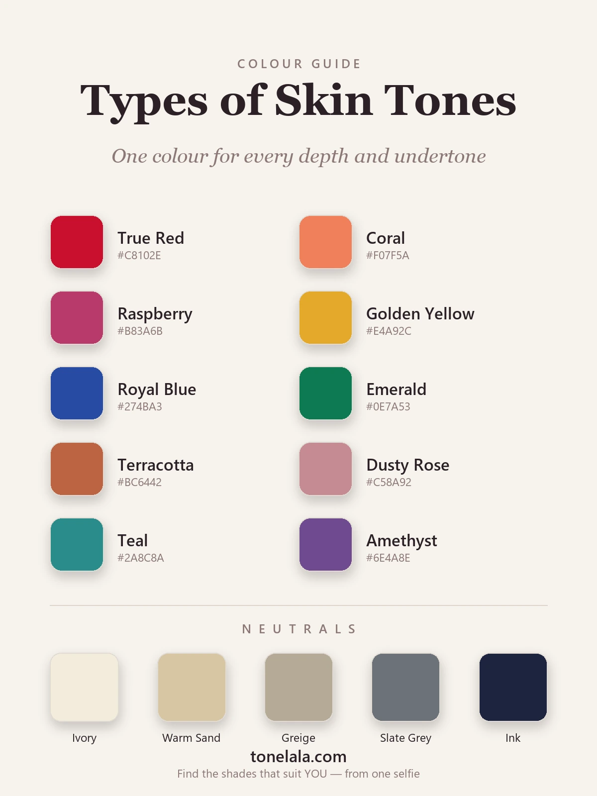
The palette above is built to span the whole grid on purpose. The cool cues, a true blue-red, raspberry, royal blue, emerald and amethyst, sit alongside the warm cues, coral, golden yellow and terracotta, with a balanced teal and dusty rose in the middle that nearly any skin can wear. The neutrals run the same way, from ivory and warm sand at the warm end through greige to slate gray and ink at the cool end, so every undertone has an anchor.
To find your colors, answer both axes and read across. Say you land on medium depth, warm undertone: your shades are the golden, earthy versions, coral, golden yellow, terracotta, taken at full mid-saturation and grounded by warm sand. Land on medium depth, cool undertone and you swing the other way: true red, raspberry, royal blue and emerald, grounded by slate gray and ink, at the same saturation your depth supports. Same depth, opposite halves of the palette. Depth then tells you how light or deep to take each one, a fair cool wears a softer royal blue, a deep cool wears it at full strength. That single crossing is what a depth-only chart can never tell you.
Want to know exactly which depth-and-undertone square is yours?
Find your color season →From your type to your color season
Your spot on the grid isn't the destination, it's the doorway into seasonal color analysis, which is just this grid with a third dimension added. Every season is built from undertone (warm or cool), depth (light or deep) and chroma (soft and muted, or bright and clear).
Your undertone makes the first cut. Cool sends you to the Winter and Summer families; warm sends you to Spring and Autumn. Then depth and chroma split each pair:
- Cool + deep + bright → Winter. High contrast, clear saturated color.
- Cool + light + soft → Summer. Lower contrast, muted dusty hues.
- Warm + bright + clear → Spring. Light-to-mid depth, fresh and lively.
- Warm + deep + muted → Autumn. Rich, earthy, low-contrast warmth.
So two cool people can need very different palettes: a deep, high-contrast cool reads Winter and wants color at full strength, while a soft, low-contrast cool reads Summer and wants the muted version of the same hues. The same fork happens on the warm side between Spring and Autumn. If you want to walk through all twelve, the color analysis guides cover each season in detail, and the skin tone chart lays out the depth-and-undertone grid as a single reference you can find yourself on.
Where the categories fall short
I'll be straight about the limits, because they matter. These types are a brilliant starting frame, but they can't read the subtle middle ground, and that's where a lot of people actually live. Neutral undertones especially are hard to place from a bathroom mirror: the tests come back mixed, and the gap between a neutral that leans warm and one that leans cool can be a single degree that flips which red flatters you. Chroma is harder still to self-assess; almost nobody can judge from a chart whether they want color bright or muted, yet getting that wrong is the most common reason a "right" color still looks off.
That's the gap a personal reading closes. It looks at your depth, undertone and contrast together, against your own skin, and settles the borderline calls a set of static categories leaves open, the very reason draping has been the professional standard for decades.
Putting it together
Two questions, two answers, and you've named your type. Read your depth off the surface, fair, light, medium, tan or deep, using how you react to sun as the tiebreaker. Then read your undertone by weighing the vein, jewelry and white-versus-cream tests together until they point cool, warm or neutral. Where the two answers cross is your spot on the grid, your half of the palette, and the doorway to your season. Build a small wardrobe around the neutrals at your end and a couple of feature colors from your side, and getting dressed turns from guesswork into a quick check. The only step left is precision, confirming your exact season and the specific reds, blues and neutrals that flatter you. Find your color season.
Frequently asked questions
What are the different types of skin tones?
There are two separate things people call a skin tone type, and it helps to keep them apart. The first is depth, how light or deep your complexion is, usually grouped as fair, light, medium, tan and deep. The second is undertone, the steady color sitting beneath the surface, grouped as warm (golden or peach), cool (pink or blue) and neutral (a balance of the two). Depth is what you see at a glance and what foundation brands number; undertone is the part that decides which clothes and makeup colors flatter you. Every complexion is one depth crossed with one undertone.
What is the difference between skin tone depth and undertone?
Depth is the surface lightness you can see, fair through to deep, and it shifts with sun exposure and the time of year. Undertone is the permanent base color underneath, which reads cool, warm or neutral and does not change when you tan. Two people can share the same depth and have opposite undertones, which is why they suit completely different colors despite buying the same numbered foundation. For getting dressed, undertone does most of the work; depth mainly tells you how light or dark to take a shade.
How do I find out which type of skin tone I have?
Work it out in two steps, in daylight with a bare face. First place your depth: decide whether you read fair, light, medium, tan or deep, using how readily you tan versus burn as a guide. Second, read your undertone by weighing several cues together, blue or purple wrist veins, flattering silver jewelry and skin that looks crisp against pure white all point cool; green veins, flattering gold and skin that looks healthier against cream point warm; a genuine tie points neutral. Your type is the meeting point of those two answers.
How many skin tone types are there?
If you count depth and undertone together, there are fifteen common combinations, five depths (fair, light, medium, tan, deep) crossed with three undertones (warm, cool, neutral). In practice the lines between depths are soft, so you might sit between two, and most neutral undertones lean a touch warm or a touch cool. The number matters less than the principle: you are always one depth and one undertone at once, and naming both is what tells you your most flattering colors.
Is olive skin a separate type of skin tone?
Olive is best treated as a layer rather than a fourth undertone. It describes a green or green-gray cast that sits over the top of your warm-cool balance, and it can appear at several depths, most often medium to deep. Many olive complexions read neutral or warm underneath the green overlay. So rather than a separate category, think of olive as an extra note on top of your underlying depth and undertone, you still have one of each beneath it.
Does my type of skin tone determine my color season?
It points the way but does not finish the job. Undertone makes the first cut, cool sends you towards the Winter and Summer families, warm towards Spring and Autumn. Depth and contrast then decide the exact season within that half: deeper, higher-contrast coloring leans towards the deeper seasons, softer and lighter coloring towards the muted ones. So your depth-and-undertone type narrows twelve seasons to a likely few, and a personal color analysis reads all three together to pin down the one that is yours.
Related guides

Skin Tone Chart: Find Your Shade & Undertone
A color analyst's skin tone chart to find your shade (fair to deep) and undertone (warm, cool or neutral) with simple at-home tests, and your color season.

Warm vs Cool Skin Tone: How to Tell
Learn how to tell if you have a warm, cool or neutral skin tone with simple at-home tests, plus the colors that flatter each undertone.

Warm vs Cool Undertones
A color analyst's guide to warm vs cool undertones: simple at-home tests, the neutral middle ground, and example colors with hex codes for each.

Olive Skin Undertones: Warm, Cool and Neutral Olive Explained
Olive skin is a green-gray cast that can sit over a warm, neutral or cool undertone. Five daylight tests to tell which olive you are, with the colors, makeup, hair and seasons for each.

Fair Skin Tone: Undertones & Best Colors
A color analyst's guide to fair skin tone, how to spot it, read your cool, warm or neutral undertone, the seasons it suits
Best Blush for Your Skin Tone
A color analyst's guide to the best blush for your skin tone, how to pick peach, coral, rose and berry by undertone and depth, with real hex codes.
Prefer in person? Find color analysis near you
Browse local color analysts by city, or get the same season, palette and best-colors breakdown online from one selfie.
See your colors on a photo of you
Upload one selfie and ToneLala reveals your season, your full palette, and your best hair, makeup, jewelry and outfits, styled on you.