In a sentence: the best colors for dark skin are clear, saturated jewel and bright tones, cobalt, emerald, fuchsia, true red, royal purple, turquoise, marigold and tangerine, with bright white for contrast, anchored by charcoal, navy, camel and stone gray. Skip to the full palette or find your exact shades.
Best Colors for Dark Skin: Your Most Flattering Shades (with Hex Codes)
By ToneLalaUpdated July 12, 2026
Contents
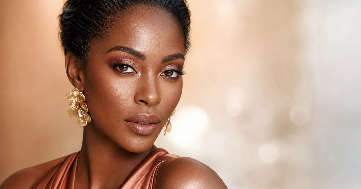
The first time I draped a cobalt-blue cloth on a deep-skinned client who'd lived in beige her whole adult life, she actually laughed out loud. Her face lit from within, cheekbones, eyes, the lot, and she said, "I look awake." She'd spent years being told to play it safe in neutrals that, on her, did nothing but mute the most striking thing about her coloring. Dark skin is rich in pigment, and rich pigment can hold rich color. The shades that overwhelm a paler complexion are exactly the ones that make deep skin glow.
So the brief here is the opposite of "tone it down." If you've got dark skin and you've been hiding in safe neutrals, this is your permission slip to wear the loud, clear, joyful colors other people can't carry. There's one honest caveat I'll keep coming back to, the single most flattering version of each color still depends on your undertone, but the direction of travel is the same for everyone: brighter, cleaner, deeper.
Understanding dark skin and color
Dark skin has a lot of melanin, and that's a color superpower. High melanin means depth and saturation in the skin itself, so it can stand up to depth and saturation in clothing without being washed out. Where a light, delicate complexion gets overpowered by a vivid emerald or a true red, deep skin meets that color as an equal, the contrast reads as vibrant and intentional rather than harsh.
Here's the part most charts get wrong, though: "dark skin" is not a single thing, and depth is not the same as undertone. Two women can have identically deep complexions and look best in completely different palettes, one glowing in warm marigold and bronze, the other in icy fuchsia and cobalt. That difference is undertone: the warm (golden, red, bronze), cool (blue, rose) or neutral cast underneath the surface color. Depth tells you that you can go saturated; undertone tells you which saturated colors. That's why undertone matters more than anything else, and why I'm careful never to promise one universal "best" shade.
The good news is that a few colors are so clear and pigment-rich that they flatter across almost every dark-skin undertone, they're the ones below.
The best colors for dark skin
These are the ten I reach for again and again on deep complexions, clear, confident colors that the skin is rich enough to carry.
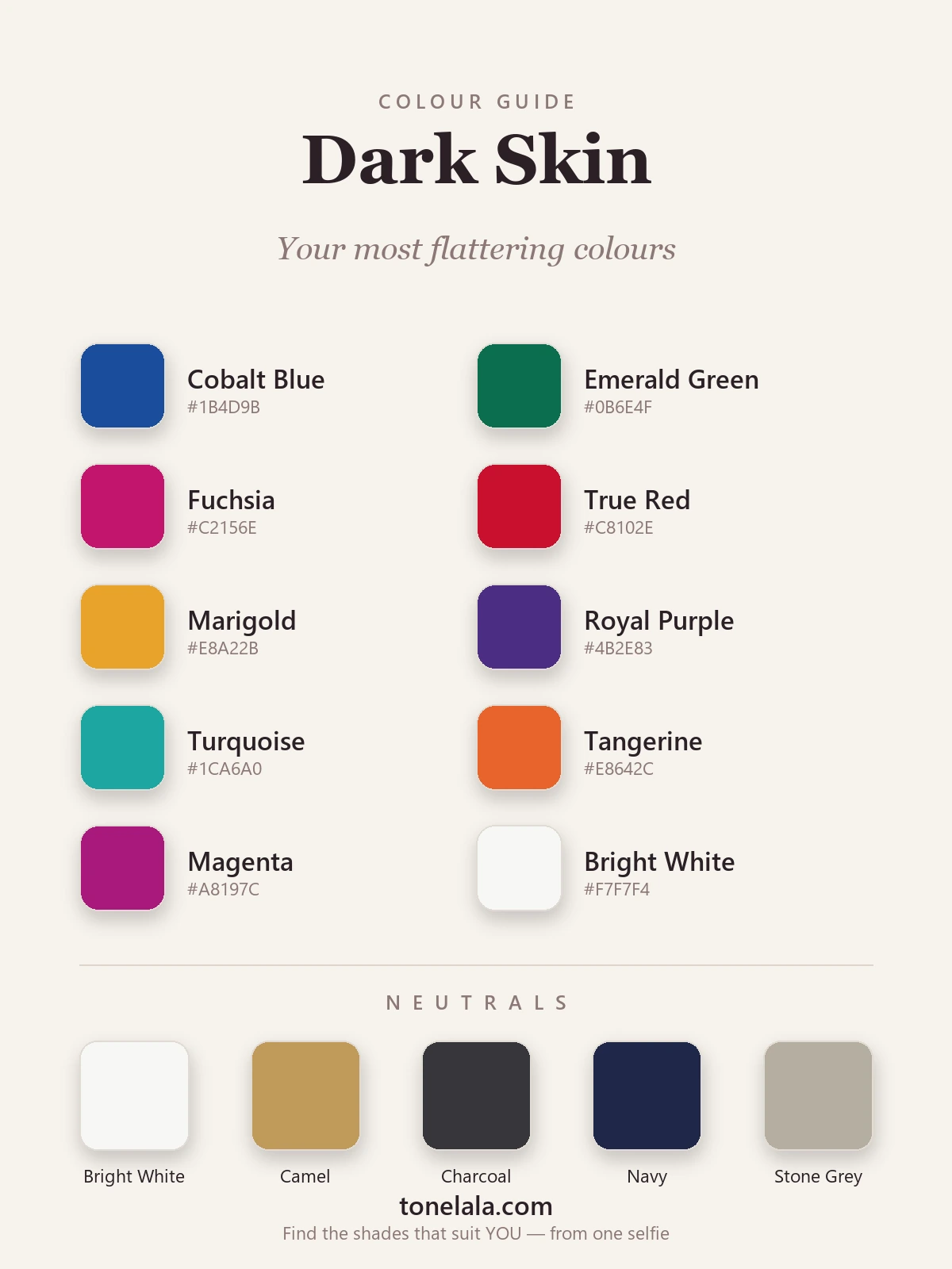
| Color | Hex | Why it works |
|---|---|---|
| Cobalt Blue | #1B4D9B |
My desert-island shade for dark skin. Deep, electric and clean, it makes the whites of the eyes and the skin both look brighter. |
| Emerald Green | #0B6E4F |
A true jewel green with real depth. It reads expensive against deep skin and flatters warm and cool undertones alike. |
| Fuchsia | #C2156E |
A cool, vivid pink-red that lights up the face. The brighter it is, the better it looks here, soft dusty pink does the reverse. |
| True Red | #C8102E |
Clear, slightly blue-based red. Dramatic and universally flattering on dark skin; it's the color I put people in for confidence. |
| Marigold | #E8A22B |
A warm golden yellow that glows like sunlight on deep skin. Where pale lemon can clash, this rich yellow sings, especially on warm undertones. |
| Royal Purple | #4B2E83 |
Deep, saturated and regal. Purple and dark skin is one of fashion's great pairings; it adds drama without ever looking heavy. |
| Turquoise | #1CA6A0 |
A bright blue-green with a holiday energy. Cool and clear, it makes deep skin look luminous and sun-kissed. |
| Tangerine | #E8642C |
A warm, punchy orange. It's bold, but dark skin grounds it so it reads joyful rather than loud, gorgeous on warmer complexions. |
| Magenta | #A8197C |
A deeper, more purple-leaning cousin of fuchsia. Rich and high-impact; brilliant for cool and neutral undertones. |
| Bright White | #F7F7F4 |
The contrast move. A crisp, clean white beside deep skin is striking in a way it never is on paler people, instant freshness. |
Best neutrals: Bright White #F7F7F4 (the crispest, most flattering contrast), Camel #C19A5B (a warm tan that keeps a look polished and expensive), Charcoal #36363B (a softer, richer "dark" than flat black), Navy #1E2749 (the smart, modern alternative to black), and Stone Gray #B6AEA0 (a warm gray that won't go flat against deep skin).
Want YOUR exact most-flattering shades?
Find your color season →Colors to avoid with dark skin
- Muddy mid-browns and murky taupe that sit close to your own skin tone. Instead of contrasting, they blend in, the outfit and your features both go quiet. Reach for camel or a deep chocolate with more clarity, or skip to a brighter color entirely.
- Chalky, washed-out pastels: baby blue, pale lilac, dusty mauve. They're so low in pigment that they can look ashy and lifeless against rich skin, draining the contrast that's your biggest asset. If you love pastels, go for the clearer, more saturated versions.
- Beige and "nude" neutrals pitched for lighter skin. A beige that's gorgeous on fair skin often reads flat and greige on deep skin. Swap it for a warm camel, a true ivory or a clean bright white, which all hold up far better.
None of these are forbidden, they're simply the shades that most often disappoint, so treat them as "handle with care" rather than rules.
Dark Skin and the color seasons
Depth puts most dark skin in the deeper, richer half of the seasonal system, but depth alone doesn't pick your season. Undertone does.
If your undertone is warm (golden, bronze, red-brown), you likely sit in Deep Autumn: think warm emerald, marigold, tangerine, teal and rich earthy reds, with gold metals and camel neutrals. If your undertone is cool (blue or rose beneath the skin), you're probably a Deep Winter: clear, icy-edged brights like fuchsia, cobalt, royal purple and true red, with crisp bright white and charcoal, and silver as easily as gold. Neutral undertones can borrow happily from both. And while it's less common on genuinely deep skin, brighter-but-lighter complexions can lean Bright Winter or Bright Spring, where clarity matters even more than depth.
That's the bit a one-size chart can't do, because two equally dark complexions can land in different seasons entirely. Our color analysis guides walk through each season in detail, so you can see exactly where your warmth, depth and contrast place you.
Makeup & styling for dark skin
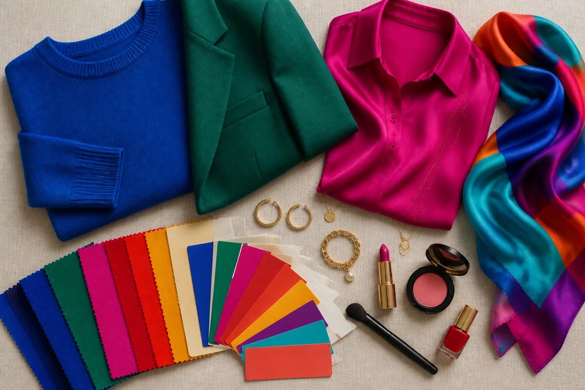
The same logic runs straight through to makeup: pigment-rich beats sheer. Deep skin carries bold lip color beautifully, a true red, a berry, a warm brick or a glossy plum all read intentional rather than overdone, where a wishy-washy nude can look gray. On the eyes, jewel tones (emerald, sapphire, bronze, copper) flatter, and warm metallic accents are universally lovely. For clothing, lean into color-blocking two of your brights together, cobalt with tangerine, emerald with fuchsia, because deep skin can anchor combinations that would overwhelm a paler frame. And both gold and silver work, so let your undertone, not a rule, decide which feels more "you."
Putting it together
Build around clarity and you can't go far wrong: pick two or three brights you genuinely love from the list, say cobalt, emerald and a true red, add bright white for contrast and camel or charcoal to ground them, and you've got a wardrobe that does the deep skin justice instead of muting it. The colors here flatter across most undertones, but the exact cobalt, the exact red that makes your face light up is personal, and worth pinning down properly. Stop dressing to be inoffensive, lean into the saturated colors your skin was made to wear, and let one vivid shade do the talking.
Frequently asked questions
What colors suit dark skin?
Dark skin carries rich, saturated color better than almost any other complexion. The most flattering shades are clear jewel and bright tones, cobalt blue, emerald, fuchsia, true red, royal purple, turquoise and tangerine, plus a crisp bright white that creates beautiful contrast. Warm golds and marigold yellow glow too. The single best version depends on your undertone, but if you remember one rule, it's this: go brighter and more saturated than you think.
What colors should you avoid with dark skin?
Be careful with muddy, grayed-out tones that sit close to your own skin tone, flat dusty browns, murky taupe and washed-out beige can blend in rather than flatter, so the color disappears and your features do the same. Pale chalky pastels and over-softened neutrals can also drain the contrast that makes dark skin look so vivid. None are banned, but they're the shades that most often fall flat; reach for a clearer, deeper or brighter version instead.
What are the best neutrals for dark skin?
Bright white (#F7F7F4) is the standout, it gives crisp, high contrast that makes deep skin glow. Charcoal (#36363B) and navy (#1E2749) are smarter, richer alternatives to flat black; camel (#C19A5B) is a warm, expensive-looking tan that flatters most undertones; and warm stone gray (#B6AEA0) is kinder than cold blue-gray. These five do the quiet work behind your brights.
Does undertone change the best colors for dark skin?
Yes, undertone decides your exact palette. Dark skin runs warm (golden, bronze, red), cool (blue, rose) or neutral, and that's what separates a Deep Autumn from a Deep Winter. Warm undertones glow in marigold, tangerine, warm emerald and gold; cool undertones come alive in fuchsia, cobalt, royal purple and bright white with silver. The color families stay the same; the temperature and exact shade shift with your undertone.
How do I find my exact most flattering shades for dark skin?
A personal color analysis reads your photo to pin down your undertone, depth and contrast, then gives you the precise versions of these colors, your exact cobalt, your exact red, that light your face up. It's far more accurate than a generic chart, because two people with equally dark skin can sit in completely different seasons. You can find your color season at tonelala.com/onboarding.
Related guides
Best Colors for Dark Skin And Brown Eyes: Your Most Flattering Shades (with Hex Codes)
A color analyst's guide to the best colors for dark skin and brown eyes, jewel tones, bright clears and the neutrals that glow, with hex codes.

Best Colors for Fair Skin And Dark Hair: Your Most Flattering Shades (with Hex Codes)
A color analyst's guide to the best colors for fair skin and dark hair, 10 flattering shades and 5 neutrals with hex codes, what to avoid

Best Colors for Tan Skin And Green Eyes: Your Most Flattering Shades (with Hex Codes)
A stylist's edit of the best colors for tan skin and green eyes, olive, teal, rust, gold and more, with hex codes, neutrals and shades to avoid.
Best Colors for Olive Skin And Brown Eyes: Your Most Flattering Shades (with Hex Codes)
A color analyst's guide to the best colors for olive skin and brown eyes, teal, terracotta, olive, gold and more, with hex codes and shades to avoid.
Best Colors for Medium Skin: Your Most Flattering Shades (with Hex Codes)
A color analyst's guide to the best colors for medium skin, teal, coral, marigold, emerald and more, with hex codes, the right neutrals and what to avoid.

Best Colors for Pale Skin: Your Most Flattering Shades (with Hex Codes)
A color analyst's guide to the best colors for pale skin, 10 flattering shades with hex codes, the best neutrals, what to avoid
Prefer in person? Find color analysis near you
Browse local color analysts by city, or get the same season, palette and best-colors breakdown online from one selfie.
See your colors on a photo of you
Upload one selfie and ToneLala reveals your season, your full palette, and your best hair, makeup, jewelry and outfits, styled on you.