In a sentence: color analysis for men reads your undertone, depth and contrast, then hands you the shirt, suit and casual colors that make you look sharp instead of washed out, for most men that means navy and charcoal over black, blue and teal shirts, and earthy greens and burgundy as color. Skip to the full palette or find your season.
Color Analysis for Men
By ToneLalaUpdated July 14, 2026
Contents
- 01 Color analysis isn't gendered, your face is the input
- 02 How to find your undertone
- 03 The best colors for men
- 04 Suits: navy and charcoal first, then your undertone
- 05 Shirts: blue is your friend, white isn't always
- 06 Casual: where color finally gets interesting
- 07 Why a personal analysis beats a generic men's chart
- 08 Putting it together
A man came to me convinced he looked terrible in every photo from his own wedding. Charcoal suit, crisp white shirt, the lot, textbook "smart." The problem wasn't the fit or the camera. It was that stark white drained every bit of warmth out of his face, and the black tie dropped a hard shadow under his jaw, so in picture after picture he looked gray and slightly unwell next to a bride who was glowing. We swapped him into a soft ecru shirt and a deep teal tie for the next event, kept the same suit, and the difference was almost embarrassing, same man, suddenly looking rested and alive.
That's the whole case for color analysis, and it has nothing to do with whether you care about fashion. Your skin has an undertone running underneath it, and colors either echo that warmth or coolness, making you look healthy, or argue with it and pull the life out of your face. Menswear leans hard on a tiny set of "safe" colors (black, gray, white, navy) precisely because nobody taught men the rest. So here's the honest, useful version: how to read your own coloring, and the shirt, suit and casual shades that actually flatter men, with real hex codes.
Color analysis isn't gendered, your face is the input
Let me clear up the obvious question first, because it stops a lot of men before they start. Color analysis was popularised in womenswear, but the science underneath it reads skin, hair and eyes, it has no idea whether you're a man or a woman, and it doesn't care. A warm, deep-colored man is flattered by exactly the same family of colors as a warm, deep-colored woman. The only thing that differs is where the color lands: a shirt, a knit, a tie or an overshirt instead of a blouse or a scarf.
So everything that follows is just the standard framework, pointed at the things men actually wear. Three dials decide your palette. Undertone is the temperature beneath your skin, warm (gold, olive, peach), cool (pink, blue-red) or neutral. Depth is how light or deep your overall coloring is, top to bottom. And contrast is the gap between your hair and your skin, think the high contrast of dark hair on fair skin versus the soft, blended look of mid-brown hair on medium skin. Get those three right and the colors follow.
How to find your undertone
Undertone is the color underneath your skin, and it doesn't shift with a tan or a rough week. Three quick checks, done in daylight, usually agree:
- Veins. Look at the inside of your wrist. Veins that read more green lean warm; veins that read more blue or purple lean cool.
- Metal. Hold a gold watch or chain to your jaw, then a silver one. Whichever makes your skin look clearer and more even is your temperature, gold-flatters means warm, silver-flatters means cool.
- Sun. Skin that tans easily and rarely burns usually reads warm; skin that burns, goes pink and refuses to brown usually reads cool.
If the signals split, green-ish veins but silver suits you, say, you're most likely neutral, which is common in men and simply means you have a foot in both camps and can borrow from each. Beard and hair color are useful clues too: gingery or golden-brown facial hair points warm, ashy or blue-black points cool. None of these is a verdict on its own, but together they point you to a lane.
If you want to see the full method, our how to find your undertone guide goes deeper on each test.
The best colors for men
These are the ten I reach for across most men's coloring, a spread of blues for shirting, earthy greens for casual, and rich reds for knitwear and accents. They're chosen to be broadly wearable; your exact best versions get warmer or cooler depending on your undertone.
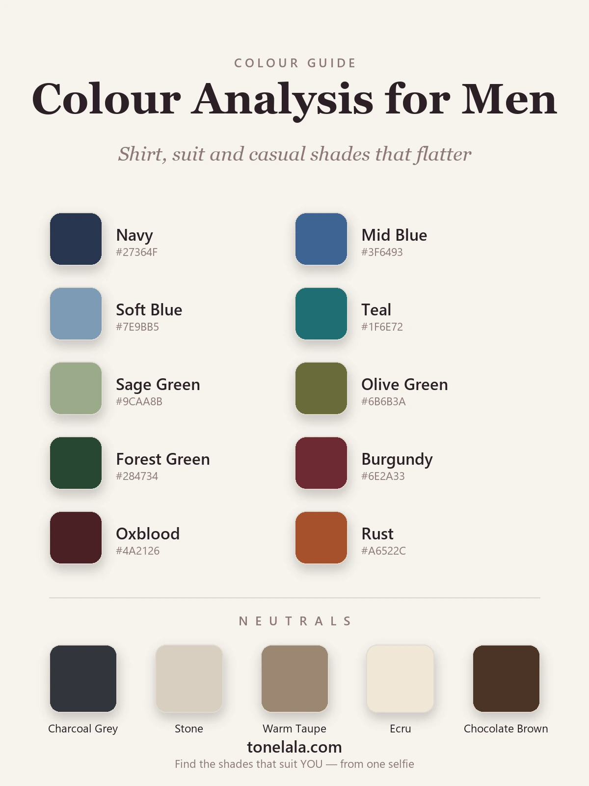
| Color | Hex | Where it earns its place |
|---|---|---|
| Navy | #27364F |
The hardest-working color in menswear. Suiting, knits, casual, it flatters almost everyone and beats black near the face. |
| Mid Blue | #3F6493 |
A confident shirt and jacket blue. Echoes the cool tones in most skin and makes eyes read clearer. |
| Soft Blue | #7E9BB5 |
The everyday flattering shirt, a faded, dusty blue that suits warm and cool men alike. |
| Teal | #1F6E72 |
A blue-green jewel note for knitwear or a tie when you want one decisive color without going loud. |
| Sage Green | #9CAA8B |
Muted and grown-up, sage reads almost neutral and bridges warm and cool wardrobes, a brilliant casual shirt. |
| Olive Green | #6B6B3A |
The backbone of a warm casual wardrobe, overshirts, field jackets, chinos. Looks expensive and unfussy. |
| Forest Green | #284734 |
A deep, near-neutral green that behaves like navy's warmer cousin, a great alternative dark for knits and outerwear. |
| Burgundy | #6E2A33 |
The dressy depth. A burgundy knit or tie lifts a neutral suit straight into the evening. |
| Oxblood | #4A2126 |
Darker and richer than burgundy, superb for a leather, a deep knit, or a cool man's "dark" color. |
| Rust | #A6522C |
Burnt and autumnal; the standout for warm men in knitwear and casual layers, a natural partner to olive and ecru. |
Best neutrals: Charcoal Gray #33363B (your dark anchor, softer than black), Stone #D8CFBF (a sandy daytime neutral for chinos and casual trousers), Warm Taupe #9A8772 (the tonal bridge that makes a neutral outfit look considered), Ecru #EFE7D6 (a soft off-white, kinder near the face than stark optic white), and Chocolate Brown #4A3526 (a warm "dark" for shoes, belts and outerwear that flatters warmer men far more than black).
Want to know YOUR exact shirt and suit colors?
Find your color season →Suits: navy and charcoal first, then your undertone
Here's the single most useful thing I tell men about suiting: for most of you, navy and charcoal beat black. Black is genuinely flattering only on deep, high-contrast coloring, dark hair, cool skin, strong features. On everyone else it drops a hard shadow under the chin and reads heavier than the occasion needs. Navy and charcoal do the formal job while sitting far more graciously near the face.
From there, undertone refines the choice:
- Warm men can wear what black-obsessed wardrobes never offer, brown, tobacco, taupe and olive-based suiting look genuinely rich on you, and navy still works as your formal default.
- Cool men suit true gray, navy and slate-blue suiting; keep browns cooler (taupe over tobacco) and you can carry charcoal and even black if your contrast is high.
- Deep, high-contrast coloring carries charcoal, navy and black with ease, strong color holds up beside strong features.
- Soft, lower-contrast coloring looks better in mid gray and blue-gray than in heavy charcoal, which can overwhelm a gentle face.
If you're choosing between the two cool classics, our how to wear navy guide breaks down where each one wins.
Shirts: blue is your friend, white isn't always
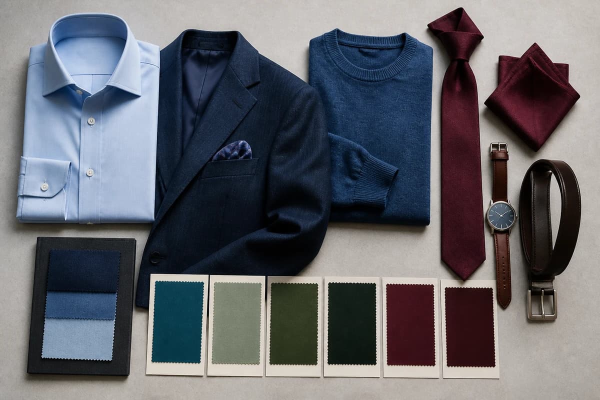
After white, the most universally flattering shirt colors for men are soft blue and mid blue. Blue carries cool tones that most complexions share, and it makes eyes, any color of eyes, read clearer and brighter. If you own one non-white shirt, make it a good soft blue.
White is where men quietly go wrong. Stark optic white is a cool color, and on warm or deeper skin it can pull the warmth straight out of your face and leave you looking drained, exactly what happened to my wedding client. The fix is easy: switch to ecru or a soft off-white, which gives you the same crisp, clean read without the gray-out. After blue and a kinder white, follow your undertone, warm men glow in sage, olive and warm stone shirts; cool men suit crisp white, lilac and cool gray. A sage or soft-blue shirt under a navy jacket is about as flattering as casual-smart gets for the broadest range of men.
Casual: where color finally gets interesting
Casual is where men have the most room and use it the least. The earthy half of the palette lives here. Olive is the quiet hero, an olive overshirt or field jacket goes with everything and flatters warm and neutral men especially well. Sage and forest green extend the same idea into knitwear. Rust and burgundy are your color for jumpers and casual layers, autumnal, rich, and far more wearable than men expect. And teal is the one cool-but-characterful note that lifts an otherwise plain outfit.
The trick with casual is the same as with everything else: keep it in your temperature. A warm man in olive, rust and ecru looks pulled-together because it's all one family; the same man in cool gray and icy blue-greens looks slightly off, even if every piece is nice on its own. Pick two neutrals you wear constantly, say stone and charcoal, then add two or three of the colors above, and your weekend wardrobe mixes itself.
Why a personal analysis beats a generic men's chart
Everything above is the honest starting point, the colors that flatter men as families. But "men's colors" isn't one palette any more than "women's colors" is. In seasonal color analysis your undertone, depth and contrast place you in a specific season, and that's what turns this list into yours. A warm, deep man is a True or Deep Autumn, his rust runs darker, his olive richer, and stark white is out entirely. A cool, high-contrast man with dark hair sits in Winter, and he's one of the few who genuinely owns black, charcoal and crisp white. A softer, mid-contrast man needs muted, gentler versions of all of it.
Same ten colors, but the exact shade, and which ones to skip, shifts with your season. That's the bit a chart can't do, because it can't see your face. Our color analysis guides walk through each season in detail, and a photo-based analysis reads your undertone, depth and contrast together to hand you your specific navy, your specific olive, your specific shirt-white, not a generic men's list.
Putting it together
Color analysis for men is the same simple idea as it is for anyone: match the color near your face to the temperature of your skin, and you look healthy instead of tired. Start with the safe wins, navy and charcoal over black, a soft-blue shirt, ecru instead of stark white, then build out into the earthy greens and rich reds that menswear never bothered to offer you. Get the family right from this guide, then let a proper analysis pin down your exact shades. The payoff isn't looking fashionable; it's the thing my wedding client noticed first, putting on a color and, for once, looking like the best version of yourself in the photo.
Frequently asked questions
What is color analysis for men?
Color analysis for men is the same process used in womenswear, applied to a man's skin, hair and eyes: it works out your undertone (warm, cool or neutral), your depth (how light or deep your overall coloring is) and your contrast (the gap between your hair and skin), then hands you the shirt, suit, knitwear and casual colors that make you look healthy and sharp rather than tired. Nothing about it is gendered, the science reads your face, and the output is simply a palette of colors that suit you.
How do I find my undertone as a man?
Three quick checks point the same way. Look at the veins on your inner wrist in daylight, greener veins lean warm, bluer veins lean cool. Hold a gold watch or chain to your face, then a silver one: whichever makes your skin look clearer and more even is your metal, and gold-flatters means warm, silver-flatters means cool. And notice how you react to sun, tan-easily skin usually reads warm, burn-and-go-pink skin usually reads cool. If the signals are mixed, you're likely neutral, and a photo-based analysis settles it.
What color suit suits me best?
For most men the safest, most flattering suit colors are navy and charcoal rather than pure black, they sit softer near the face and work across warm and cool coloring. From there, undertone refines it: warmer men can wear brown, tobacco and olive-based suiting beautifully; cooler men suit true gray, navy and slate; deep-and-high-contrast coloring carries charcoal and even black with ease, while softer coloring looks better in mid gray and blue-gray. Match the suit's temperature to your skin and it frames your face instead of fighting it.
What shirt colors flatter men the most?
Beyond white, the most universally flattering shirt colors are soft blue and mid blue, because blue echoes the cool tones in most complexions and makes eyes pop. After that, follow your undertone: warm men glow in ecru, sage, olive and warm off-whites; cool men suit crisp white, soft blue, lilac and cool gray. Swap stark optic white for ecru if it makes your skin look drained, for warmer or deeper men, a softer white is far kinder near the face.
Do men need a different color palette to women?
No, the palette comes from your coloring, not your gender. A warm, deep man and a warm, deep woman are flattered by the same family of colors; the only thing that changes is where those colors land (a shirt and tie rather than a blouse and scarf). That's why color analysis works identically for everyone: it reads undertone, depth and contrast, then you apply the result to whatever you actually wear.
Related guides
Gold vs Silver: Which Suits You
A color analyst on whether gold or silver jewelry suits you, three quick undertone tests, why one metal lifts your face, and what to wear if you're neutral.
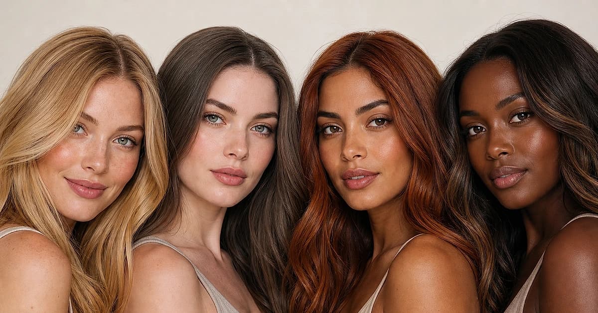
Hair Color for Your Skin Tone: The Complete Match Chart
A color analyst's chart of the most flattering hair colors for every skin tone and undertone, fair, medium, olive, tan and deep, warm and cool, plus the shades that wash you out.
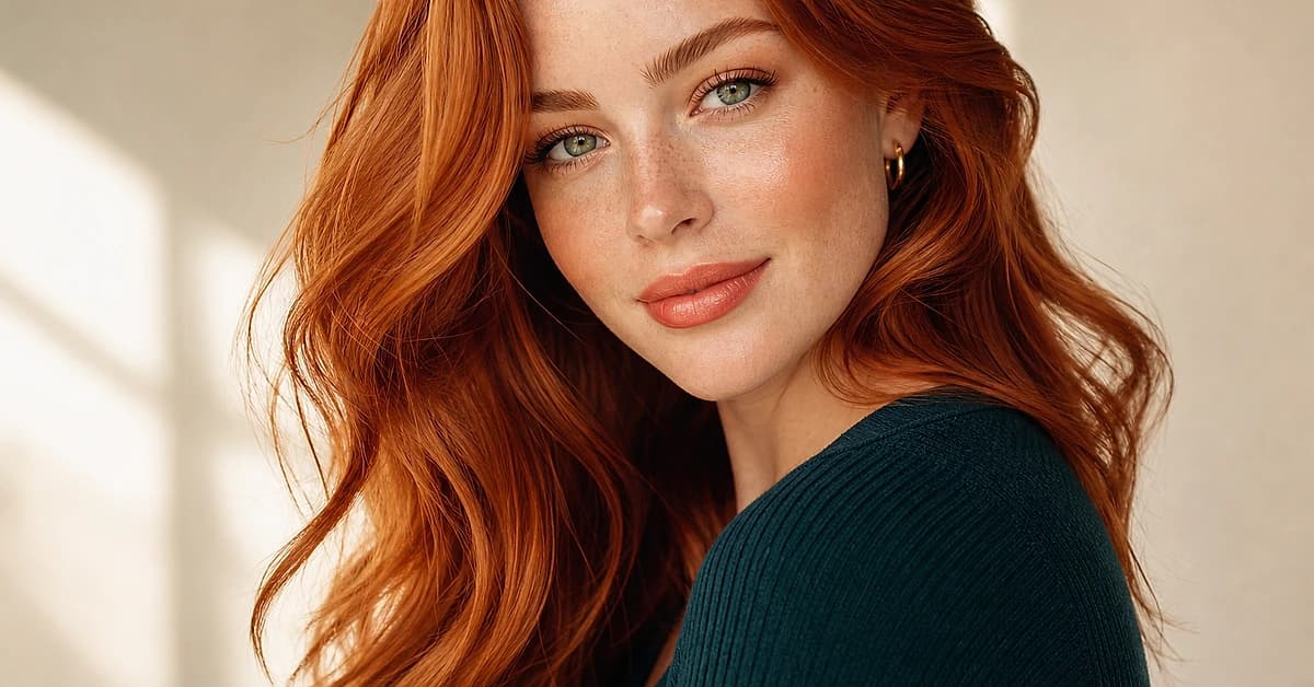
Which Skin Tones Suit Copper Hair? A Color Analyst's Guide
Copper hair flatters warm skin, but which depths and undertones exactly? A color analyst explains who suits copper, which copper shade to choose, and how to wear it if you're cool.
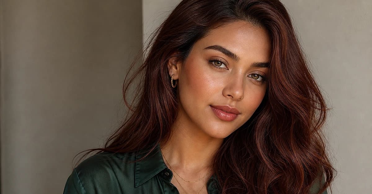
Which Skin Tones Suit Auburn Hair? A Color Analyst's Guide
Auburn is the most wearable red, but who does it flatter? A color analyst explains which skin tones and undertones suit auburn, which shade to pick, and how cool skin can wear it.
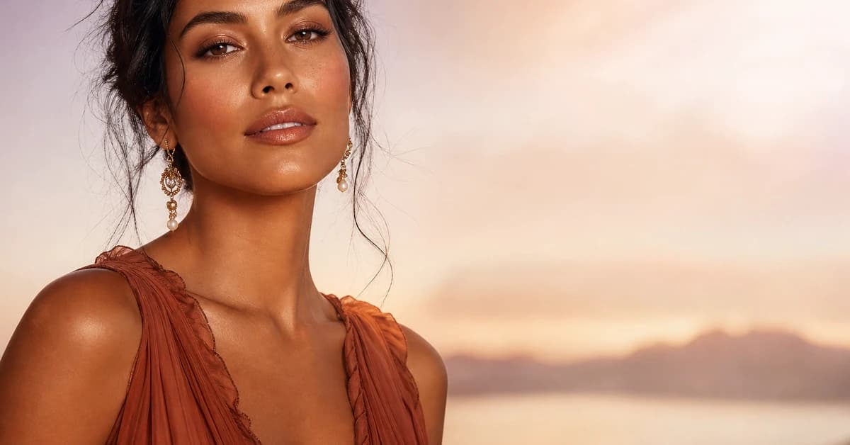
Tan Skin Tone: Undertones & Best Colors
A color analyst's guide to tan skin tone, read your undertone, find your likely season, and the best colors to wear, with hex codes.
What Colors Look Good on Me
A color analyst explains how to find what colors look good on you, read your undertone, value and chroma, with a sample palette
Prefer in person? Find color analysis near you
Browse local color analysts by city, or get the same season, palette and best-colors breakdown online from one selfie.
See your colors on a photo of you
Upload one selfie and ToneLala reveals your season, your full palette, and your best hair, makeup, jewelry and outfits, styled on you.