In a sentence: The best colors to go with red are navy, cream, camel and blush for everyday polish, plus olive green, forest green, teal, mustard gold and burgundy when you want depth, let red lead and keep its partners quieter. Skip to the full pairing palette or find your most flattering colors.
Colors That Go With Red: 12 Stylish Combinations (with Hex Codes)
By ToneLalaUpdated July 6, 2026
Contents
Red is the color people are most afraid to pair, and I understand why, it walks into a room before you do. But the mistake I see most often isn't wearing red at all; it's flanking it with a second color that's just as loud, so the two end up shouting over each other. A true red with a hot pink, or a scarlet with a bright cobalt at full volume, the eye doesn't know where to land.
The fix is almost embarrassingly simple. Give red one job: to be the bold thing. Then surround it with colors that have the good manners to hold back, deep, quiet, or soft. Do that and red stops being a risk and starts being the most useful color in your wardrobe. I'd rather see someone in a brilliant red coat over a plain navy and cream outfit than in a busy red-and-emerald-and-yellow combination they're nervous in all day.
What kind of color red is
Red is a warm primary, but "red" covers an enormous range, and the undertone is what actually decides its partners. A tomato or brick red leans orange and sits happily with golden, earthy colors, camel, olive, mustard. A true red is balanced, neither warm nor cool, and it's the most versatile of the lot. A crimson or raspberry leans blue and cool, and it loves navy, charcoal and clean whites.
The other thing to know is that red is high in chroma, it's saturated and demanding by nature. That's why it behaves so well next to lower-chroma colors (a grayed olive, a soft blush, a deep navy) and so badly next to other high-chroma brights. You're not really pairing "red with X"; you're balancing one intense color against calmer ones so the whole outfit breathes.
The best colors to go with red
Here are the ten I reach for most, from safest to boldest, every one tested on real outfits, not just a color wheel.
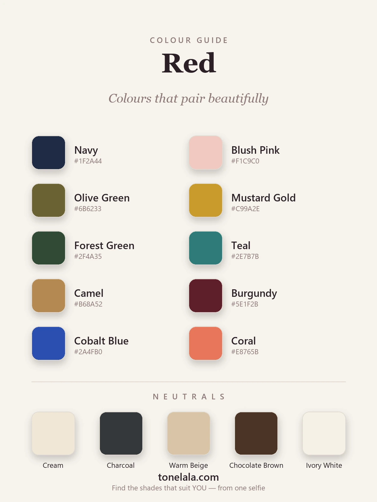
| Color | Hex | Why it works |
|---|---|---|
| Navy | #1F2A44 |
The most reliable partner red has. Navy is deep enough to ground red's energy without ever competing, endlessly chic and quietly grown-up. |
| Cobalt Blue | #2A4FB0 |
A braver blue. Use it in smaller doses, a cobalt heel or bag against red, for a high-energy, deliberately bold pairing. |
| Blush Pink | #F1C9C0 |
A pale tint of red itself, so it's effortlessly harmonious. Softens the whole scheme into something warm and approachable. |
| Coral | #E8765B |
A warm, tonal cousin of red. Keep both in the same warm family and you get a sunset palette that feels rich rather than clashing. |
| Olive Green | #6B6233 |
My favorite unexpected pick. Olive's muted, golden green calms a warm red beautifully, think autumn, not Christmas. |
| Forest Green | #2F4A35 |
Red's true complement, done the grown-up way. Deep and saturated rather than bright, so it reads as luxe, not festive. |
| Teal | #2E7B7B |
A blue-green with enough depth to stand up to red without shouting. Sophisticated and slightly unexpected. |
| Mustard Gold | #C99A2E |
Shares red's warmth and adds a vintage glow. A mustard scarf or knit with a brick red is a 1970s pairing that still lands. |
| Burgundy | #5E1F2B |
Red's deeper relative. Tonal dressing, a bright red with a burgundy, looks considered and rich, especially in winter fabrics. |
| Charcoal Plum | #4A3344 |
A smoky, barely-there purple-brown that adds moodiness. Pairs red back from "bold" into "intriguing." |
Neutrals that go with red: Cream #EFE7D6, charcoal #34373B, warm beige #D8C4A6, chocolate brown #4A3526, and ivory white #F6F1E7. These are your safety net, any one of them lets red be the only statement in the outfit, which is exactly where red is happiest.
Which shade of red actually suits YOU?
Find your color season →Colors to avoid with red
- Bright orange. Right next to red on the wheel and almost the same intensity, so the two vibrate. A warm coral works because it's softer; a fire orange just competes.
- Clear acid yellow and hot magenta. Both are high-chroma brights, like red. Put two of them together and neither wins, it reads as costume rather than considered.
- A clashing red undertone. Wearing a cool blue-red top with warm tomato-red shoes is the quiet killer. Keep your reds in the same temperature family, or break them up with a neutral.
Red outfit combinations
- The grown-up classic: a true-red coat over a navy jumper and dark denim, with cream trainers or a camel boot. Bold but completely wearable for daytime.
- Autumn warmth: a brick-red knit with olive trousers and a camel coat, gold jewelry. Everything stays in the warm family, rich and easy.
- Quiet drama: a burgundy-and-red tonal look, burgundy trousers, a brighter red blouse, with charcoal accessories. Looks expensive and intentional.
- Soft and modern: a red midi skirt with a blush knit and ivory coat. The blush takes the edge off the red so the whole thing feels gentle rather than loud.
- One bold accent: an all-neutral outfit, cream, beige, a touch of chocolate brown, lifted by a single red bag or shoe. The least intimidating way to wear red, and often the most striking.
How to wear red for your color season
Here's the part most pairing guides skip: there is no single "red." The version that makes you glow depends on your coloring.
If you're warm (golden, peachy skin), your reds are tomato, brick and warm coral, and they pair naturally with the camel, olive and gold end of this palette. If you're cool (rosy or blue-undertoned skin), reach for true red, raspberry and blue-based crimson, and lean into navy, charcoal and cool whites. Deep coloring carries the saturated, dramatic reds, scarlet, burgundy; light or soft coloring is flattered by a gentler watermelon or muted brick, with blush and cream nearby, rather than a hard fire-engine red that overwhelms.
This is where seasonal color analysis earns its keep. My color analysis guides walk through each of the twelve seasons, and a personal analysis pins down your exact red, and which of the pairings above will look made for you.
Putting it together
Red rewards restraint more than any color I know. Choose the red that matches your own undertone, give it one confident partner, navy if you want safe, olive or teal if you want clever, blush if you want soft, and let your neutrals do the rest. Get that balance right and red stops being the color you save for special occasions and becomes the one you reach for on purpose. If you want to know which red is genuinely yours, find your color season and start there.
Frequently asked questions
What colors go with red?
The most reliable partners for red are quiet, confident ones: navy, cream, charcoal, camel and blush pink, plus richer tones like olive green, teal, mustard gold and burgundy. The rule of thumb is one loud color at a time, let red lead and surround it with neutrals or deeper, less saturated colors so nothing fights it.
What color best complements red?
On the color wheel, red's direct complement is green, and a deep forest or olive green is genuinely beautiful with it. But the single most flattering, wearable partner is navy: it grounds red's energy without competing, which is why the red-and-navy pairing has stayed in style for decades.
What colors should you not wear with red?
Avoid clashing warm brights, bright orange or a clear acid yellow next to red tends to vibrate and looks unbalanced. Be careful pairing two equally saturated colors (a hot pink or a vivid purple beside true red competes for attention). And mind undertone: a cool blue-red with a warm tomato red in the same outfit reads as a mistake rather than a choice.
What are the best neutrals to wear with red?
Cream, ivory and warm beige soften red and feel polished; charcoal and navy add depth and make it look intentional rather than loud; chocolate brown and camel warm it up for autumn. Stark white and pure black both work but read sharper and more graphic, lovely if that's the mood you want.
How do I wear red for my skin tone?
Match the red to your undertone. Warm, golden skin glows in tomato, brick and warm coral-reds; cool skin suits true red, raspberry and blue-based crimson. Deep coloring carries rich burgundy and scarlet; light, soft coloring is flattered by a watermelon or muted brick rather than a hard fire-engine red. A personal color analysis tells you your exact shade.
Related guides
Colors That Go With Sage Green: 12 Stylish Combinations (with Hex Codes)
A stylist's pick of the colors that go with sage green, terracotta, blush, cream, navy and more, with hex codes, outfit ideas and shades to avoid.

Colors That Go With Teal: 12 Stylish Combinations (with Hex Codes)
The colors that go with teal: 12 combinations with an outfit for each, 10 pairing colors and 5 neutrals with hex codes, shoes and jewelry, and what to avoid.
Colors That Go With Burgundy: 12 Stylish Combinations (with Hex Codes)
12 colors that go with burgundy, each with a hex code and an outfit to copy: cream, camel, navy, green, blush, gold, teal, gray, denim, olive and more, plus what to avoid and which burgundy suits you.
Colors That Go With Black: 12 Stylish Combinations (with Hex Codes)
A stylist's guide to the best colors that go with black, 10 pairings plus 5 neutrals, with hex codes, outfit ideas and how to match black to your skin tone.
Colors That Go With Purple: 12 Stylish Combinations (with Hex Codes)
A stylist's guide to the colors that go with purple, 10 pairings and 5 neutrals with hex codes, outfit combinations, what to avoid
Colors That Go With Green: 12 Stylish Combinations (with Hex Codes)
A stylist's guide to the colors that go with green, blush, mustard, terracotta, navy, teal and more, with hex codes, neutrals, outfit ideas and what to avoid.
Prefer in person? Find color analysis near you
Browse local color analysts by city, or get the same season, palette and best-colors breakdown online from one selfie.
See your colors on a photo of you
Upload one selfie and ToneLala reveals your season, your full palette, and your best hair, makeup, jewelry and outfits, styled on you.