In a sentence: Wear burgundy as a rich neutral, lean on cream, camel and navy for everyday, then bring in forest green, emerald or mustard when you want it to sing, and match the shade to your own undertone. Skip to the pairing palette or find your most flattering colors.
How to Wear Burgundy: Outfit Ideas & Color Pairings
By ToneLalaUpdated July 8, 2026
Contents
Most people own burgundy and wear it exactly one way: with black, every single time. The burgundy boots, the black jeans. The burgundy jumper, the black coat. It works, which is precisely the problem, it's the safest, dullest thing this color can do, and burgundy is far too good for safe.
Here's what years of styling clients in it taught me. Burgundy is doing two jobs at once. It has the depth of a dark neutral and the richness of a jewel tone, which means it can sit quietly behind camel and cream or throw a proper spark next to emerald. Almost everyone uses the quiet half and stops there. This guide is about the rest, the real pairing shades with hex codes, outfit formulas you can copy straight off the page, and the one thing that matters more than any of them: getting your version of burgundy right.
What burgundy brings to an outfit
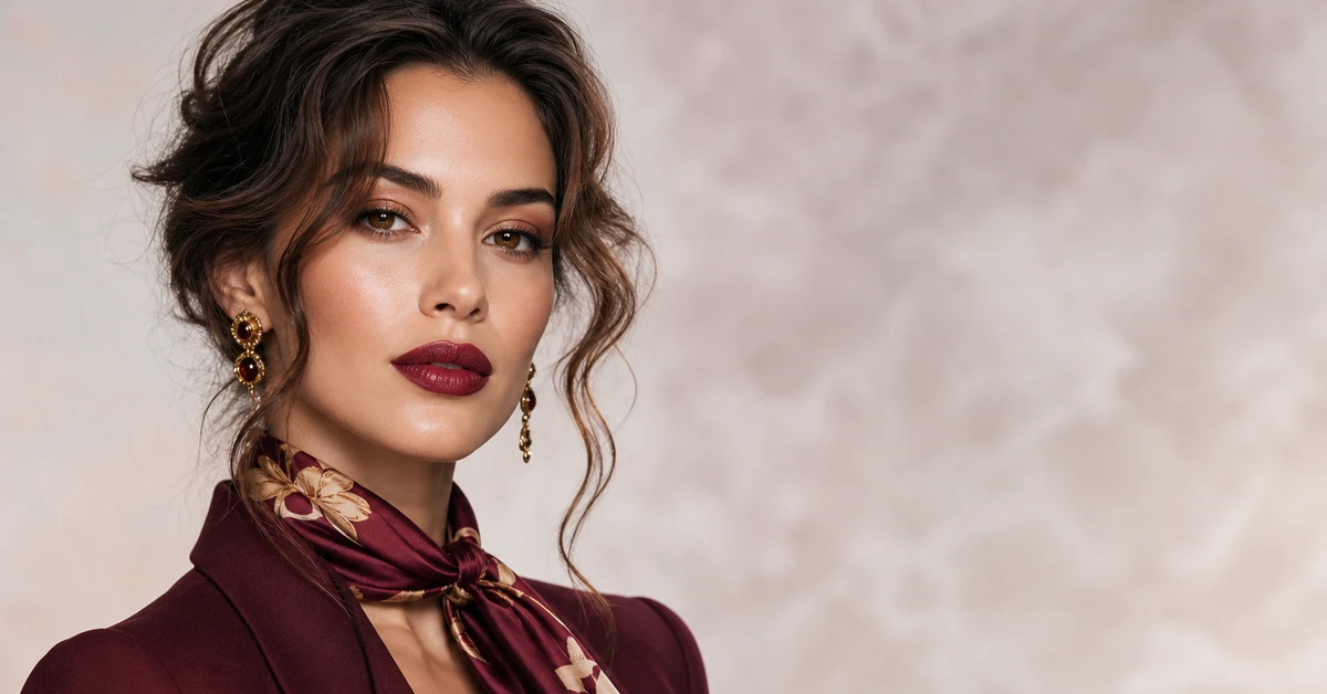
Burgundy is a deep, dark red with a distinctly cool, blue-based undertone, red mixed with purple and a good deal of brown, named after the wine, sitting roughly between #6E1423 and #800020. That blue-purple lean is the whole character of the color. It's what separates burgundy from a warm brick or a true scarlet, and it gives it a grown-up, slightly serious mood that brighter reds simply don't have.
What that means in practice is that burgundy behaves like a neutral with the volume turned up. It anchors an outfit the way charcoal or chocolate would, but it never reads as boring, because there's real saturation underneath. It comes alive from late summer onward, it's the first color I reach for when the light starts to drop, and it dresses up beautifully for evening while staying perfectly sensible at the office. The one rule worth carrying through everything below: because burgundy is softened and slightly cool, it wants partners that are softened too. Clean, bright, warm colors fight it; muted, deep or dusty ones fall in line.
The best colors to pair with burgundy
Here's the palette I actually use, a mix of soft tones, jewel tones and warm earthy shades, so there's a burgundy pairing for every mood.
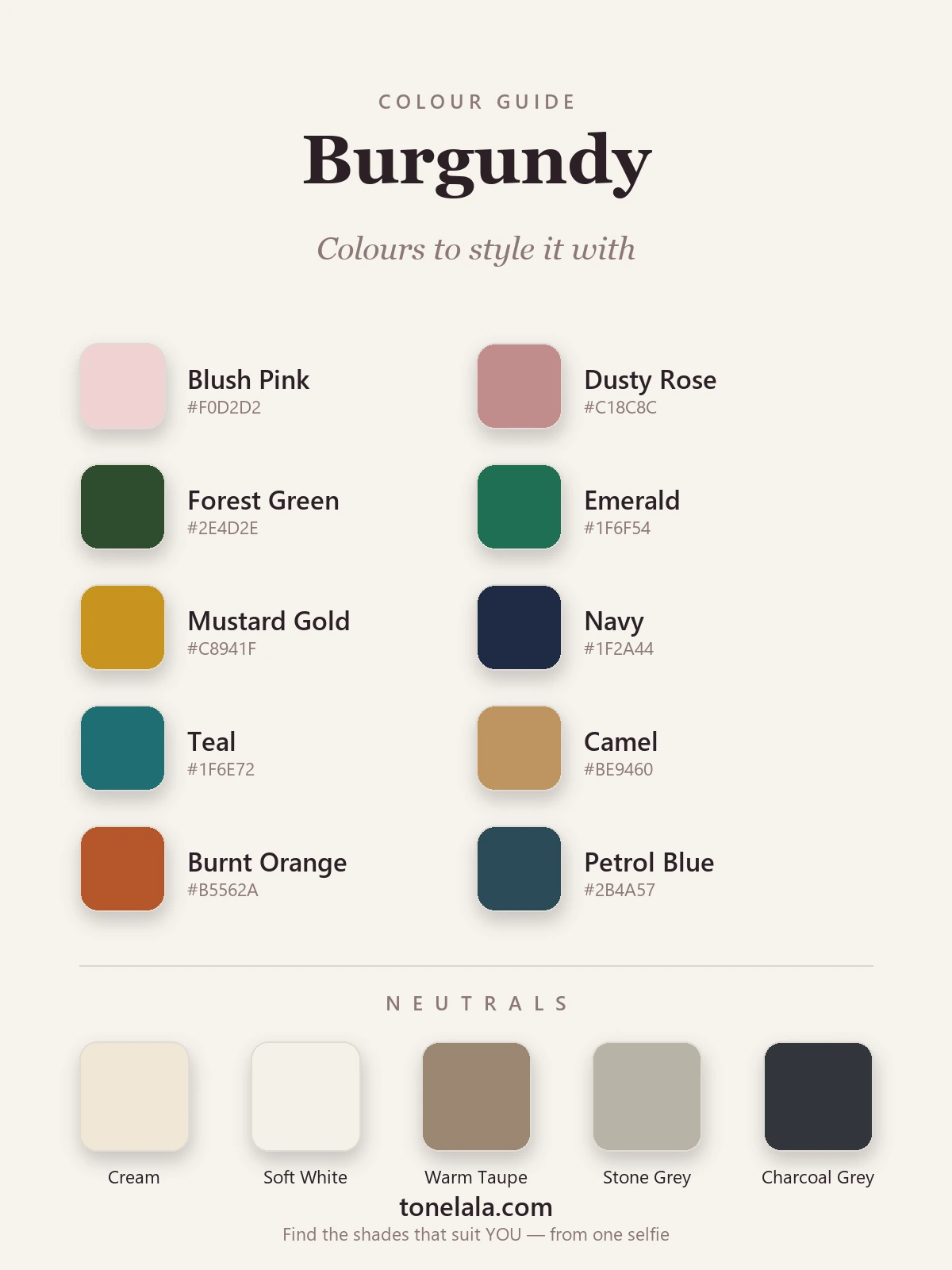
| Color | Hex |
|---|---|
Blush Pink #F0D2D2 |
A soft, tonal partner from the same red family, far lighter. Reads romantic and modern, never twee. |
Dusty Rose #C18C8C |
The grown-up blush, muted enough to live in burgundy's world without competing for attention. |
Forest Green #2E4D2E |
Burgundy's near-complement. Deep green against deep wine is the most elegant contrast there is. |
Emerald #1F6F54 |
The same green idea with more life in it, jewel-on-jewel, rich and a little festive. |
Mustard Gold #C8941F |
Warm ochre lifts burgundy out of seriousness; the autumn pairing that always looks expensive. |
Navy #1F2A44 |
A smarter, softer "dark" than black, two deep tones that hold hands instead of clashing. |
Teal #1F6E72 |
Shares burgundy's blue base, so it harmonizes rather than shouts. Cool and quietly unexpected. |
Camel #BE9460 |
The single most flattering near-neutral partner. Warm tan makes burgundy positively glow. |
Burnt Orange #B5562A |
A muted, earthy orange, analogous warmth that feels intentional and very seasonal. |
Petrol Blue #2B4A57 |
A deep blue-green-gray that's moodier than navy; rich and a touch directional worn together. |
Neutrals to wear with burgundy: Cream #EFE7D4 and Soft White #F4F1EA are the kindest lights, far warmer than stark white. Warm Taupe #9A8772 and Stone Gray #B9B3A7 sit quietly beside it, and Charcoal Gray #33363B is your best "dark", kinder and more flattering than jet black.
Is YOUR best shade of burgundy warm or cool?
Find your color season →Burgundy outfit formulas
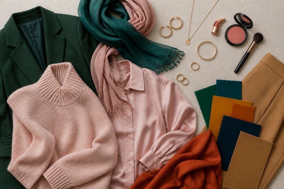
A pairing on paper is one thing; a whole outfit is another. These are the four I come back to again and again, sorted by where you're actually going.
- Casual: burgundy + cream + camel. A burgundy knit, cream trousers and a camel coat or scarf. White trainers keep it relaxed. This is the failsafe, warm, polished, the kind of look that seems effortless without being. Add gold hoops and it's done.
- Work: burgundy + navy + charcoal. Burgundy trousers or a skirt with a navy jumper, or a burgundy blazer over a charcoal dress. Two deep tones doing the heavy lifting, no black in sight. A gold watch or buckle stops it reading flat, and the whole thing looks quietly sharp.
- Evening: burgundy + forest green (or emerald). A burgundy dress with emerald earrings, or a forest-green top with a burgundy midi skirt. Deep-on-deep, jewel-toned and genuinely rich, my favorite cool-weather combination for dinner, with gold to finish.
- Soft and unexpected: burgundy + blush + soft white. Burgundy trousers, a blush blouse and a soft-white coat. Tonal and gentle, this takes burgundy somewhere lighter and more spring-like, proof it doesn't have to be heavy to look considered.
::img:flatlay::
Colors and styling to avoid with burgundy
- Bright, warm orange-reds and tomato shades. They sit on the opposite side of the undertone line from burgundy's blue-red base, so the two reds bicker rather than blend. If you want warmth, keep it muted, burnt orange, not pillar-box red.
- Flat mid-browns, and head-to-toe jet black. A muddy chocolate brown dissolves into burgundy until the outfit reads as one murky block, while pure black deadens its richness and can age the whole look. Lift brown with camel; swap black for charcoal or navy.
- Too much shine, all at once. Burgundy already carries a luxe, slightly formal weight. Pile on patent, satin and metallics together and it tips into costume. Let one rich texture lead, a velvet, a leather, and keep the rest matte.
Wearing burgundy for your coloring
Here's the part most styling guides skip: there isn't one burgundy. The shade that lights you up depends on your own coloring, and getting it right matters more than any pairing on this page.
Deep, cool-toned people, think True Winter or Deep Winter, wear a true, blue-based wine burgundy beautifully, worn right up to the face with crisp partners. Warm, deep types like Deep Autumn or True Autumn come alive in a brick-leaning, earthier oxblood instead, and should pull their pairings warmer, more camel, mustard and burnt orange than teal and petrol. Softer, lighter seasons usually do best in a muted, lighter "burgundy" closer to a deep dusty rose, and may want to keep a very dark version away from the face, on a skirt or trousers rather than a top.
If you've ever held a burgundy top up and watched your face either glow or quietly drain, that's undertone talking, and it's almost impossible to judge reliably in your own bathroom mirror. Our color analysis guides walk through how each season reads, and a personal analysis pins down the exact version of burgundy, and the exact partners, built for your skin, hair and eyes.
Putting it together
Wear burgundy like the rich neutral it is and you've already won: cream and camel for ease, navy and charcoal for sharpness, then forest green, emerald or mustard when you want it to genuinely sing. Keep your accent colors softened and slightly muted rather than clean and bright, let one luxe texture lead, and pick the shade, warm brick or cool wine, that matches your own coloring. Do that and you'll never reach for burgundy-and-black on autopilot again.
Frequently asked questions
How do you wear burgundy?
Treat burgundy as a rich neutral. For ease, build around cream, camel and warm taupe; for sharpness, pair it with navy or charcoal instead of black; and when you want it to actually stand out, add forest green, emerald or mustard gold. Keep your accent colors softened and slightly muted rather than clean and bright, and the outfit falls into place. A burgundy knit with a camel coat and cream trousers is the most foolproof place to start.
What should you wear with burgundy?
Burgundy is happiest with blush pink, dusty rose, forest green, emerald, mustard gold, navy, teal, camel, burnt orange and petrol blue. For neutrals, reach for cream, soft white, warm taupe, stone gray and charcoal, all kinder than stark white or jet black. Gold jewelry warms burgundy's depth; silver gives a cooler, crisper finish.
Is burgundy a good color to wear?
Yes, it's one of the most useful colors you can own because it works like a deep neutral with the richness of a jewel tone. It reads polished and grown-up, flatters most coloring when you get the shade right, and carries from autumn through winter and into evening. The trick is choosing a warm, brick-leaning burgundy or a cool, wine-leaning one to suit your own undertone.
What colors make burgundy look more expensive?
Camel and cream are the quiet luxury pairing, warm, tonal and effortless. Navy with a touch of gold reads sharp and considered, and forest green or emerald gives you that deep-on-deep, jewel-toned richness that always looks more costly than it is. Avoid pairing burgundy with bright warm orange-reds or flat mid-brown, which make it look cheaper and muddier.
Can you wear burgundy in summer?
You can, but lighten the way you style it. Swap dark partners for blush, soft white and cream, choose burgundy in a lighter fabric like linen or a fine knit, and keep it to one piece rather than head to toe. A burgundy linen shirt with white trousers feels seasonal rather than heavy. Softer, lighter coloring may prefer a muted burgundy closer to deep dusty rose in warmer months.
Related guides

How to Wear Beige: Outfit Ideas & Color Pairings
A stylist's guide to wearing beige, 10 color pairings with hex codes, the best neutrals, outfit formulas by occasion and what to avoid.
How to Wear Brown: Outfit Ideas & Color Pairings
How to wear brown without looking dull: 10 color pairings with hex codes, 5 neutrals, outfit formulas by occasion, and the right shade for your coloring.
How to Wear Orange: Outfit Ideas & Color Pairings
A stylist's guide on how to wear orange, 10 pairing colors with hex codes, the best neutrals, outfit formulas, and the right shade for your coloring.
How to Wear Red: Outfit Ideas & Color Pairings
How to wear red without it wearing you, a stylist's outfit formulas, the 10 best colors to pair with red (plus neutrals)

How to Wear Navy: Outfit Ideas & Color Pairings
A stylist's guide to wearing navy, 10 color pairings with hex codes, 5 neutrals, outfit formulas by occasion, and the right shade of navy for your coloring.
How to Wear Lavender: Outfit Ideas & Color Pairings
A stylist's guide to wearing lavender, 10 color pairings and 5 neutrals with hex codes, outfit formulas by occasion, and the right shade for your coloring.
Prefer in person? Find color analysis near you
Browse local color analysts by city, or get the same season, palette and best-colors breakdown online from one selfie.
See your colors on a photo of you
Upload one selfie and ToneLala reveals your season, your full palette, and your best hair, makeup, jewelry and outfits, styled on you.