In a sentence: your complexion is the full picture of your facial skin, depth, undertone and surface quality together, and reading all three tells you which colors genuinely flatter you. Skip to the complexion color palette or find your season.
Skin Complexion: Types & Color Guide
By ToneLalaUpdated July 10, 2026

Contents
- 01 What skin complexion actually means
- 02 The main complexion types by depth
- 03 Undertone: the layer that picks your colors
- 04 Surface quality: the part most guides skip
- 05 The complexion color guide
- 06 From your complexion to your color season
- 07 Where reading your own complexion falls short
- 08 Putting it together
A woman once told me her complexion was "just pink", said almost as an apology. She'd spent years steering away from red because it seemed to double the flush in her cheeks, and away from white because it left her looking, in her words, like she'd been crying. When I draped a soft cool red under her chin instead of the hot orange-red she'd been avoiding, the flush in her face actually settled, the color met her pink and calmed it rather than amplifying it. Nothing about her depth or her undertone had changed. What we'd named was the third thing: the surface of her skin, the ruddiness that no foundation shade chart ever talks about.
That third layer is the reason "complexion" is a more useful word than people give it credit for. Foundation ranges talk about depth. Undertone guides talk about warm versus cool. But your complexion is all of it at once, how deep your skin is, which way it leans underneath, and how it behaves on the surface. Read those three together and you can explain not just which colors suit you, but why a shade that should work on paper sometimes lands flat in the mirror.
What skin complexion actually means
Strip the word back and complexion has three parts, and almost every confusion about color comes from mixing them up.
- Depth: how light or deep your skin is, from fair through light, medium and tan to deep. This is the visible surface shade, the part that shifts when you catch the sun, and the part foundation brands number.
- Undertone: the steady color sitting beneath the surface: cool (pink, blue, rosy), warm (golden, peach, yellow) or neutral (a balance). Undertone doesn't move with a tan; it's fixed for life.
- Surface quality: how your skin reads on top: even (balanced, uniform), ruddy (visible pink or flushing, often across the cheeks and nose), sallow (a yellow-gray flatness that can wash you out), or sun-warmed (a tan laid over your natural depth).
Depth and undertone are independent, you can be fair and warm, or fair and cool, deep and warm, or deep and cool. Surface quality sits on top of both. Your complexion is where all three meet, and that's why a color that flatters one fair-and-cool person can fall flat on another: same depth, same undertone, different surface.
The main complexion types by depth
Depth is the easiest layer to read, because you can mostly see it. The quickest gauge is how your skin behaves in sun. Here's the spectrum I use, with a rough cue for each:
| Complexion depth | What it looks like | In the sun |
|---|---|---|
| Fair | Porcelain to light; often shows freckles or visible veins | Burns easily, rarely tans |
| Light | A step up from fair; reads "neutral light" in most ranges | Burns, then tans a little |
| Medium | Mid-range; the most common depth worldwide | Tans readily, burns sometimes |
| Tan | Warm mid-deep; holds color well | Tans deeply, burns rarely |
| Deep | Rich, dark complexions across many undertones | Rarely burns; deepens in sun |
The lines between these are soft, if you hover between light and medium, you're simply light-medium, and nothing breaks. And depth on its own doesn't dictate your colors; it mostly tells you how light or how saturated to take a shade. A fair person and a deep person can both be cool, wearing the same true red, one just wears a slightly lighter version of everything. If you want depth-specific shortlists, I've written them out for medium skin, fair skin and the full range in the skin tone chart.
Undertone: the layer that picks your colors
Undertone is the half that does the heavy lifting, and the half you can't simply eyeball. No single test is foolproof, so I read several cues together and let the weight of evidence decide. Do these in daylight, bare-faced, away from colored walls.
- Wrist veins. Blue or purple veins lean cool; green or olive-tinged veins lean warm. Genuinely can't tell, they look blue-green? That points neutral.
- Gold vs silver. Hold gold near your face, then silver. If gold makes your skin look lit and even, you're warm. If silver makes it look clean and clear, you're cool. Both fine, neutral.
- White vs cream. Drape pure white under your chin, then cream. Cool skin looks crisp in white; warm skin looks healthier in cream, and pure white can gray it slightly.
Tally the cues. Mostly blue-vein, silver and white is cool; mostly green-vein, gold and cream is warm; a real split down the middle is the signature of neutral. There's more on the full method in how to find your undertone, and the olive skin and neutral skin guides cover the trickier in-between complexions.
Surface quality: the part most guides skip
Here's where complexion earns its name. Two people can share a depth and an undertone and still need different colors, because the surface of their skin behaves differently. These are the three surface qualities I check for, and the simple adjustments each one calls for.
- Ruddy: visible pink or flushing, common on fair cool skin. Hot, orange-based reds and bright corals near the face tend to amplify the flush; cooler, slightly muted shades and soft blue-greens calm it. If your cheeks read pink already, let your colors pull away from pink rather than toward it.
- Sallow: a yellow-gray flatness that can make skin look tired. The fix is contrast: clear, cool-leaning colors like sapphire, soft teal and a true cool red counter the yellow cast and bring the face back to life, while muddy olives and mustards tend to deepen the grayness.
- Even: a balanced, uniform surface with no strong pull either way. This is the most forgiving, and it lets your undertone lead without correction; you can wear the fuller, brighter versions of your colors that ruddy and sallow skin have to temper.
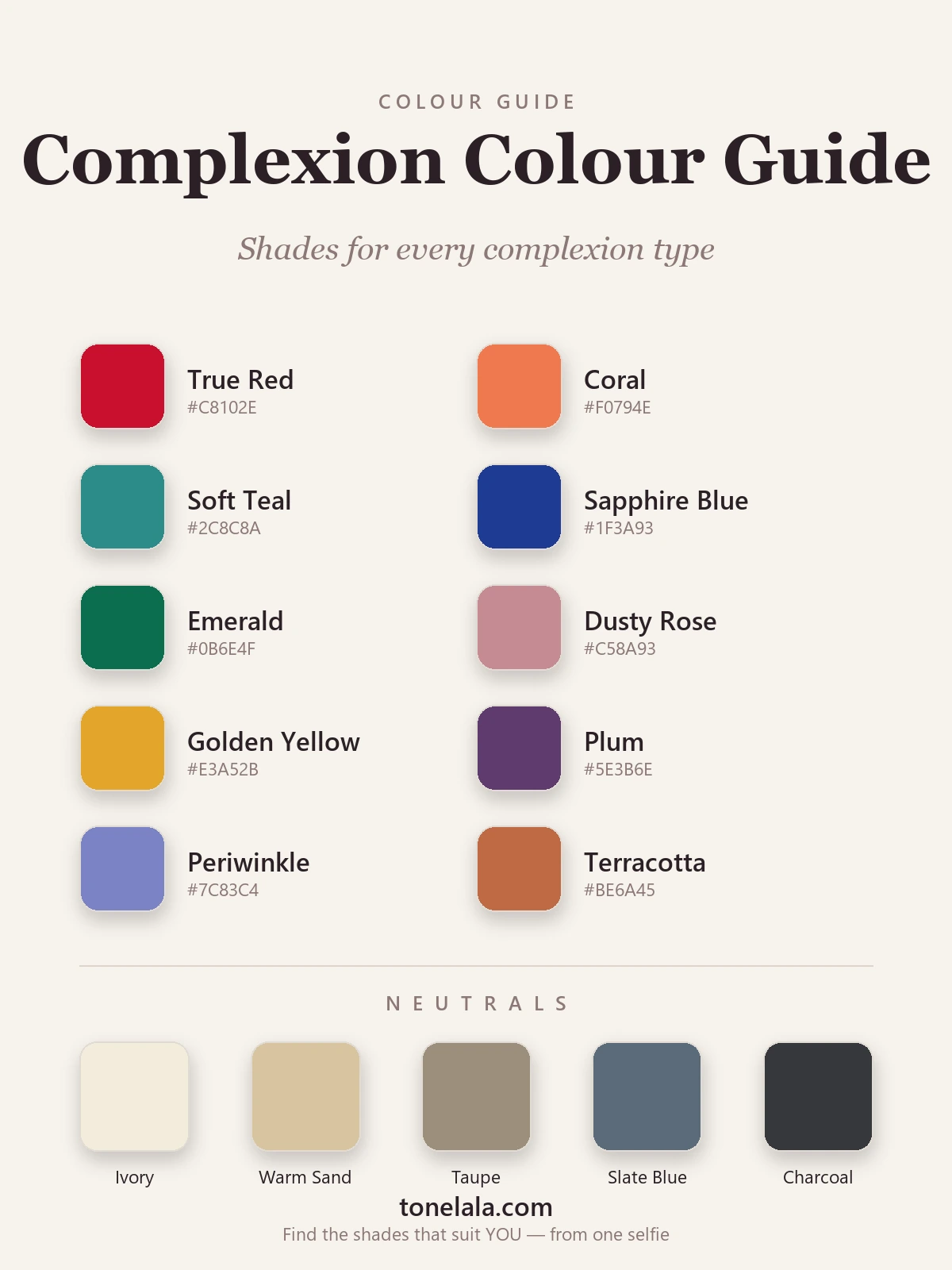
The complexion color guide
The palette above is built to span every complexion type on purpose. The cool cues, true red, soft teal, sapphire, emerald, dusty rose, plum and periwinkle, flatter cool complexions and do double duty for ruddy and sallow skin that needs cooling or brightening. The warm cues, coral, golden yellow and terracotta, glow on warm complexions. The neutrals run the same way, from warm sand through taupe to slate blue and charcoal, so every undertone has an anchor at its end.
To use it, layer your three answers. Start with undertone to pick your side of the palette: warm complexions take coral, golden yellow and terracotta; cool complexions take true red, sapphire, emerald and plum; neutral complexions wear the balanced middle, soft teal, dusty rose and periwinkle. Then let depth set how light or deep you take each shade: a deep complexion can carry emerald and plum at full strength, while a fair one wears lighter, airier versions of the same hues. Finally, let surface quality fine-tune it, ruddy skin leans on the cooler, more muted shades and eases off coral; sallow skin reaches for the clear, cool-leaning brights; even skin can wear the lot. That layering is exactly what depth-only advice can never give you.
Want to know exactly which version of each color flatters your complexion?
Find your color season →From your complexion to your color season
Your complexion isn't the destination, it's the doorway into seasonal color analysis, which is this same picture with brightness added as a final dimension. Every season is built from undertone (warm or cool), depth (light or deep) and chroma (soft and muted, or bright and clear).
Your undertone makes the first cut. Cool sends you toward the Winter and Summer families; warm sends you toward Spring and Autumn. Then depth and chroma split each pair:
- Cool + deep + bright → Winter. High contrast, clear saturated color.
- Cool + light + soft → Summer. Lower contrast, muted dusty hues.
- Warm + bright + clear → Spring. Light-to-mid depth, fresh and lively.
- Warm + deep + muted → Autumn. Rich, earthy, low-contrast warmth.
So two cool complexions can need very different palettes: a deep, high-contrast cool reads Winter and wants color at full strength, while a soft, low-contrast cool reads Summer and wants the muted version of the same hues. Surface quality often nudges you here too, a naturally muted, sallow-prone complexion tends to sit on the softer Summer or Autumn side rather than the bright extremes. If you want to walk through all twelve, the color analysis guides cover each season in detail, and the seasonal color analysis guide shows how the three dimensions fit together.
Where reading your own complexion falls short
I'll be straight about the limits. Reading your complexion at home gets you a long way, depth and undertone are usually within reach of a careful mirror check. But the borderline calls are genuinely hard to make on yourself. Neutral undertones come back mixed by design; surface qualities blur in mixed lighting; and chroma, whether you want color bright or muted, is the single hardest thing to judge from a bathroom, yet getting it wrong is the most common reason a "correct" color still looks off. A flushed complexion and a sallow one can even read as the same "doesn't suit me" verdict on a color for opposite reasons.
That's the gap a personal reading closes. It looks at your depth, undertone, surface and contrast together, against your actual skin, and resolves the calls a self-assessment leaves open, which is exactly why draping has been the professional standard for decades.
Putting it together
Your complexion is three things, not one: the depth you can see, the undertone beneath it, and the way your skin behaves on the surface. Read your depth off how you react to sun, weigh the vein, jewelry and white-versus-cream tests until your undertone points cool, warm or neutral, then notice whether your surface runs even, ruddy or sallow. Those three answers tell you which half of the palette is yours, how light or deep to take it, and which shades to lean on or ease off. Build a small wardrobe around the neutrals at your end and two or three feature colors from your side, and getting dressed turns from guesswork into a quick check. The last step is precision, confirming your exact season and the specific reds, blues and neutrals that flatter you, and that's what a personal analysis is for.
Frequently asked questions
What does skin complexion mean?
Complexion is the overall look of your facial skin, its depth (how fair or deep it is), its undertone (the cool, warm or neutral cast underneath), and its surface quality (whether it reads even, ruddy, sallow or sun-warmed). People often use 'complexion' loosely to mean just the shade, but the word really covers all three at once: the color you see, the color beneath it, and the texture and evenness on top. When someone says a color 'suits your complexion', they're responding to that whole picture, not only how light or dark your skin is.
What are the main types of skin complexion?
Complexions are usually grouped by depth, fair, light, medium, tan and deep, and then described by undertone (cool, warm or neutral) and surface quality. The depth bands tell you how light or saturated to take a color; the undertone decides which colors flatter you; and surface qualities such as ruddy (pink, flushed), sallow (yellow-gray) or even (balanced) tell you which colors to lean on or avoid. A full description of any complexion names all three, which is why two people at the same depth can suit completely different palettes.
How do I find out what my complexion is?
Work in three steps, bare-faced and in daylight. First, place your depth, fair, light, medium, tan or deep, using how easily you burn or tan. Second, read your undertone by weighing several cues together: blue veins, flattering silver and skin that looks crisp against white point cool; green veins, flattering gold and skin that warms against cream point warm; a genuine tie is neutral. Third, note your surface quality, visible flushing is ruddy, a yellow-gray flatness is sallow, an even tone is balanced. Those three answers together are your complexion.
What colors suit my complexion?
Your undertone does most of the work: warm complexions glow in golden, earthy shades such as coral, terracotta and golden yellow; cool complexions lift in blue-based shades such as true red, sapphire, emerald and plum; neutral complexions wear balanced, medium-saturation versions of both. Depth then tells you how light or deep to take each shade, and surface quality fine-tunes it, ruddy skin calms in cooler, muted colors and avoids hot pinks near the face, while sallow skin brightens beside clear, cool-leaning shades that counter the yellow-gray cast.
Is complexion the same as skin tone or undertone?
They overlap but aren't identical. Skin tone, in everyday use, usually means depth, how fair or deep you are. Undertone is the steady cool, warm or neutral cast sitting beneath the surface, which doesn't change with a tan. Complexion is the broadest term of the three: it bundles depth and undertone together with surface qualities such as evenness, ruddiness or sallowness. So your undertone is part of your complexion, and your skin tone (depth) is another part, but your complexion is the full picture they add up to.
Related guides

Types of Skin Tones Explained
A color analyst explains the types of skin tones, depth (fair to deep) and undertone (warm, cool, neutral), how they differ, and how to find yours.

Skin Tone Chart: Find Your Shade & Undertone
A color analyst's skin tone chart to find your shade (fair to deep) and undertone (warm, cool or neutral) with simple at-home tests, and your color season.

Fair Skin Tone: Undertones & Best Colors
A color analyst's guide to fair skin tone, how to spot it, read your cool, warm or neutral undertone, the seasons it suits

Medium Skin Tone: Undertones & Best Colors
A color analyst's guide to medium skin tone, how to spot it, find your warm, cool or neutral undertone, and the colors and seasons that flatter you most.

Best Colors for Medium Skin: Your Most Flattering Shades (with Hex Codes)
A color analyst's guide to the best colors for medium skin, teal, coral, marigold, emerald and more, with hex codes, the right neutrals and what to avoid.

Olive Skin Color Palette: The Best Colors to Wear (with Hex Codes)
The olive skin color palette with hex codes: 10 best colors, 5 neutrals and metals, grouped by light, medium and deep olive and by undertone, plus what to avoid.
Prefer in person? Find color analysis near you
Browse local color analysts by city, or get the same season, palette and best-colors breakdown online from one selfie.
See your colors on a photo of you
Upload one selfie and ToneLala reveals your season, your full palette, and your best hair, makeup, jewelry and outfits, styled on you.