In a sentence: deep skin tone is defined by depth, not undertone, it carries rich, saturated color like emerald, cobalt, fuchsia, ruby and marigold beautifully, and the only real decision is whether your version leans warm or cool. Jump to the full palette or find your season.
Deep Skin Tone: Undertones & Best Colors
By ToneLalaUpdated July 12, 2026
Contents
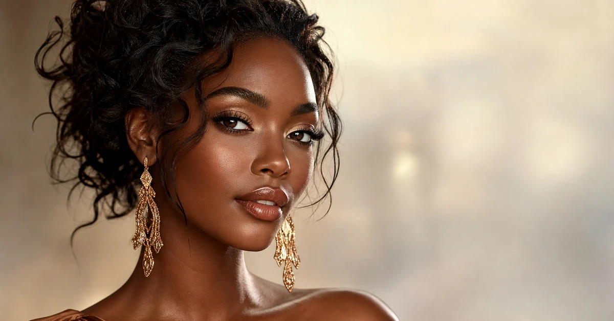
A client of mine has the deepest, most luminous skin I've ever draped, and she walked in apologizing for her wardrobe of beige, taupe and oatmeal. She'd been told her whole life to "keep it neutral" so as not to look loud. Every one of those soft shades was doing the opposite of what she wanted, they grayed her out, flattened her face, made her look tired in photos. The moment I laid a saturated fuchsia against her, the room reorganised itself around her. That's deep skin in one image: it doesn't need toning down, it needs feeding.
Here's the part most advice gets backwards. Deep skin can hold a depth and intensity of color that lighter complexions would vanish under. Pale, chalky shades are the ones that fight you, because they've got too little pigment to meet your skin as an equal. Bold, pigmented color is your home turf. So before we talk palettes, let's be clear about what "deep skin tone" actually means, because it's the foundation for every choice that follows.
What "deep skin tone" actually means
Depth and undertone are two different things, and confusing them is where most people go wrong. Depth is simply how light or dark your skin is, how much melanin you carry. Deep skin sits at the rich end of that scale, anywhere from warm golden-brown through umber to the deepest ebony. Undertone is the color cast running underneath the surface: warm (golden, red or olive), cool (blue or rosy), or neutral (a balance of both). They're independent. You can have deep skin with a warm undertone, deep skin with a cool undertone, or anything in between.
Why does the distinction matter so much? Because depth tells you how saturated and contrasting your colors should be, and deep skin's answer is "very", while undertone tells you which direction each color should lean. Get the depth right and skip the undertone and you'll wear strong colors that still feel slightly off. Get both right and your skin looks lit from within. The whole of this guide hangs on holding those two ideas apart.
How to read your undertone on deep skin
This is the bit a generic "colors for deep skin" list always skips, and it's the bit that does the real work. The cues are the same at every depth, you just have to read your own:
- The wrist test. In natural daylight, look at the veins on your inner wrist. Greenish veins lean warm, blue or purple lean cool, a mix you can't quite call reads neutral.
- Gold versus silver. Hold a gold chain and a silver one up to your bare face. If gold makes your skin look richer and lit, you're warm; if silver looks cleaner and brighter against you, you're cool; if both flatter, you're neutral and lucky.
- How you catch the sun. Notice the tone you deepen to. A richer golden or red cast points warm; an ashier or rosier cast points cool.
- White versus cream. A pure bright white that makes your skin glow suggests cool or neutral; a soft ivory or cream that feels kinder suggests warm.
Deep skin most often runs warm or neutral, which is why the palette below skews rich and warm-friendly. But cool deep skin is genuinely common, and it's stunning in true blue-reds and icy brights, so don't assume. If you want this read precisely rather than by eye, my full how to find your undertone walk-through goes deeper, and a personal analysis settles it from a photo.
The best colors for deep skin tone
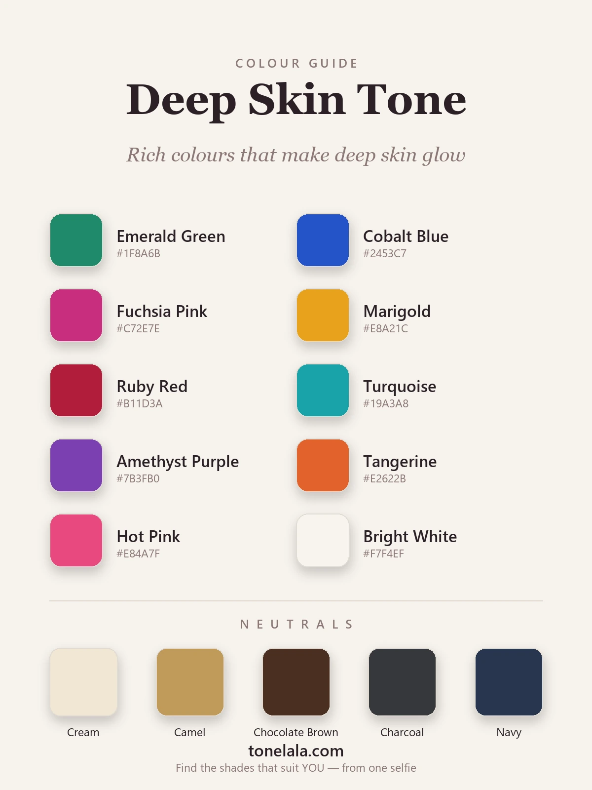
These are the ten I reach for first on deep skin, a run of jewel tones, a couple of clear brights, and the one white that genuinely pops against rich skin.
| Color | Hex | Why it works |
|---|---|---|
| Emerald Green | #1F8A6B |
The desert-island color for deep skin, lush, rich, flattering on nearly every undertone. |
| Cobalt Blue | #2453C7 |
Electric against deep skin and makes the whites of your eyes look brighter. |
| Fuchsia Pink | #C72E7E |
A pink bold enough to hold its own, no chalky blush here. Cool undertones especially light up. |
| Marigold | #E8A21C |
Golden yellow that deep skin can truly wear, reading like sunlight rather than sickly. Warm skin's friend. |
| Ruby Red | #B11D3A |
The lipstick-red of the group, confident, deep and near-universally flattering. |
| Turquoise | #19A3A8 |
A cooler, oceanic lift that's gorgeous in summer and brilliant against rich skin. |
| Amethyst Purple | #7B3FB0 |
The unexpected one, a saturated purple that flatters deep skin far more than people expect. |
| Tangerine | #E2622B |
Warmth and energy in one, echoing the gold in warm deep skin. |
| Hot Pink | #E84A7F |
A vivid blue-pink that reads joyful and luminous, not pastel. |
| Bright White | #F7F4EF |
The showstopper, the deeper your skin, the more a crisp white glows against it. |
Best neutrals: Cream #F1E7D3 (softer than stark white, endlessly wearable), Camel #C19A5B (warm and tonal, very expensive-looking on deep skin), Chocolate Brown #4A2F22 (a rich brown that flatters far better than mid-beige), Charcoal #36383B (sharper and kinder than flat black), and Navy #27364F (the deep, soft alternative to black for tailoring).
Want YOUR exact most-flattering shades?
Find your color season →Why saturation flatters deep skin
There's a principle underneath every color on that list: deep skin reads against contrast and saturation, not softness. A pastel carries so little pigment that, next to richly melanated skin, it looks washed and weak, and it drags your face down with it. A saturated jewel tone has the depth to meet your skin as an equal, so instead of competing it makes your skin look luminous. That's the entire mechanism. Pick colors with real pigment in them and you've won half the battle before you've thought about undertone.
This is also why "wear neutrals to be safe" is such bad counsel for deep skin. The grayed, in-between beiges that read as quietly chic on fair skin sit too close to deep skin's own depth and blur the line between fabric and face. Your neutrals need to be either much lighter (cream, bright white) or much richer (chocolate, navy, charcoal) to give your face the contrast it thrives on. The muddy middle is the only real trap.
Colors to handle with care on deep skin
- Chalky pastels: baby blue, mint, dusty lilac, powder pink. Too little pigment to stand up to deep skin, so they look faded and pull the life from your face. Want soft? Choose a clearer, juicier version, turquoise instead of mint, fuchsia instead of dusty pink.
- Muddy mid-browns and greige: beiges and taupes that sit close to your own skin depth blur fabric into face and flatten everything. Camel and chocolate work precisely because they're brighter or deeper; it's the in-between browns that disappoint.
- Dull, grayed-down "dirty" shades: sludgy olive, muted mushroom, dusty mauve. Deep skin wants clarity. A grayed color reads as "missing something" beside it, where a clean, saturated one looks intentional and rich.
None of these are forbidden, they're simply the shades that fall flat most often, so treat them as handle-with-care rather than off-limits.
Deep skin tone and the color seasons
Personal color analysis sorts everyone into one of twelve seasons, and deep skin most often lands in the Deep, Bright and True families, but not always, and that's the point. Depth alone doesn't set your season; undertone and contrast do.
If you're warm and rich, you're likely a Deep Autumn, your emerald leans gold-green, your red leans tomato, gold jewelry wins, and marigold and tangerine are made for you. If you're cool and deep, you're probably a Deep Winter, cobalt, true ruby, fuchsia and that crisp bright white are your power colors, and silver holds its own beside gold. And if your coloring is especially clear and high-contrast, a Bright Winter or Bright Spring palette gives you the most electric versions of everything. The Deep seasons are the most common landing spot, and if you're torn between the two, my Deep Autumn vs Deep Winter comparison lays the difference out side by side.
That's exactly why one chart can't finish the job. My color analysis guides walk through each season in detail, and a personal analysis reads your photo to tell you whether your emerald should lean blue or gold, and which of these ten is your showstopper.
Makeup and styling notes
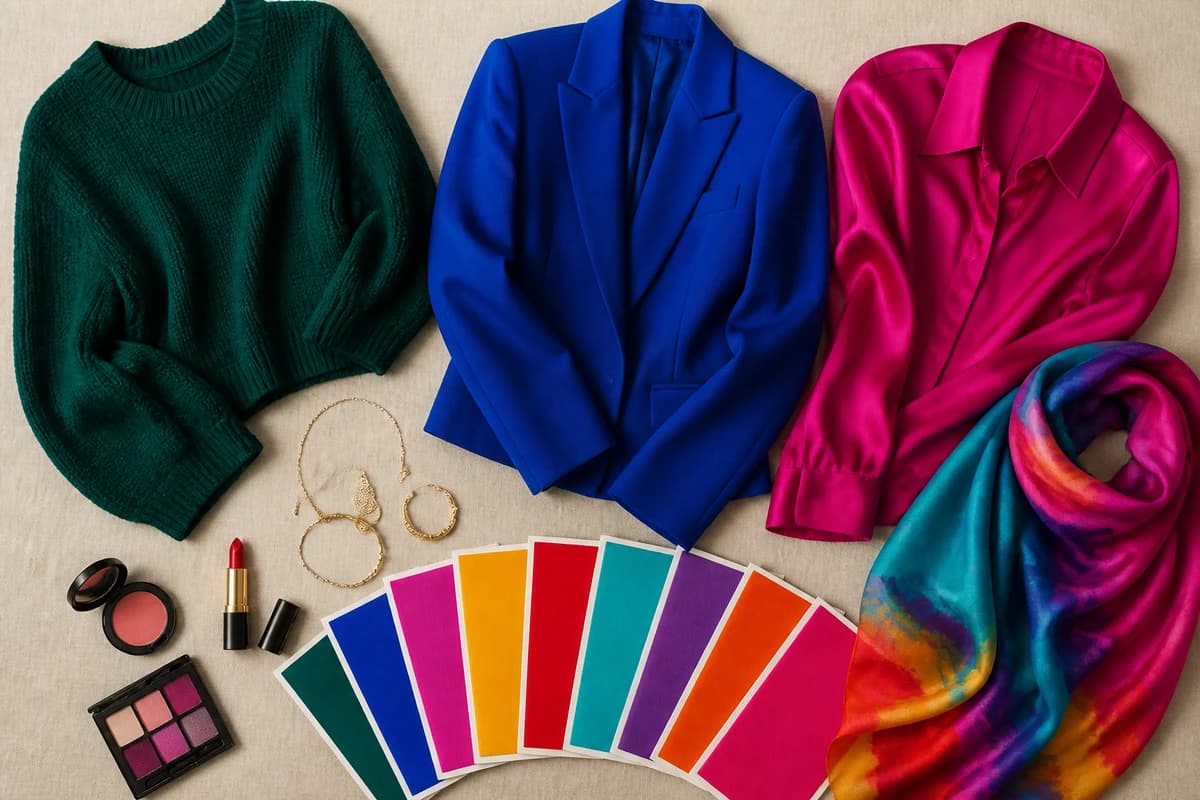
Lean into pigment here too. For lips, a true red, a deep berry or a warm brick all flatter deep skin far more than a muted nude, and a glossy bronze or copper eye looks like amber on warm coloring. On the face, gold and bronze highlighter give a lit-from-within glow that pearly silvers can struggle to on deeper skin, though cool deep skin can carry a rose-gold beautifully. For clothes, let one saturated color lead and keep the rest tonal: a cobalt dress with gold jewelry, or an emerald blazer over cream. Wear your brights near your face, tops, scarves, jackets, where they do their work, and let your neutrals anchor the lower half.
Putting it together
Build a small core and the rest falls into place: pick two jewel tones you adore (emerald and cobalt are the safest bet), one warm bright (marigold or tangerine), and anchor them with cream, chocolate and navy. The single most flattering version of this palette is the one tuned to your undertone, so if you only do one thing, settle whether you run warm, cool or neutral. Then go bold, deep skin was built for color the rest of us can only borrow.
Frequently asked questions
How do I know if I have a deep skin tone?
Deep skin tone describes the depth of your complexion, how much melanin sits in your skin, rather than its undertone. If your skin reads as rich brown to deep ebony, tans easily and rarely burns, and pale, chalky colors tend to wash you out rather than light you up, you have a deep skin tone. Depth is one thing; undertone (warm, cool or neutral) is a separate layer that decides your exact palette.
How do I find my undertone with deep skin?
The reliable cues are the same at every depth. Look at the veins on your inner wrist in daylight, greenish reads warm, blue or purple reads cool, a mix reads neutral. Hold gold and silver to your face: gold flattering you points warm, silver points cool, both looking good points neutral. Notice how you react to sun, rich golden or red tones lean warm, an ashier or rosier cast leans cool. Deep skin most often runs warm or neutral, but cool deep skin is real and common, so read your own cues rather than assuming.
What colors look best on deep skin tone?
Deep skin carries rich, saturated color beautifully, emerald, cobalt, fuchsia, marigold, ruby, turquoise, amethyst, tangerine, hot pink and a crisp bright white that pops harder the deeper your skin. For neutrals, reach for cream, camel, chocolate brown, charcoal and navy. The single most flattering version of each depends on your undertone: warm deep skin glows in marigold, tangerine and gold-greens, while cool deep skin sings in cobalt, fuchsia and true emerald.
What is the best color season for deep skin tone?
There is no single season for deep skin, but it most often lands in the Deep, Bright and True families. Warm, rich coloring tends toward Deep Autumn; cool, high-contrast coloring tends toward Deep Winter; very clear, vivid coloring can read Bright Winter or Bright Spring. Depth alone does not set your season, undertone and contrast do, which is why two people with the same deep skin can sit in different seasons.
What colors should deep skin tone avoid?
Be wary of chalky pastels (baby blue, mint, dusty mauve), muddy mid-browns that sit close to your own depth, and dull greige beiges, these tend to gray deep skin out rather than light it up. None are truly off-limits, but they fall flat most often. If you love a soft color, choose a clearer, more pigmented version of it instead of the chalky one.
Related guides

Types of Skin Tones Explained
A color analyst explains the types of skin tones, depth (fair to deep) and undertone (warm, cool, neutral), how they differ, and how to find yours.
Skin Tone Chart: Find Your Shade & Undertone
A color analyst's skin tone chart to find your shade (fair to deep) and undertone (warm, cool or neutral) with simple at-home tests, and your color season.
Olive Skin Undertones: Warm, Cool and Neutral Olive Explained
Olive skin is a green-gray cast that can sit over a warm, neutral or cool undertone. Five daylight tests to tell which olive you are, with the colors, makeup, hair and seasons for each.

Warm-Toned Skin: How to Tell & Best Colors
How to tell if you have warm-toned skin, the vein, jewelry and white-paper tests, plus the colors, metals and neutrals that flatter warm skin

Neutral Skin Tone: Undertones & Best Colors
A color analyst explains what a neutral skin tone is, how to tell if you have one, and the versatile colors and seasons that suit it (with hex codes).

Tan Skin Tone: Undertones & Best Colors
A color analyst's guide to tan skin tone, read your undertone, find your likely season, and the best colors to wear, with hex codes.
Prefer in person? Find color analysis near you
Browse local color analysts by city, or get the same season, palette and best-colors breakdown online from one selfie.
See your colors on a photo of you
Upload one selfie and ToneLala reveals your season, your full palette, and your best hair, makeup, jewelry and outfits, styled on you.