In a sentence: pale skin tone is about how light your complexion is, not its temperature, so the colors that flatter you hinge on whether your pale skin is cool, warm or neutral, but soft raspberry, periwinkle, dusty rose, soft teal and their relatives suit most pale complexions, grounded by soft white, dove gray and soft navy rather than stark white and black. Skip to the full palette or find your season.
Pale Skin Tone: Undertones & Best Colors
By ToneLalaUpdated July 11, 2026

Contents
Stand a pale face next to a sheet of printer paper and the undertone usually shows itself in a second, the skin either looks faintly pink beside the white, faintly golden, or it just reads light with no obvious lean either way. That tiny comparison is the whole reason pale skin trips so many people up. Two women can be equally light, stand shoulder to shoulder, and need opposite colors, because "pale" only describes how light the skin is, never which way it's tinted.
I see the same mix-up week after week. Someone decides she's "very pale" and reaches for the softest, palest version of everything she owns, then can't work out why she looks washed out in all of it. The paleness was never the problem. Pale skin is responsive rather than fragile, it picks up whatever color you put beside it faster than deeper complexions do, so the right shade lights it up and the wrong one drains it just as quickly. Read your undertone first, then choose colors that agree with it, and a pale complexion looks lit from within instead of bleached out.
How to tell if you have pale skin
Pale skin is a depth, it sits at the light end of the scale and reflects a lot of light. A few practical signs: you tend to burn before you tan, fine veins are often visible at the wrist and temple, and a little redness or a scatter of freckles shows through easily because there's less pigment to mask it. Held against pure white, pale skin reads as genuinely light rather than warm-mid or deep; held against black, it can look slightly drained, which is your first hint that hard black may not be doing you any favors.
What paleness does not tell you is your temperature. This is the single most useful thing to grasp about light skin: depth and undertone are independent dials. You can be pale and cool, pale and warm, or pale and neutral, and each of those wants a different palette. So don't stop at "I'm pale", that's only half a sentence. The half that actually decides your colors is your undertone. If you'd like to see exactly where you sit on the lightness range before you go further, the skin tone chart maps depth from fair through to deep and is a useful companion to this read.
Reading your undertone: cool, warm or neutral
Undertone is the quiet wash of color underneath the surface of your skin, and it doesn't shift with a tan or a bad night's sleep. On pale skin it tends to fall into one of three camps.
Cool, pale skin has a pink, rosy or very slightly blue cast. You probably go pink rather than golden in the sun, your wrist veins look more blue or purple than green, and silver jewelry sits more naturally against your skin than gold. Porcelain-with-a-flush is the classic cool-pale look.
Warm, pale skin has a golden, peach or ivory cast. You may freckle, you might tan a touch despite being light, your veins read greener, and gold jewelry makes your skin glow where silver can look a little cold. Think ivory rather than rosy.
Neutral, pale skin sits in between with no strong lean, gold and silver both look fine, your veins are a muddy blue-green, and you don't clearly pink or go golden in the sun. Plenty of pale people land here, which is good news, because it widens your palette.
One honest caveat: judging undertone in your own bathroom mirror is genuinely hard, because lighting lies and we're all biased about our own faces. Hold the test in soft daylight, against the white paper, and trust the comparison more than your memory of what you think your skin "should" be.
Colors that flatter pale skin
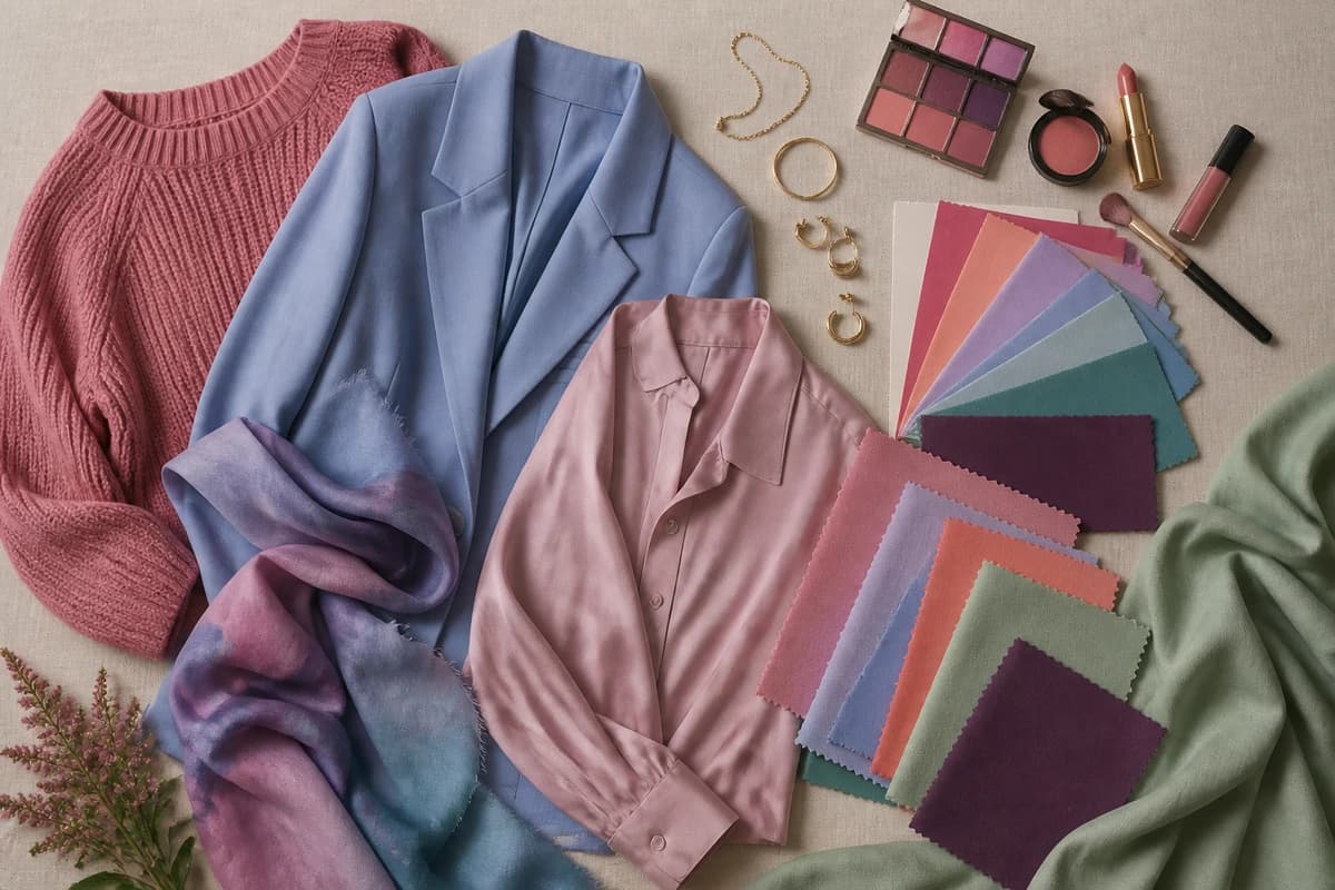
These are the ten I reach for first on a pale complexion, clear enough to give the face some life, soft enough that they never bulldoze it. They lean cool-to-balanced, because most pale skin (and certainly cool-pale skin) glows in this family; I'll flag where warmer-pale skin should shift below.
::img:palette:: {#the-palette}
| Color | Hex | Why it works |
|---|---|---|
| Soft Raspberry | #B7466A |
A blue-based pink-red that brings instant life to a light face without shouting. The pale-skin classic. |
| Periwinkle | #8C9BE0 |
A blue with a whisper of violet, soft, luminous and endlessly flattering on cool, pale skin. |
| Dusty Rose | #D08A92 |
A muted rosy pink that flatters the cheeks rather than competing with them. Gentle and pretty. |
| Soft Teal | #3E9B96 |
Sits between warm and cool, so almost any pale undertone looks lit beside it. Hard to get wrong. |
| Lavender | #B5A3D6 |
A cool, airy purple that's surprisingly easy to wear and makes pale skin look fresh. |
| Cornflower Blue | #5B7CC9 |
A clear, friendly blue that brightens light skin by contrast, an everyday hero. |
| Soft Coral | #EE8A6E |
The bridge color for warm-pale skin: a peachy coral that reads healthy rather than flushed. |
| Sage Green | #A3AE92 |
A soft, grayed green that's tonal and calm against pale skin and quietly expensive-looking. |
| Plum | #6E3B6E |
A deep cool purple that gives a light complexion richness and depth without any harshness. |
| Powder Blue | #9CC2DC |
A light, slightly dusty sky blue that looks fresh and open against pale skin. |
Best neutrals: Soft White #F3EEE4 (far kinder than optic white), Dove Gray #BFC3C2 (a gentle mid-gray that works near the face), Soft Navy #2E3A55 (your smart "dark" in place of black), Warm Taupe #B6A893 (a greige base for warmer-pale skin), and Cocoa #5A4636 (a soft brown-dark that flatters where hard black would drain).
If your pale skin reads warm, nudge this list golden: lean on soft coral, sage and warm taupe, swap cool periwinkle for a warmer teal, and let cocoa be your dark. If it reads cool, the raspberry-periwinkle-plum end is your home turf. Neutral-pale skin can borrow happily from both. For more depth on the warm-versus-cool split and a fuller wardrobe breakdown, my guide to the best colors for pale skin takes it shade by shade.
Not sure which version of these is *yours*?
Find your color season →Colors that drain pale skin
- Chalky, washed-out pastels: baby beige, pale lemon, oatmeal, the palest "nude" tones. They sit a shade away from your own paleness and your face simply dissolves into them. Reach for a clearer or slightly deeper version: dusty rose instead of barely-there pink, sage instead of pale putty.
- Stark optic white and hard black: both are extremes a delicate complexion struggles to balance. Optic white can leave pale skin looking grayish; black worn right under the chin drops a hard shadow and pulls the color out of your face. Soft white and soft navy (or cocoa) do the same jobs far more kindly.
- Heavy, muddy darks: dense chocolate-black, murky olive-brown, anything weighty and dull near the face can overpower light coloring and leave it looking flat. If you want depth, choose a clear dark like plum or soft navy rather than a heavy, muddied one.
None of these are forbidden. They're simply the shades that disappoint most often on pale skin, so treat them as handle-with-care, and when something looks off, ask whether the color is too pale, too stark or too heavy. That's nearly always the culprit.
What color season is pale skin?
Here's the honest part: there's no single "pale skin season", because light complexions turn up across several of them. Depth is only one of three things that decide your palette, the other two are undertone and contrast, and pale skin can pair with any combination.
Roughly: cool, pale skin usually lands in Light Summer or True Summer, where the colors are soft, cool and a little dusty. Warm, pale skin belongs with the Springs, Light Spring and True Spring, where everything is clear, warm and sunlit. And bright, high-contrast pale skin: light skin with dark hair and clear eyes, the snow-white-and-ink look, can be a Winter, carrying colors at a saturation that would swamp a softer person.
That contrast layer is exactly what a chart can't read for you. A Light Summer and a True Winter can both be pale, yet a soft summer pastel that flatters one looks anaemic on the other, while a winter's icy bright that electrifies one overwhelms the other. My color analysis guides walk through each season in detail, and if you're not sure whether your pale skin is soft or bright, cool or warm, which is genuinely hard to judge in your own mirror, that's exactly what a personal analysis settles.
Putting it together
Build a small capsule and getting dressed stops being a guessing game: pick two soft neutrals you love, say soft white and soft navy, then add two or three colors from above you're drawn to, like soft raspberry, periwinkle and soft teal. Everything mixes, because it's all pitched at the same gentle clarity, and your face stays lit in all of it. The one real trap with pale skin is the timid one, dressing so pale and safe that you cancel yourself out. Read your undertone, choose color with a little conviction, and let a proper analysis hand you the exact raspberry and the exact teal that turn "that's nice" into "you look so well, have you been away?"
Frequently asked questions
What is a pale skin tone?
Pale skin is skin that sits at the very light end of the depth scale, it reflects a lot of light, usually burns before it tans, and often shows fine veins and a little redness or freckling through the surface. Held against pure white it reads as genuinely light rather than mid or deep. Pale describes how light your skin is, not its temperature, so being pale tells you nothing on its own about whether you're cool, warm or neutral, that's a separate question your undertone answers.
What undertone does pale skin have?
Pale skin comes in all three undertones. Cool, pale skin has a pink, rosy or slightly blue cast and tends to go pink in the sun; warm, pale skin has a golden, peach or ivory cast and may freckle; neutral, pale skin sits in between with no obvious lean. Depth and undertone are independent, being light says nothing about your temperature, so you have to read undertone separately using your veins, how you react to sun, and whether gold or silver flatters you more.
What colors suit pale skin tone?
Pale skin is flattered by colors with a little clarity and life that stop short of overwhelming it, soft raspberry, periwinkle, dusty rose, soft teal, lavender, cornflower blue, soft coral, sage, plum and powder blue all tend to look lovely. Soft white, dove gray and soft navy are far kinder near the face than stark white and black. The single most flattering version of each depends on whether your pale skin is cool, warm or neutral.
What colors wash out pale skin?
The usual culprits are chalky, washed-out pastels that sit too close to your own paleness and make you disappear (baby beige, pale lemon, oatmeal), stark optic white and hard black worn right up to the face, and heavy, muddy darks that overpower delicate coloring. None are banned, soft white instead of optic white, soft navy or cocoa instead of black, and a clearer or deeper version of a color will usually flatter where a washed-out one drains.
What color season is pale skin?
Pale skin shows up across the lighter seasons rather than belonging to just one. Cool, pale skin often lands in Light Summer or True Summer; warm, pale skin in Light Spring or True Spring; and bright, high-contrast pale skin, light skin with dark hair and clear eyes, can be a Winter. Depth is only one of three things that decide your palette; undertone and contrast settle the rest, so a personal color analysis is the reliable way to place your pale skin in its exact season. You can start one at tonelala.com/onboarding.
Related guides
Warm vs Cool Undertones
A color analyst's guide to warm vs cool undertones: simple at-home tests, the neutral middle ground, and example colors with hex codes for each.

Fair Skin Tone: Undertones & Best Colors
A color analyst's guide to fair skin tone, how to spot it, read your cool, warm or neutral undertone, the seasons it suits
Best Blush for Your Skin Tone
A color analyst's guide to the best blush for your skin tone, how to pick peach, coral, rose and berry by undertone and depth, with real hex codes.

Warm-Toned Skin: How to Tell & Best Colors
How to tell if you have warm-toned skin, the vein, jewelry and white-paper tests, plus the colors, metals and neutrals that flatter warm skin

Best Lipstick for Your Skin Tone
A color analyst's guide to the best lipstick for your skin tone, how to pick reds, nudes, pinks and berries by undertone, with real hex codes and examples.
Best Jewelry Metal for Your Skin Tone
A color analyst's guide to the best jewelry for your skin tone, when gold, silver or rose gold flatters your undertone, with the metal test and hex codes.
Prefer in person? Find color analysis near you
Browse local color analysts by city, or get the same season, palette and best-colors breakdown online from one selfie.
See your colors on a photo of you
Upload one selfie and ToneLala reveals your season, your full palette, and your best hair, makeup, jewelry and outfits, styled on you.